The Evolution of the Web Modal: Mastering the Native HTML <dialog> Element
It has been nearly a decade since the native <dialog> element was introduced to the HTML specification, promising to end the era of "modal soup"—that chaotic landscape of third-party libraries, z-index conflicts, and accessibility nightmares that defined early web UI development. Yet, despite its longevity, many developers still approach the <dialog> element with hesitation, often relying on outdated patterns or over-engineered JavaScript solutions.
As web architecture matures, the native <dialog> has evolved from a simple container into a powerful, browser-native tool that handles focus trapping, top-layer management, and inertness out of the box. This article serves as a comprehensive deep dive into the modern implementation, styling, and architectural implications of the <dialog> element, ensuring you are equipped to build robust, accessible interfaces.
Main Facts: What is the <dialog> Element?
At its core, the <dialog> element is a native HTML tag designed to represent a window, widget, or other interactive component that sits on top of the main page content. Unlike a simple <div>, the <dialog> element possesses unique browser-level behaviors that significantly simplify the developer experience:
- The Top Layer: When opened via the
showModal()method, the element is promoted to the browser’s "top layer." This prevents it from being hidden behind other elements due to complex CSS stacking contexts. - Inertness: When a modal dialog is active, the rest of the document automatically becomes
inert. This means users cannot interact with or focus on elements outside the dialog, a critical feature for accessibility. - Built-in Backdrop: It includes an automatically generated
::backdroppseudo-element, which can be styled to dim or blur the background content. - Accessibility Defaults: The browser automatically handles focus management, ensuring that when the modal opens, the focus is placed appropriately, and when it closes, it returns to the triggering element.
Chronology: From Custom Hacks to Native Standards
The journey of the modal began in the early 2000s, an era dominated by "lightbox" scripts. Developers were forced to use absolute positioning, complex JavaScript event listeners to trap focus, and manual z-index management to ensure modals appeared on top.
By the mid-2010s, the W3C drafted the <dialog> specification. Browser support, however, was fragmented for years. Firefox, Chrome, and Edge eventually aligned, but Safari’s holdout created a "poly-fill" culture. Today, with the widespread adoption of the showModal() API and the recent standardization of starting-style and ::backdrop styling, the <dialog> element has finally reached a state of feature parity across all modern engines. We are now seeing a transition toward "declarative" dialogs, where even the JavaScript required to open them is being replaced by HTML-native "invoker commands."

Supporting Data: Implementation and API Nuances
Marking Up and Invoking
A basic dialog is defined by a simple markup structure:
<button id="open-btn">Open Dialog</button>
<dialog id="main-dialog">
  <p>Hello, I am a native dialog!</p>
  <button id="close-btn">Close</button>
</dialog>
To invoke it, developers have two primary paths. The show() method renders the dialog as a standard pop-up, which does not trigger the inert state or the backdrop. Conversely, showModal() is the industry standard for user-blocking UI.
The Rise of Declarative Commands
One of the most exciting developments is the "Invoker Commands" proposal. This allows developers to eliminate JavaScript entirely for simple toggles:
<button command="show-modal" commandfor="main-dialog">Open</button>
<dialog id="main-dialog">
  <button command="close" commandfor="main-dialog">Close</button>
</dialog>
This reduces the "JavaScript tax" on page performance and keeps interaction logic within the declarative HTML layer.
Official Responses and Accessibility Standards
The W3C and the WHATWG (Web Hypertext Application Technology Working Group) have been clear: the accessibility of a modal is not a "nice-to-have" but a requirement. Native <dialog> elements satisfy ARIA requirements automatically, which is a major victory over custom implementations.

The "X" Button Dilemma
A common pitfall is the use of an icon-only "X" button. While visually appealing, it fails screen readers. The consensus from accessibility experts is to utilize a visually hidden <span> that provides semantic context:
<button>
<span class="visually-hidden">Close modal</span>
<span aria-hidden="true">×</span>
</button>Focus Management
When a dialog opens, the browser places focus on the first focusable element. If your dialog contains a form, you should explicitly set the autofocus attribute on the primary input field to avoid the "Close" button receiving focus by default. This creates a more intuitive user flow.
Implications for Web Architecture
The Backdrop and Styling
Styling the ::backdrop is where the element truly shines. Modern CSS allows for sophisticated visual effects that were previously performance-heavy:
dialog::backdrop
  background: rgba(0, 0, 0, 0.4);
  backdrop-filter: blur(5px);
This native implementation is significantly more performant than blurring the entire document body, as it limits the rendering cost to the backdrop layer itself.
Animations and @starting-style
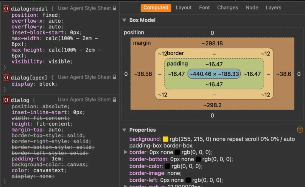
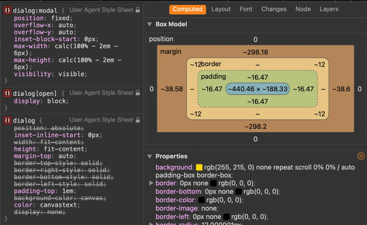
For years, animating the entrance and exit of a dialog was nearly impossible because of the jump between display: none and display: block. The introduction of @starting-style in CSS has solved this. By defining a state for the element before it is rendered in the DOM, developers can now create smooth fade-in and slide-up animations without triggering layout shifts.

Dialog vs. Popover
The industry is currently wrestling with the distinction between the <dialog> and the new popover API. Zell Liew and other standards advocates emphasize that:
- Dialogs are for blocking, modal experiences that require user attention.
- Popovers are for transient, non-blocking UI (like tooltips or menu dropdowns) that do not necessarily require the page to be inert.
Choosing the wrong API leads to "accessibility debt." If you use a popover for a critical form, you must manually code the focus trap and the inert behavior—essentially rebuilding the <dialog> element from scratch.
Future Outlook: The Path Ahead
The future of the <dialog> element lies in its continued integration with the browser’s internal rendering engine. As we look toward the potential for even more declarative behaviors—such as built-in animation hooks for closing and native support for keyboard-triggered focus restoration—the role of the developer shifts from "builder" to "orchestrator."
By leveraging native HTML elements, we reduce the total bytes of JavaScript sent to the user, improve the reliability of UI components across different devices, and ensure that our applications remain accessible to all users, regardless of their hardware or assistive technology.
The <dialog> element is not just a tag; it is a testament to the web’s maturity. It represents a move away from the "wild west" of custom UI libraries toward a more unified, high-performance, and standardized future. As developers, our responsibility is to embrace these native features, simplify our dependencies, and focus on the content that truly matters to our users.

Whether you are building a simple contact form or a complex dashboard, the <dialog> element remains the gold standard for modal interactions. It is time to let the browser do the heavy lifting.