Beyond the Static Edge: The Evolution of Animated CSS Border Images

For years, web designers have relied on the standard border property—the reliable, yet somewhat monotonous, solid, dashed, or dotted lines that define the boundaries of our UI elements. While functional, these static constraints often feel like a relic of a more rigid era of web design. However, a powerful, often overlooked tool has been waiting in the wings of the CSS specification: the border-image property.
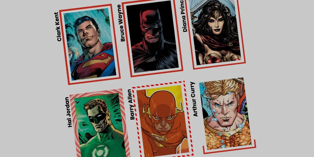
Far from a new invention, border-image has matured into a sophisticated mechanism for creating dynamic, fluid, and highly interactive interfaces. By moving beyond simple color blocks and embracing the power of CSS gradients, developers can now craft borders that animate, pulse, and draw themselves across the screen, turning mundane UI elements into captivating visual experiences.
Main Facts: The Power of border-image
At its core, border-image allows developers to replace the standard border styles with an image or a CSS gradient. The primary mechanism is simple yet flexible: you define a source (the image or gradient), determine how it is sliced (via border-image-slice), and set the width and outset.
The "magic" occurs when we move from static images to dynamic, programmatic CSS gradients. Unlike standard backgrounds, border-image can be manipulated using modern CSS features like @property. This allows developers to treat a border not as a fixed frame, but as a living canvas. By animating the underlying variables that define the gradient’s start and end points, or by manipulating the slice depth, developers can create the illusion of a border "growing" or "rotating" around an element—a technique that significantly elevates the user experience.
Chronology: From Static Frames to Dynamic Motion
The journey of the CSS border has been one of gradual liberation:
- The Early Web (The "Box" Era): The early days of CSS were defined by strict, rigid borders. If you wanted a unique border, you relied on background images or nested HTML wrappers, leading to "div-soup" and bloated markup.
- The Introduction of
border-image: Introduced as part of the CSS3 specification, this property finally allowed images to serve as borders. However, it was initially used mostly for decorative, static assets—think ornate picture frames or specific branding elements. - The CSS Gradient Renaissance: As browsers began to support complex CSS gradients, developers realized that a gradient is an image. This shifted the focus from static assets to generated code.
- The Modern Era (@property): The introduction of the Houdini API and the
@propertyrule changed everything. By allowing developers to define custom properties with specific types (like<percentage>or<angle>), it became possible to animate values that were previously "unanimatable," such as the stops in a gradient or the slice values in a border.
Supporting Data: Why border-image Outperforms Alternatives
While there are alternative ways to achieve similar effects—such as using CSS masks or multiple pseudo-elements—border-image remains a superior choice for specific use cases.
Efficiency and Performance
When compared to the "pseudo-element" approach (which often requires creating two extra layers of HTML or CSS content to simulate a border), border-image is exceptionally efficient. It requires no additional DOM nodes, keeping the markup clean and the accessibility tree straightforward. Because the browser handles the tiling and slicing internally, it is highly optimized for rendering performance.
The "Slice" Advantage
The border-image-slice property is the secret weapon of this technique. It functions similarly to background-size and background-position, allowing a single slice of an image to be repeated across the entirety of the border. By animating this value, developers can create complex, rhythmic movements that would otherwise require dozens of lines of keyframe animations or complex SVG manipulation.
The Caveat: The Curvature Limitation
It is important to acknowledge the elephant in the room: border-image does not respect border-radius. If you apply a rounded corner to an element, a border-image will stubbornly remain rectangular, effectively clipping off the corner of your border. For projects requiring soft, pill-shaped elements, developers often turn to the CSS mask approach pioneered by experts like Temani Afif. However, for sharp-edged cards, dashboards, and call-to-action blocks, border-image remains the gold standard for ease of implementation.
Technical Implementation: A Step-by-Step Guide
To implement an animated border, we must move beyond static CSS and into the realm of custom properties.
1. Registering the Property
We must inform the browser that our custom variable—let’s call it --p—is a percentage. This allows the browser to interpolate the values during an animation.
@property --p
  syntax: "<percentage>";
  initial-value: 0%;
  inherits: false;
2. The Gradient Source
Next, we define our border using this variable within a linear-gradient. By setting the color stop to var(--p), we gain control over the "fill" of the border.
.card
  border-image-source: linear-gradient(-45deg, red var(--p), transparent 0%);
  border-image-slice: 1;
  border-image-width: 5px;
3. The Hover Interaction
Finally, we trigger the animation on hover. Because the property is registered, the browser knows how to smoothly transition the percentage from 0% to 100%, creating the effect of the border drawing itself.
.card:hover
  --p: 100%;
  transition: --p 0.6s ease-in-out;
Implications: The Future of UI/UX Design
The ability to animate borders carries significant implications for modern interface design.
Enhanced Feedback Loops
In high-end UI design, micro-interactions serve as crucial feedback loops. When a user hovers over a button or a card, a subtle, animated border provides immediate, satisfying confirmation of the interaction. It turns a "click" into an "experience."
Branding and Visual Hierarchy
Brands are no longer restricted to static colors. With animated gradients, a company’s primary color can "travel" around the edge of a component, creating a sense of energy and motion. This can be used to highlight important notifications, guide the user’s eye toward primary calls-to-action, or signify the "active" state in a complex dashboard.
Accessibility and Motion
While the aesthetic benefits are clear, developers must remain mindful of user accessibility. Animations should be meaningful and, ideally, respect the user’s prefers-reduced-motion settings. By using media queries, developers can disable these animations for users who find them distracting, ensuring that the decorative flair of border-image does not compromise the usability of the site.
Conclusion
The border-image property is a testament to the depth of the CSS specification. While many developers may have dismissed it as a tool for simple image-based frames, it has evolved into a cornerstone of modern, high-performance UI animation. By combining the border-image property with custom properties and CSS gradients, designers can create interfaces that feel alive, responsive, and thoroughly modern.
As the web continues to move toward more immersive, app-like experiences, the tools we use to build those experiences must evolve. Whether you are building a simple portfolio or a complex enterprise dashboard, the power of animated borders is an essential addition to your toolkit. It is time to stop thinking of borders as the edges of a box, and start thinking of them as the stage for your next great interaction.