

In the ever-evolving landscape of front-end development, the ability to create fluid, complex animations is no longer a luxury—it is a standard requirement for high-end user interfaces. Among the tools available to modern developers, the CSS offset-path property stands out as a sophisticated mechanism for defining custom movement trajectories. By allowing elements to follow intricate shapes, developers can move beyond simple linear transitions, crafting immersive motion experiences that were previously only possible through complex JavaScript libraries or SVG-specific SMIL animations.
The Evolution of Motion: From motion-path to offset-path
To understand the current implementation of path-based motion, one must look at the property’s origin. Initially introduced under the name motion-path, the property served as a way to specify a geometric path along which an element could be animated. However, as the W3C’s FX Task Force refined the specifications for motion, it became clear that the nomenclature needed to be more consistent with other offset-related properties.
Consequently, the W3C transitioned the specification to the offset-* family of properties. This change was not merely aesthetic; it was a structural realignment intended to categorize all motion-related properties—including offset-distance, offset-rotate, offset-anchor, and offset-position—under a single, unified namespace. For developers maintaining legacy codebases, this transition requires careful attention. While modern browsers have largely adopted the offset-* syntax, it remains a best practice to provide both the legacy motion-* properties and the new offset-* standards to ensure cross-browser compatibility across older versions of Chrome and other Blink-based engines.
Mechanics of Movement: How offset-path Functions
At its core, offset-path is a non-animatable property. This is a common point of confusion for developers; they often expect to animate the path itself. Instead, offset-path serves as the definition of the route, while the actual movement is controlled by the offset-distance property.
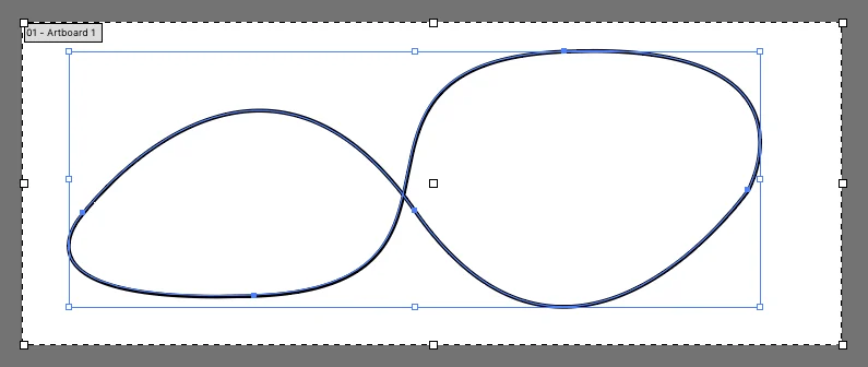
By defining a path using the path() function—which accepts standard SVG path data (the same string found in the d attribute of an SVG <path> element)—developers can dictate exactly where an element travels.
Defining the Trajectory
The path() function is the most robust way to utilize this property. For example:
.mover
  offset-path: path("M 10 80 C 40 10, 65 10, 95 80 S 150 150, 180 80");
  animation: travel 5s linear infinite;


@keyframes travel
  from  offset-distance: 0%;
  to    offset-distance: 100%;
In this implementation, the offset-path defines the "track," and the @keyframes rule uses offset-distance to move the element from the start (0%) to the end (100%) of that track.
The Coordinate System
A crucial detail for developers is how the coordinate system is interpreted. When applying offset-path to an HTML element, the coordinates within the path() string are treated as pixels. However, if the element being animated is already part of an SVG, the coordinate system is relative to the SVG’s viewBox. This nuance is vital for maintaining the intended scale and position of the animation when moving elements between different DOM contexts.
Controlling Orientation with offset-rotate
One of the most powerful features of the offset-* specification is the ability to automatically handle the orientation of the moving object. In traditional CSS animations, rotating an element as it moves along a curve requires tedious manual calculation of angles at every keyframe.
With offset-rotate, the browser handles this automatically:
auto: The element rotates to follow the direction of the path. If the path curves, the element turns to face the "forward" direction of the path.reverse: The element faces the opposite direction of the path.[angle]: The element remains fixed at a specific rotation, regardless of the path’s curvature.auto [angle]: Combines automatic path-following with an additional fixed rotation offset, which is perfect for adjusting the "facing" direction of an object (e.g., if a sprite is drawn sideways).
Implications for Modern Web Design
The standardization of offset-path has profound implications for performance and accessibility. Before this property, developers frequently relied on JavaScript libraries like GSAP or SMIL (Synchronized Multimedia Integration Language) to animate elements along paths. While these tools are powerful, they often come with a heavy memory footprint or, in the case of SMIL, are increasingly deprecated or poorly supported in modern browser engines.
By offloading path-based motion to the CSS engine, developers can leverage hardware acceleration. The browser’s compositor thread can handle the calculation of the element’s position along the path, resulting in smoother animations, lower CPU usage, and improved battery life for mobile users.
Challenges and Browser Support
Despite the benefits, the adoption of the full offset-* specification has been a gradual process. While path() is widely supported, other potential values for offset-path—such as url() references to existing SVG paths—have faced inconsistent implementation across browsers. In many cases, developers have found that path() is the only reliable way to achieve the desired effect.
Furthermore, developers must remain vigilant regarding accessibility. Complex animations can be distracting or cause motion sickness for users with vestibular disorders. It is recommended to wrap path-based animations in prefers-reduced-motion media queries:
@media (prefers-reduced-motion: reduce)
  .mover
    animation: none;
The Broader Ecosystem: Alternatives and Integrations
While offset-path is the standard for CSS, it is not the only way to move elements along a path.
SMIL and SVG
SMIL, specifically the <animateMotion> element, is the historical standard for SVG-based path animation. While powerful, its syntax is verbose and, as noted by CSS expert Sarah Drasner, it is often seen as a "legacy" approach compared to the declarative nature of modern CSS.
GSAP (GreenSock Animation Platform)
For enterprise-level projects where browser consistency is paramount, GSAP remains the gold standard. The MotionPathPlugin provided by GreenSock abstracts away the inconsistencies of CSS support, allowing for highly complex path animations that behave identically across all modern browsers and even older versions of IE/Edge. The decision to use CSS offset-path versus GSAP often comes down to the complexity of the project: CSS for simple, lightweight UI flourishes, and GSAP for complex, data-driven, or multi-element synchronized sequences.
Future Outlook: What Lies Ahead?
The W3C continues to refine the offset-* specifications. As the web platform matures, we may see expanded support for more intuitive path-creation functions. The current reliance on manual extraction of d attributes from SVG software is a friction point for designers and developers alike. Future improvements in tooling—perhaps through native browser integration or better CSS-to-SVG workflow bridges—will likely make path-based animation as common as simple transitions.
Moreover, the integration of offset-path with the Web Animations API (WAAPI) opens up new possibilities for dynamic, user-driven animations. Developers can now use JavaScript to dynamically update an element’s offset-path in response to user input—such as mouse movement or scrolling—creating interactive experiences that feel tactile and highly responsive.
Conclusion
The offset-path property represents a significant milestone in the maturity of CSS. By providing a native, performant, and declarative way to animate elements along complex paths, it empowers developers to push the boundaries of what is possible in the browser. While the transition from the legacy motion-* syntax serves as a reminder of the evolving nature of web standards, the current implementation provides a robust foundation for the next generation of web interfaces. As with any powerful tool, it must be used with a focus on performance, accessibility, and cross-browser consistency, ensuring that the web remains a medium that is both beautiful and inclusive for all users.