Mastering the Third Dimension: An In-Depth Guide to CSS translateZ()
The evolution of web design has consistently pushed the boundaries of the flat, two-dimensional constraints of the browser window. Among the most powerful tools in a modern developer’s arsenal for breaking these boundaries is the CSS translateZ() function. While it may seem like a simple translation method at first glance, translateZ() is the gateway to genuine 3D spatial manipulation, performance optimization, and sophisticated user interface architecture.
Main Facts: Understanding translateZ()
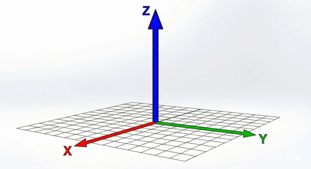
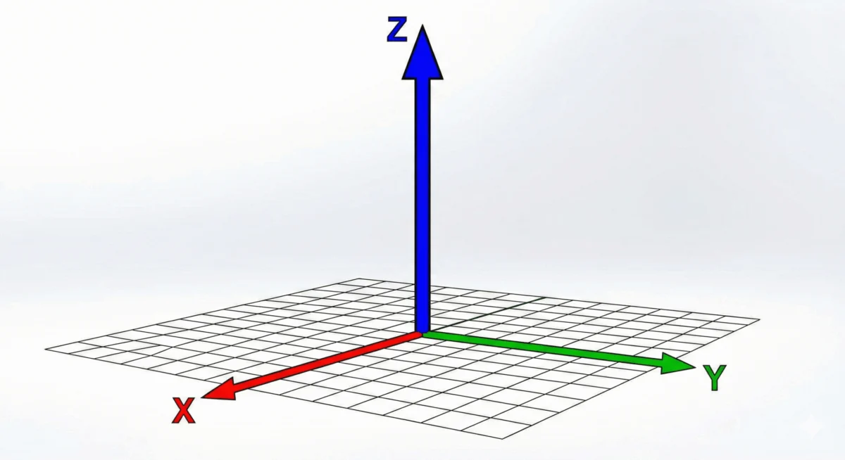
At its core, translateZ() is a CSS transformation function that shifts an element along the Z-axis—the imaginary line that runs perpendicular to your screen. While translateX() and translateY() move elements horizontally and vertically, translateZ() adjusts the distance between the user’s viewport and the element itself.
When you apply a positive translateZ() value, the element moves closer to the viewer. Conversely, a negative value pushes the element further away, deeper into the virtual space behind the screen.
However, there is a critical distinction that often trips up developers: depth is not automatically rendered by the browser. Because browsers default to a 2D rendering engine, an element moved along the Z-axis will appear static unless the browser is instructed to calculate perspective. Without a defined perspective property or perspective() function, translateZ() will essentially do nothing, as the browser has no "camera" focal point to determine how the object’s size should change relative to its distance.
Chronology: The Evolution of 3D Transforms
The journey toward 3D on the web began in earnest with the introduction of the CSS Transform Module.
- Early Web (Pre-2010): Developers relied on complex JavaScript math or static images to simulate depth.
- CSS Transform Module Level 1: Introduced basic 2D transforms like
rotate,scale, andskew. 3D was largely absent or highly experimental. - CSS Transform Module Level 2: This specification formalized the 3D space, introducing
translateZ(),perspective, andtransform-style: preserve-3d. This was the turning point that allowed browsers to treat the DOM as a 3D environment rather than a collection of layered cards. - Modern Era: Today,
translateZ()is a cornerstone of performance and interaction design, supported by every modern browser and integrated into the "Baseline" of web standards.
Supporting Data: Perspective and Projection
To grasp how translateZ() functions, one must understand the relationship between the viewer and the canvas. On a flat screen, the browser needs a mathematical "vanishing point" to render depth correctly.
Perspective Property vs. Perspective Function
While both achieve the same result—creating a 3D projection—they are applied differently:

- The
perspectiveproperty: Applied to a parent element, it sets the stage for all child elements. This creates a "scene" where all children exist in the same 3D coordinate system. - The
perspective()function: This is applied directly to the individual element within thetransformshorthand. It acts as a local focal length, affecting only the element it is attached to.
Crucial Note on Syntax: When using perspective() inside the transform property, order is paramount. It must be declared before the translateZ() function. If you write transform: translateZ(100px) perspective(500px), the browser will fail to render the effect because the translation is processed before the perspective is established.
The transform-style Factor
To build complex 3D structures, such as a rotating cube or a layered card interface, the transform-style: preserve-3d property is essential. By default, child elements are flattened into the parent’s plane. By setting preserve-3d, you allow the child elements to maintain their own Z-axis positions relative to the parent, creating a nested 3D environment.
Implications: The Performance Hack
Perhaps the most practical, real-world application of translateZ() has little to do with visual depth and everything to do with hardware acceleration.
GPU Acceleration and Rendering
Modern browsers utilize the Graphics Processing Unit (GPU) to handle complex animations and transitions. When an element is moved using traditional CSS properties (like top or left), the browser often relies on the CPU, which can lead to "layout thrashing" or stuttering frame rates.
By applying transform: translateZ(0), developers force the browser to promote the element to its own "layer" in the GPU. This is commonly referred to as a "GPU hack." It instructs the browser to handle the element’s rendering independently of the rest of the page. This is the primary reason why many developers use translateZ(0) (or will-change: transform) to fix flickering animations or to ensure smooth transitions on mobile devices.
Avoiding Common Pitfalls
It is vital to distinguish between translateZ() and scale(). While translateZ() makes an element look larger by bringing it closer to the "camera," it does not change the actual dimensions of the box. If you rotate a box that has been translated via translateZ(), you will see it occupy a different spatial position. If you use scale(), the element simply grows in its existing 2D plane. Misunderstanding this can lead to jarring UI bugs where elements overlap unexpectedly.
Official Specifications and Browser Support
The definition of translateZ() is governed by the CSS Transform Module Level 2. This specification ensures that the behavior of the Z-axis is consistent across all rendering engines (Blink, WebKit, Gecko).

As of the current standards, browser support is universal. Every modern desktop and mobile browser—Chrome, Firefox, Safari, and Edge—fully supports 3D transforms. Developers no longer need to rely on vendor prefixes (like -webkit- or -moz-), as the property has moved firmly into the "Baseline" status of web standards.
The Future of Spatial Web Design
As we look toward the future of web interfaces—particularly with the rise of Augmented Reality (AR) and Virtual Reality (VR) on the web via WebXR—the mastery of translateZ() becomes even more critical. The ability to manipulate elements in a true 3D space is not just a stylistic choice; it is a fundamental shift in how we build interactive digital environments.
When you design with translateZ(), you aren’t just moving a div; you are constructing a user experience that respects physical logic. Whether you are creating a simple hover effect that makes a card "pop" off the screen or optimizing a complex animation for high-performance rendering, translateZ() remains one of the most reliable and efficient tools in the developer’s toolkit.
By keeping the following three rules in mind, you can master the Z-axis:
- Always enable perspective: The browser needs a focal point to render depth.
- Order matters: If using
perspective()in the transform chain, always place it first. - Optimize with intent: Use
translateZ(0)to leverage the GPU, but be mindful that creating too many layers can consume significant memory.
In conclusion, while the web is still primarily a 2D medium, translateZ() allows us to reach through the screen. By understanding the intersection of hardware performance and 3D geometry, developers can craft experiences that are not only visually stunning but also technically robust and performant.