Beyond the Label: The Critical Nuance of Accessible Web Design
In the evolving landscape of digital accessibility, the devil is often in the details. As web developers and content strategists strive to create more inclusive experiences, a recurring challenge has emerged: the tendency to over-explain. Recent discourse within the web development community—spearheaded by experts like Mark Underhill—has highlighted how seemingly helpful additions to code, such as descriptive navigation labels and verbose alternative text, can ironically create friction for users relying on assistive technologies.
This article explores the necessity of brevity and precision in accessibility, examining why "less is more" when designing for screen readers.
Main Facts: The Redundancy Trap
At the heart of the current debate is a simple, yet frequently overlooked, practice: labeling <nav> elements with the word "navigation."
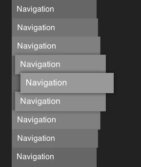
When a developer writes <nav aria-label="Primary navigation">, the screen reader does not simply announce the link content. Instead, it announces the semantic role of the element followed by its label. The user hears: "Navigation, Primary navigation." This redundancy may seem minor to a sighted user, but for someone navigating a complex website using a screen reader, it introduces unnecessary cognitive load and auditory clutter.
The consensus among accessibility advocates is that the <nav> tag already carries semantic meaning. Assistive technologies are designed to identify navigation landmarks automatically. By adding the word "navigation" to the label, developers are essentially repeating information the browser already provides. This pattern of redundancy extends beyond navigation labels; it is a systemic issue in how we approach alt text for images, aria-labels for buttons, and even the descriptive text for nested interactive controls.
Chronology of Accessibility Best Practices
The evolution of web accessibility has undergone a significant shift over the past two decades. Understanding this timeline is crucial to appreciating why these nuances matter today.
1. The Early Web (1990s – 2005)
During the early days of the internet, accessibility was an afterthought. Screen readers were rudimentary, and developers were encouraged to provide as much context as possible. It was common practice to label everything explicitly because browsers often failed to identify page structures correctly.
2. The Semantic Web Era (2006 – 2015)
With the introduction of HTML5, the web began to favor semantic elements like <header>, <main>, <footer>, and <nav>. As these elements became standard, the role of assistive technology matured. Screen readers began to parse these tags, allowing users to jump between "landmarks" rather than reading page content linearly.
3. The Refinement Period (2016 – Present)
We are currently in the "Refinement Period." Now that the infrastructure for accessibility is robust, the challenge has shifted from how to make things accessible to how to make accessibility seamless. The recent commentary by Underhill and others at platforms like Piccalilli and CSS-Tricks marks a maturation of the craft: acknowledging that good accessibility is about reducing friction, not just providing labels.
Supporting Data: Why Brevity Wins
Research into user experience (UX) for screen reader users consistently points to "information density" as a primary pain point.
The Cognitive Load of Verbosity
Studies on auditory interface design suggest that users of screen readers have a limited "working memory" capacity for incoming audio information. If a user is navigating a page with a screen reader set at a high speech rate (often 300+ words per minute), repetitive labels act as "noise."
Consider an image of a mountain.
- Overly descriptive: "Image of a snow-capped mountain range under a blue sky during the winter season."
- Optimal: "Snow-capped mountain range."
The screen reader will announce "Graphic" or "Image" automatically. Including the word "image" in the description leads to the announcement: "Image: Image of a snow-capped mountain range." Data from user testing sessions indicates that these extra words cumulatively add minutes of unnecessary listening time over the course of a single session, leading to "user fatigue."
The "Succinctness" Metric
Experts recommend that aria-labels should be no longer than 3–5 words. When a label exceeds this, the screen reader user’s ability to quickly scan a page is compromised. The goal is to provide just enough context to identify the function of the element, then move on.
Official Responses and Industry Perspectives
The movement toward "less is more" has been met with broad support from accessibility auditing organizations, though it represents a shift in pedagogical approach.
The "Default-First" Philosophy
Leading accessibility advocates, such as those behind the W3C Web Accessibility Initiative (WAI) guidelines, emphasize that developers should rely on browser-native behaviors before applying custom ARIA labels. If a landmark can be identified by its tag alone, it should be. Custom labels should only be used to distinguish between multiple instances of the same element (e.g., <nav aria-label="Main"> vs. <nav aria-label="Secondary">).
Criticisms of Over-Automation
Some developers argue that automated testing tools (like Lighthouse or Axe) often flag missing labels as errors, leading developers to "over-label" just to satisfy the audit. There is a call for these automated tools to become more sophisticated, distinguishing between technically missing labels and semantically redundant ones.
Implications for Web Development
The transition toward more refined accessibility practices has profound implications for how we train the next generation of web developers.
1. Shift in Educational Focus
Accessibility training can no longer be a checklist of "add these tags." It must become an exercise in empathy and auditory UX. Developers must be encouraged to test their own sites with screen readers—not just to check for errors, but to "listen" to the user experience.
2. The Impact on Content Strategy
This philosophy extends to content writers as well. Writing effective alt text is an art form. It requires the writer to understand the context of the image. Is the image purely decorative? If so, it should have an empty alt attribute (alt="") so the screen reader ignores it entirely. Providing descriptive text for a decorative image is just as detrimental as redundant navigation labels.
3. Future-Proofing via Minimalism
By adopting a minimalist approach to accessibility, we ensure that as screen reader technology continues to evolve (perhaps incorporating AI-driven summaries), our websites remain clean and readable. We avoid "hard-coding" redundancies that might clash with future software updates.
Conclusion: The Path Forward
The argument against including "navigation" in navigation labels is, at its core, an argument for respect. It is a respect for the user’s time, their cognitive capacity, and the efficiency of the tools they use to navigate the digital world.
When we strip away the unnecessary, we don’t just make the web more accessible; we make it more usable for everyone. The next time you find yourself writing a label, pause. Ask yourself: Is this label telling the user something they don’t already know?
If the answer is no, delete it. Your users—especially those navigating with assistive technology—will thank you for the clarity. As the web continues to grow in complexity, our commitment to simplicity remains our most effective tool in building an inclusive digital future. The goal is not to be thorough; the goal is to be helpful. In the realm of accessibility, the most helpful action is often to get out of the user’s way.