The Retro Aesthetic That Divided a Community: A Post-Mortem on itch.io’s ‘Ameyega’ Experiment
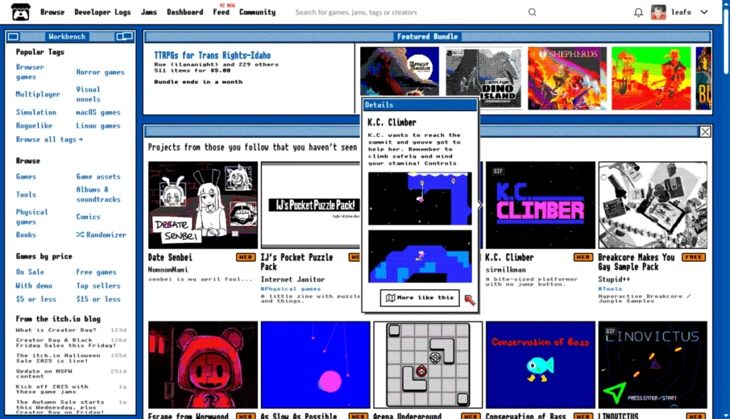
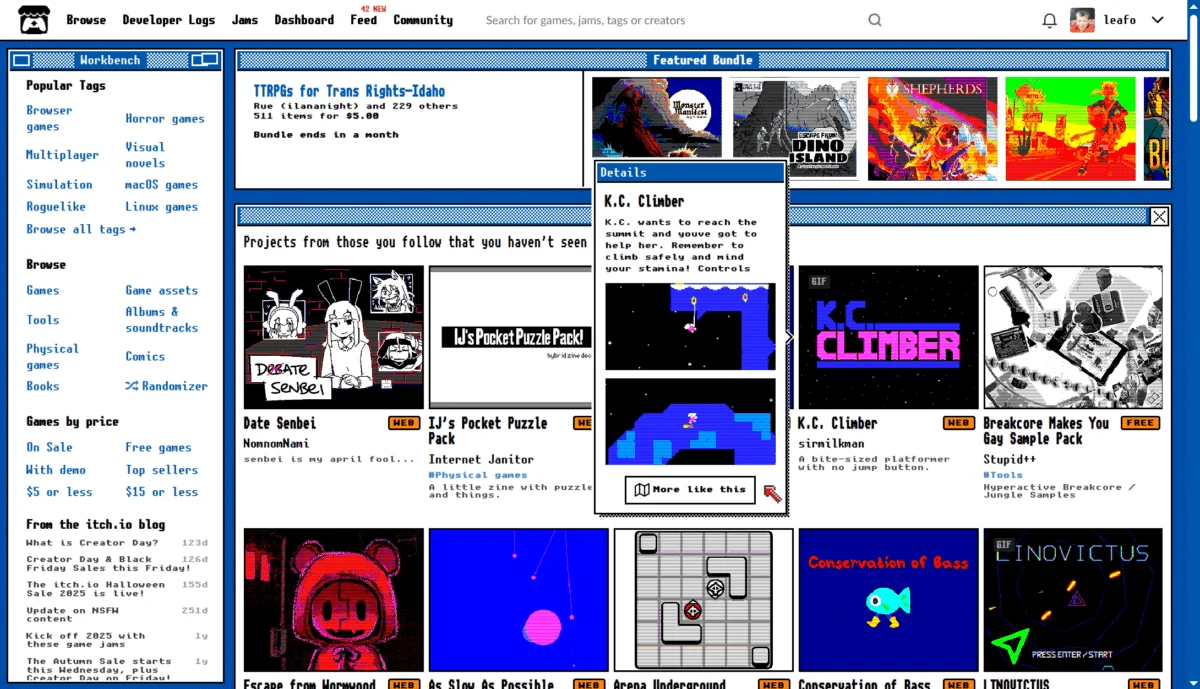
For the denizens of itch.io, the digital storefront synonymous with indie game development and experimental creative expression, April 1st is rarely just another day. The platform has long cultivated a tradition of playful, site-wide pranks that lean into the "hacker-chic" roots of the gaming industry. However, the 2024 April Fools’ event—a complete transformation of the site’s homepage into a high-contrast, ASCII-heavy retro aesthetic dubbed "Ameyega mode"—sparked a debate that extended far beyond simple holiday humor, touching on core issues of accessibility, user experience (UX), and the relationship between a platform and its community.
The Genesis of the Aesthetic: What Was Ameyega Mode?
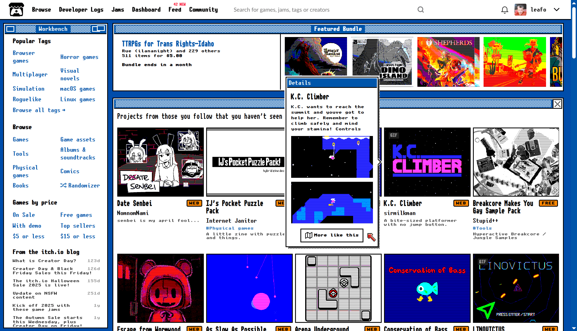
On April 1st, visitors to itch.io were greeted not by the familiar, clean layout of the storefront, but by a stark, monochromatic, and pixelated interface. Powered by the Unscii font—a project dedicated to creating highly readable, compact bitmap fonts—the "Ameyega" transformation turned the homepage into a digital artifact reminiscent of early 80s terminal computing.
The aesthetic choice was deliberate. It served as a visual homage to the "demoscene" and the early days of personal computing, where text-based interfaces and limited color palettes were the standard. According to the itch.io team, the goal was to provide a "delightful throwback" that leaned into the nostalgic charm of early digital interfaces. Because the feature was deployed later than originally intended, the developers opted to keep the mode active for an extended period, allowing users to experience the "jump scare" of the sudden UI shift even after the holiday had technically concluded.
Chronology of the Event
- April 1st: The Ameyega mode is deployed globally. Initial reactions are a mix of confusion, amusement, and frustration.
- April 1st–3rd: The community enters a phase of peak volatility. Users report issues with browser compatibility, screen readers, and the disruption of dark mode settings.
- April 4th: As the "prank" extends, the technical debt of the mode becomes apparent. Users report broken navigation, difficulty accessing game feeds, and an inability to toggle the view off.
- April 5th: The itch.io development team formally announces the end of the mode, though they provide a "legacy" URL for those wishing to visit the nostalgic layout.
- Post-Event: The community continues to debate the merits of the design, with many calling for the ASCII-style look to be implemented as an optional theme.
A Fractured Community: User Feedback and Accessibility Concerns
The reception of Ameyega mode was deeply polarized, revealing a stark divide between those who viewed the site as a space for creative experimentation and those who view it primarily as a professional tool for commerce and distribution.
The Pro-Nostalgia Camp
For a significant portion of the user base, the change was a breath of fresh air. Supporters praised the "charm" and "personality" of the design, noting that it felt more "on brand" for a site that hosts thousands of indie games. Some users even petitioned the developers to keep the mode as a permanent, optional theme, citing the font’s high readability and the aesthetic appeal of the terminal-inspired look. "It felt like a love letter to the early internet," one user remarked in the comments section.
The Accessibility Crisis
However, the shift was not purely cosmetic. For users with visual impairments or those relying on assistive technologies, the sudden change in site architecture was not a prank—it was a barrier. Numerous comments highlighted that the forced theme conflicted with existing accessibility settings.
"I am disabled and I can’t watch this!" wrote one user, pointing to the inherent danger of unilaterally changing UI elements without providing an immediate opt-out mechanism. Others noted that the custom styling broke standard CSS rules, causing dark mode to malfunction and leading to eye strain. The frustration was compounded by the fact that for many, itch.io is not just a hobbyist playground; it is a professional storefront where they manage sales, monitor analytics, and engage with their player base. When the UI hinders navigation, it hinders livelihoods.
The Technical Fallout: Navigation and Dark Mode
One of the most persistent technical criticisms centered on the interaction between the Ameyega mode and the site’s "Dark Mode." Many users reported that while the rest of the site functioned normally, the homepage failed to respect their global theme settings. This created a jarring transition where users were forced to jump from a comfortable, dark-themed experience to a high-contrast, jarring retro layout.
Furthermore, the implementation caused confusion regarding navigation. Users who rely on the homepage to track updates, monitor developer feeds, and check new releases found the new, dense layout difficult to parse. The lack of an immediate, prominent "turn off this feature" button led to a surge in support requests and negative feedback, forcing the development team to pay closer attention to the site’s global CSS integrity.
Official Responses and Developer Philosophy
The itch.io team maintained a stance of "playful transparency" throughout the process. In their post-mortem, they acknowledged the lateness of the rollout—a self-deprecating nod to their own internal scheduling—and provided a permanent URL for those who truly enjoyed the design.
However, the team’s silence on the accessibility complaints during the event was notable. While they responded to technical bugs (such as the dark mode glitch), the broader concern regarding the "forced" nature of the prank remained a point of contention. The incident highlights a recurring theme in modern web development: the tension between "surprise-and-delight" marketing tactics and the stability required by a platform that functions as a professional utility.
Broader Implications: Is the Prank Dead?
The Ameyega incident serves as a case study for the risks inherent in "surprise" UI changes. In an era where user experience is prioritized above almost all else, the traditional "April Fools’ prank" on a live production site is becoming increasingly risky.
Lessons for Platform Developers:
- Accessibility First: Any visual change, regardless of its "prank" nature, must be compatible with screen readers and existing accessibility configurations.
- The Opt-Out Clause: Users should always have a clear, immediate way to revert to the default interface, especially if the change significantly alters navigation or legibility.
- Context Matters: There is a difference between a static image change and a structural UI overhaul. When a prank interferes with the core functionality—like the ability to post reviews or manage a game page—the "fun" is rapidly overshadowed by frustration.
Conclusion: A Legacy of Mixed Emotions
The Ameyega mode experiment at itch.io will likely be remembered as a high-effort, high-risk endeavor that successfully captured the aesthetic of a bygone era but struggled under the weight of modern user expectations. While the developers successfully demonstrated their commitment to the "indie spirit," the backlash underscores a fundamental truth: as a platform grows, the tolerance for "breaking" the user experience decreases.
The fact that many users requested the mode be made permanent suggests that the team succeeded in creating something visually appealing. However, the outcry from those who found the site unusable suggests that the implementation—not the idea itself—was the primary failure. Moving forward, the itch.io team has a clear path: continue to lean into the retro, creative, and experimental identity that defines their brand, but do so in a way that respects the diverse needs of their growing, global community. For now, the ASCII fonts remain tucked away at a secret URL, serving as a reminder of the day the internet briefly felt like a terminal in 1984—for better and for worse.