The "Ameyega" Aftermath: A Retrospective on itch.io’s Retro-Inspired April Fools’ Experiment
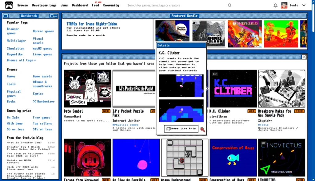
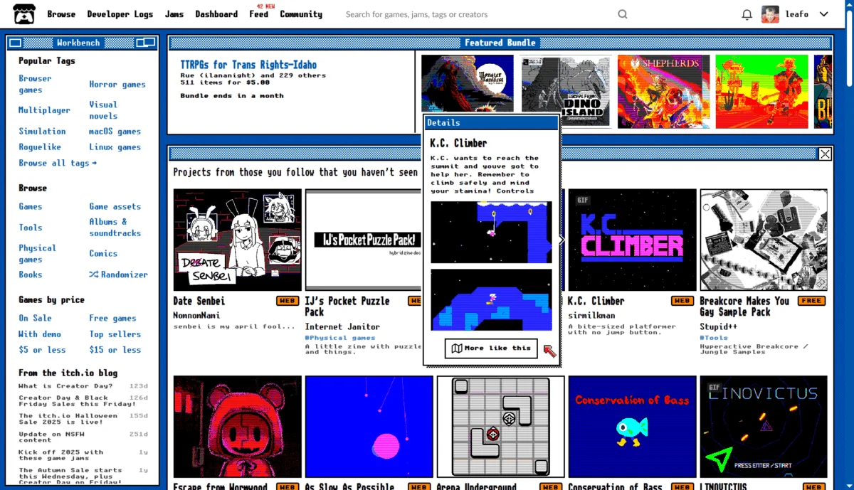
For a brief window in early April, the digital storefront itch.io—a platform globally renowned for its minimalist, utilitarian design and robust support for independent game development—underwent a radical transformation. Users logging into the site were greeted not by the familiar clean layout and modern typography they had come to expect, but by "Ameyega mode," a stark, ASCII-art-infused interface that felt like a deliberate portal back to the BBS (Bulletin Board System) era of the early 1990s.
While the playful stunt served as a lighthearted April Fools’ Day engagement, the aftermath revealed a complex divide within the platform’s community, highlighting the delicate balance between corporate whimsy and the functional requirements of a global user base.
Main Facts: The Anatomy of a Digital Prank
The "Ameyega" update, which utilized the Unscii font collection, replaced the standard homepage with a pixelated, high-contrast, text-heavy aesthetic. The goal, according to the itch.io team, was to offer a nostalgic, "charming" throwback that paid homage to the early days of computing and the roots of internet-based game sharing.
However, the change was not merely aesthetic; it altered the structural navigation of the site. For many users, the transition proved disorienting. While the developers intended for the mode to be a temporary distraction, the deployment was slightly delayed, leading the team to extend the "Ameyega" presence longer than originally anticipated.
For those wishing to revisit the interface, the developers have kept it accessible via a hidden URL (https://itch.io/?ameyega), provided the user is logged into their account. The team has stated that this version will remain functional until the next major overhaul of the site’s homepage architecture.
Chronology: A Weekend of Digital Flux
The rollout began on April 1st, catching the majority of the user base off guard. By the early hours of the morning, social media and the site’s own comment sections were flooded with reactions ranging from delight to intense frustration.
- Phase 1: The Surprise. On April 1st, users encountered the ASCII-based interface. The initial reaction was primarily confusion, followed by an immediate wave of debate regarding accessibility.
- Phase 2: The Technical Friction. As the day progressed, reports of UI bugs began to surface. Most notably, the "Ameyega" overlay appeared to conflict with the site’s "Dark Mode" settings, causing readability issues and broken CSS elements for users who rely on high-contrast accessibility features.
- Phase 3: The Extension. Recognizing that the update was released behind schedule, the itch.io team made the controversial decision to extend the duration of the mode, keeping the retro look active for several days beyond April 1st.
- Phase 4: The Rollback and Stabilization. By the second week of April, the site reverted to its standard interface. However, residual issues—specifically concerning Dark Mode compatibility—continued to plague some users, necessitating patches that were rolled out incrementally.
Supporting Data: The Community Divide
The reaction to Ameyega was polarized, providing a fascinating case study in user-experience (UX) design and community management. A review of the user comments reveals three distinct demographics:
- The Nostalgics: A significant portion of the user base praised the creativity. Comments like "it actually made browsing feel nostalgic and charming" were common among long-time users who appreciated the artistic risk. Some users even petitioned for the mode to be kept as an optional, permanent theme.
- The Functionality Advocates: This group expressed the most vocal opposition. For developers, publishers, and power users, itch.io is a professional workspace. The sudden shift in layout disrupted established workflows, hindered the ability to check feed updates, and, for some, created an environment that was physically difficult to navigate.
- The Accessibility-Conscious: This was the most critical group. For users with visual impairments or those who rely on specific browser settings (like Dark Mode), the ASCII interface was not just "hard to read"—it was an accessibility failure. Reports of eye strain and broken site navigation were frequent, underscoring the necessity of inclusive design in all software updates, even those intended as jokes.
Official Responses and Technical Maintenance
The itch.io team maintained a relatively quiet profile during the height of the debate, allowing the community to self-regulate before stepping in with technical fixes. When they did respond, the focus was primarily on resolving the "Dark Mode" conflict.
In one notable exchange, a user pointed out that the front page failed to respect their dark mode preference. The team responded with silent, effective action, deploying a patch within four hours that corrected the rendering. This responsiveness mitigated some of the backlash, demonstrating that while the team was willing to experiment with the site’s visual identity, they were not ignoring the fundamental technical stability of the platform.
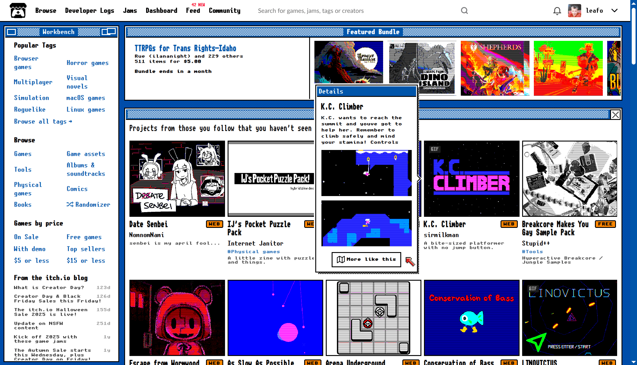
The use of Unscii fonts, credited to viznut.fi, showed that the developers put genuine effort into the design, moving beyond a simple "broken" look to something that functioned as a cohesive piece of digital art.
Implications: The High Cost of Aesthetic Experimentation
The "Ameyega" incident raises several critical questions about the future of community-driven platforms like itch.io.
The Professional vs. Personal Balance
Is a platform that serves as a primary source of income for thousands of indie developers the right place for disruptive, interface-altering pranks? The backlash from professional users suggests that while developers love a community with personality, there is a limit to how much a platform should "break" its own UI. The incident highlighted that when a site becomes an essential tool, the users expect a level of predictability that a "prank" inherently violates.
Accessibility as a Non-Negotiable
The most significant takeaway from this event is the importance of accessibility. The "Ameyega" mode inadvertently locked out users who required standard UI layouts to interact with the site. Moving forward, the incident serves as a reminder to developers that "fun" design choices must still pass accessibility audits. If a feature prevents a segment of the population from using the site, it is no longer a design choice—it is a barrier.
The Demand for Customization
Perhaps the most surprising outcome of the experiment was the number of users who requested the "Ameyega" look as a permanent, optional theme. This reveals a latent demand within the itch.io community for greater personalization. Users clearly crave a sense of agency over their digital environments. While they did not want the retro look forced upon them, they expressed a strong desire to choose it for themselves.
Trust and Engagement
Ultimately, the incident acted as a stress test for the site’s community engagement. Despite the complaints, the high level of activity in the comments section showed that the user base is deeply invested in the platform’s identity. The "jump scare" of the homepage change brought the community together to debate the very nature of the site they use, which, in a roundabout way, served to deepen their connection to the brand.
Conclusion: A Lesson in Iterative Design
The Ameyega experiment was a bold, if divisive, exercise in digital playfulness. It reminded the community that itch.io is not a faceless corporate entity, but a project run by humans who appreciate the history of the medium they support.
However, it also served as a sobering lesson for the team: when you have a global community that relies on your service for professional endeavors, the "joke" must never come at the expense of functionality or accessibility. As itch.io moves toward its future updates, the "Ameyega" legacy will likely be remembered as a moment of creative, albeit flawed, ambition—a reminder that in the world of web design, the user experience must always come first, even when you’re just trying to have a little fun.