The UI/UX Debate: Are Three-State Dark Mode Toggles Obsolete?
In the modern landscape of web development, the "Dark Mode" toggle has become a ubiquitous feature of the digital experience. From global social media platforms to personal blogs, designers have wrestled with the best way to allow users to customize their visual environment. Traditionally, developers have defaulted to a three-state control: Light, Dark, and System.
However, a recent, nuanced critique by web development expert Lea Verou has sparked a fervent debate within the UI/UX community. Verou argues that the three-state toggle is not only redundant but creates unnecessary cognitive friction for the user. By streamlining these controls into a more intuitive two-state model, developers can provide a cleaner, more efficient experience.
The Core Argument: Complexity vs. Utility
The premise of the debate centers on the concept of "Cognitive Load." When a user encounters a navigation menu with three options for theme settings, they are forced to process a decision that is fundamentally tangential to their primary goal—reading content or interacting with the site.
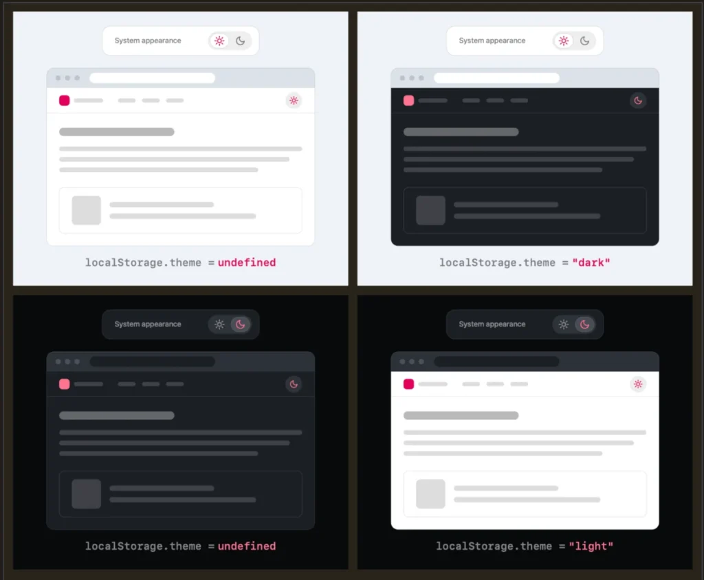
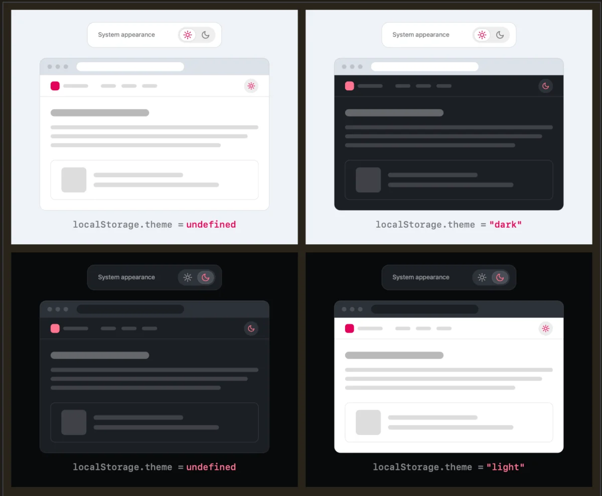
Verou’s central thesis is that a well-implemented two-state control is sufficient to express all three potential states. By defaulting to the system preference—the standard expectation for modern browsers—the site aligns with the user’s OS settings without requiring explicit input. If a user wishes to deviate from that setting, a single toggle provides the necessary override. This override is then stored in the browser’s localStorage, ensuring the preference persists across future sessions.
Why "System" as a UI Element Fails
The traditional "System" option in a menu is often a source of confusion. Does selecting "System" mean the user is choosing to follow the OS, or is it merely an indicator of the current state? By removing "System" as an explicit clickable option, designers can focus the interface on the two states that actually matter to the user: "I want this to look like this" versus "I want it to look like that." If a user finds that their manual override no longer aligns with their evolving needs, the "fix" is a simple, singular interaction.
A Chronology of the Dark Mode Evolution
To understand the shift in design philosophy, we must look at how we arrived here.
- The Early Days (Pre-2018): Web design was largely static. Themes were chosen by the developer, and the user had little recourse if they found high-contrast white backgrounds strenuous on the eyes.
- The Rise of OS-Level Integration: As macOS and Windows introduced system-wide Dark Modes, browsers followed suit. Media queries like
prefers-color-schemeallowed developers to sync their site’s theme with the user’s OS settings automatically. - The Era of the Toggle: Developers, wanting to offer "extra" control, began adding explicit toggles to headers. Many fell into the trap of over-complicating these UI elements, providing buttons for Light, Dark, and System.
- The Current Re-evaluation: As noted by Verou’s 2026 discourse, the industry is now moving toward a "less is more" philosophy. The focus has shifted from giving the user every possible configuration to providing the most friction-less path to their preferred aesthetic.
Supporting Data and User Behavior
The argument for the two-state toggle is supported by the reality of user intent. Most users visit a website for its content, not to spend time configuring its visual theme. When a user toggles a theme, it is usually a "set it and forget it" action.
Data from usability testing consistently shows that when users are presented with too many choices in a persistent UI element—like a site header—they are more likely to ignore the feature entirely or feel overwhelmed by the UI noise. By reducing the toggle to two states, developers lower the barrier to entry. If a user forces a "Light" override on a site that is currently in "System/Dark" mode, they are implicitly stating their preference. The system records this, and the UI remains stable.
The question of what happens when a user toggles back to the system default is a common counter-argument. Critics ask: "Does clearing the localStorage value return the user to the system state?" The answer is that it should. The design goal is not to create a complex state machine, but to provide an easy override that respects the user’s agency.
The Broader Implications: Browser vs. Website
The debate has expanded to include the role of the browser itself. As Chris Coleman, a notable voice in the development community, pointed out, the current frustration stems from a disconnect between user desire and browser implementation.
"All I ever wanted was for my OS to be dark, not every website I look at," Coleman remarked. This perspective highlights an interesting shift: many users feel that theme preference should be a browser-level setting rather than a site-by-site configuration.
Implications for Future Development
If browsers were to offer a unified, persistent "Dark Mode" setting that applied to all web content, the need for individual site toggles might vanish entirely. Until that day, however, developers are left to decide how much control they should grant.
The implications for developers are clear:
- Prioritize the OS: Always default to the
prefers-color-schememedia query. - Minimize Persistent UI: If a toggle is necessary, keep it binary.
- Respect the Override: Store user choices locally, but keep the implementation simple.
When Three States Are Still Relevant
Despite the push for simplicity, Verou acknowledges that there are edge cases where a tri-state control is necessary. Specifically, these scenarios include:
- Context-Specific Environments: In professional design tools or IDE-based web applications where the color scheme is vital to the core task (e.g., color grading or code syntax highlighting), users may require a dedicated, persistent choice that explicitly overrides the system without ambiguity.
- Accessibility-Focused Applications: For users with specific visual impairments, having an explicit "System" setting that resets the page to OS standards can be a vital "escape hatch" if they have accidentally misconfigured their settings or are sharing a device with another user.
In these instances, the "third state" is not a UI distraction but a functional requirement for the software’s utility.
The Path Forward: A Call for Minimalism
The discussion surrounding Verou’s work serves as a reminder that good UI/UX is not about adding features; it is about removing them until only the essential remains. The movement toward the two-state toggle is part of a larger trend in web design—the realization that we have been over-engineering common UI components for years.
As developers continue to iterate on their sites, the "two-state" philosophy should serve as the new baseline. By defaulting to system preferences and offering a simple, binary override, developers can reduce visual clutter and provide a more focused experience for their users.
In her follow-up article, Verou emphasized that this guidance is specifically for persistent toggles—the kind that follow a user through every page of a site. In such high-traffic areas, simplicity is a virtue. Perhaps the ultimate victory for UI designers, however, would be the day when the "Dark Mode" toggle disappears from our headers entirely, replaced by a seamless, automated synchronization between the user, their browser, and the web.
For now, we have the two-state toggle—a small, effective step toward a more intuitive digital world. Whether we are building a personal blog or a complex web application, the lesson remains the same: before you add a third option to your interface, ask yourself if the user is truly better off for having it, or if you are simply adding noise to their experience. The consensus seems to be leaning heavily toward the latter.