The Case for Minimalism: Rethinking Dark Mode Toggles in Web Design
In the modern landscape of web development, the "Dark Mode" toggle has become a ubiquitous fixture, often occupying prime real estate in navigation bars and headers. However, a recent discourse sparked by developer and UX expert Lea Verou has challenged the industry-standard approach to these controls. Verou argues that the common practice of presenting users with a three-state "Light/Dark/System" selector is not only redundant but counterproductive to effective user experience.
By stripping away the "System" option in favor of a simpler, two-state toggle, designers can reduce cognitive load and streamline the browsing experience. This article examines the core of this debate, the implications for UI/UX design, and why sometimes, the most effective interface is the one that disappears.
The Core Debate: Complexity vs. Utility
For years, the standard implementation for theme switching has been a tri-state control: Light, Dark, and System. The logic was sound: offer maximum granular control to the user. However, Verou’s recent critique, detailed in her latest analysis, posits that this approach over-complicates a feature that should, in theory, be "set and forget."
The central argument is simple: the "System" preference is a default state, not a choice that requires constant manual intervention. When a user visits a website, the browser already communicates their system preference via CSS media queries. If a user wants to deviate from their system setting, they are performing an "override."
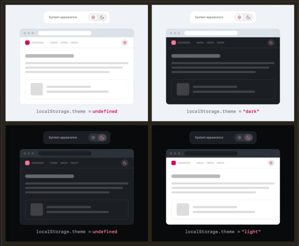
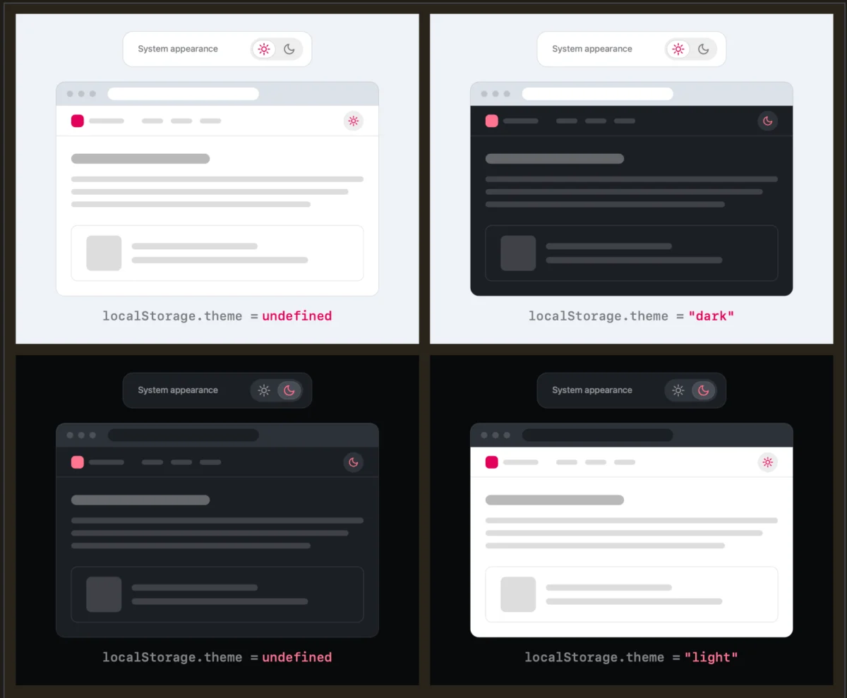
Verou suggests that a "good two-state control" can represent all three states. By providing a toggle that simply switches between the active state and the alternative, the UI becomes significantly less cluttered. If a user is on a system-light setting and wants dark mode, they click the toggle to set a "Dark" override. If they later wish to return to their system default, the toggle simply resets the local override, effectively handing control back to the operating system.
Chronology of a Design Shift
The conversation gained significant momentum in August 2026, following a series of posts on Bluesky and Verou’s personal blog.
- Initial Critique: Verou published her findings on the redundancy of three-state toggles, illustrating that the "System" option is often an unnecessary cognitive burden in persistent navigation.
- Community Engagement: The post triggered a wave of responses from the developer community. Many designers echoed the sentiment that current UI patterns are overly verbose.
- The Follow-up: Following the initial discourse, Verou released a follow-up post summarizing the feedback and clarifying the scope of her recommendations. She emphasized that her guidance specifically targets persistent UI elements—toggles that follow the user across every page of a site.
- Refining the Argument: The discussion evolved into a broader critique of how browsers and websites handle system-wide preferences, with users like Chris Coleman arguing that websites should respect the browser’s role in managing these preferences rather than forcing users to manually calibrate every site they visit.
Supporting Data and UX Psychology
The "less is more" philosophy in UI design is supported by several psychological principles, most notably Hick’s Law, which states that the time it takes to make a decision increases with the number and complexity of choices. When a user encounters a navigation bar with a three-state toggle, they must process the implications of each: Does "System" mean what I currently see? If I select "Light," will it stay that way forever?
By reducing the choice to a simple toggle, the designer effectively hides the complexity. The interface reflects the current state (e.g., a "sun" icon for Light mode, a "moon" for Dark) and provides an action to flip to the other.
Furthermore, Verou’s research into localStorage demonstrates that the "state" of the website is easily maintained without needing a dedicated "System" UI button. If the user clears their local override, the system automatically reverts to the browser default. This is a "silent" interaction that keeps the interface clean while preserving functionality.
Official Perspectives and Expert Responses
The discourse has drawn in a variety of industry voices, from independent web developers to product designers at major tech firms. The general consensus among proponents of the two-state model is that "persistent UI" requires a higher level of discipline.
Chris Coleman, a vocal contributor to the thread, pointed out a systemic issue: the web’s tendency to over-integrate with OS-level settings. "All I ever wanted was for my OS to be dark, not every website I look at," Coleman noted. This highlights a disconnect between user intent and current browser behavior. If the industry moves toward more subtle, two-state controls, it acknowledges that the browser—not the individual website—should be the primary arbiter of user preference.
However, Verou does acknowledge that three-state controls are not universally "bad." She outlines two specific scenarios where they remain appropriate:
- Accessibility-Focused Interfaces: Where users with specific visual impairments need to explicitly override system defaults to maintain readability.
- Complex Applications: Dashboards or design tools where theme switching is a primary feature and requires high visibility for frequent adjustments.
Implications for Future Web Design
The implications of this shift are profound for how we build headers and navigation components. If designers begin to strip away the third option, we can expect a few key trends:
1. Reduced Cognitive Load
Navigation bars are already crowded with essential links, search bars, and profile menus. Removing one redundant state frees up space and reduces the "visual noise" that can distract users from the primary intent of their visit.
2. Standardized "State" Management
Moving toward a two-state system encourages developers to use localStorage and CSS custom properties more efficiently. Rather than building complex logic to handle "System vs. User Override," developers can write cleaner code that listens for a simple "active/inactive" toggle.
3. The "No Toggle" Movement
The most radical conclusion from the discussion is the potential obsolescence of the toggle altogether. If browser-level preference management continues to improve, the need for a website-specific toggle may diminish. Some designers are now arguing that the best UX is one where the website respects the OS preference perfectly, and no manual toggle is needed at all—provided the design is robust enough to look good in both modes.
4. Accessibility and Inclusion
While the two-state approach is cleaner, designers must remain mindful of screen readers and keyboard navigation. A simple toggle must be semantic (using <button> or a checkbox) and clearly labeled so that the current state is always apparent to assistive technology users, regardless of how minimal the UI is.
Conclusion: Toward a More Intentional Web
Lea Verou’s critique serves as a necessary reminder that every element on a page comes at a cost. In the rush to provide "options," developers often inadvertently create friction. By questioning the necessity of the "System" option in persistent toggles, the web community is moving toward a more intentional design philosophy.
Whether or not the entire industry abandons the three-state model remains to be seen. However, the logic is compelling: if the system default is already the baseline, the user only needs an override, not a settings menu. As we continue to refine the web, the goal should always be to provide the maximum value with the minimum amount of interface. Sometimes, the best way to improve a user’s experience is simply to get out of their way.
For developers looking to refine their own implementations, the advice is clear: review your persistent UI components. If a toggle is sitting in your header, ask yourself if it is serving the user’s intent or merely adding complexity. If you can achieve the same result with a cleaner, two-state interaction, your users will likely appreciate the simplicity.