
Mastering Depth in Web Design: A Deep Dive into the CSS translateZ() Function
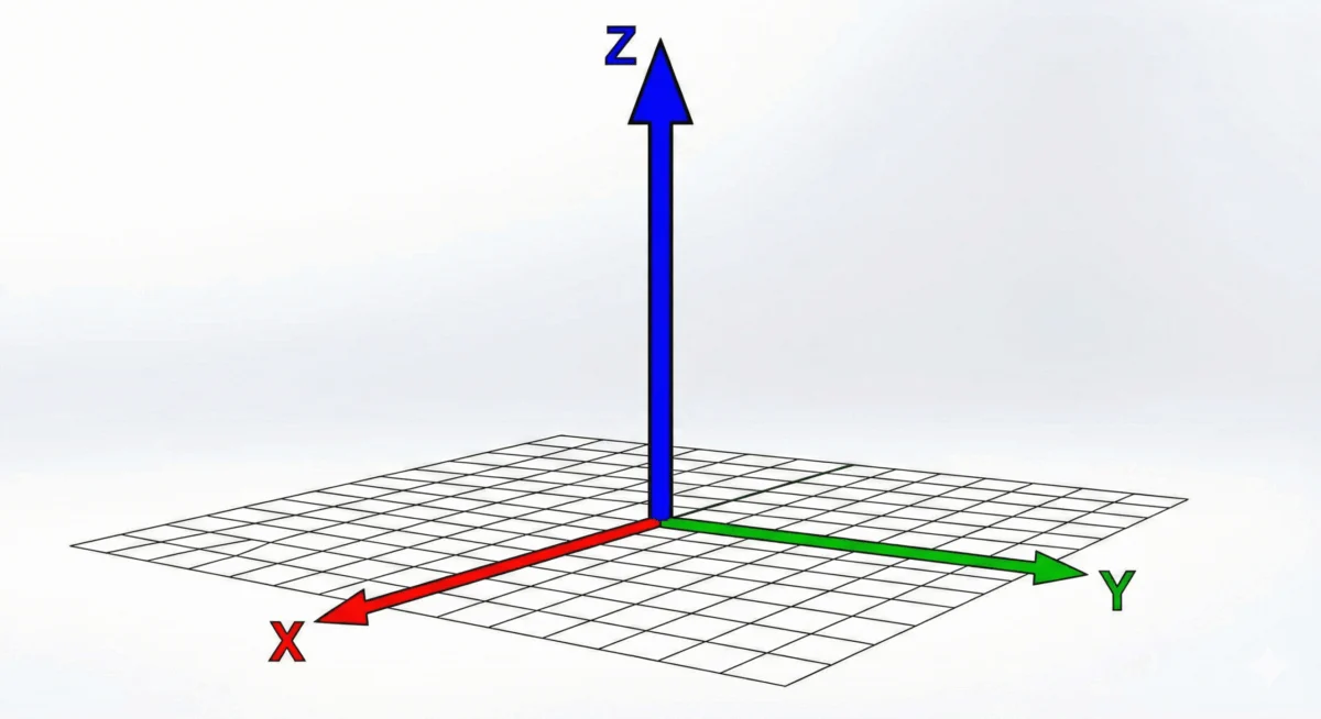
In the evolving landscape of web design, the transition from flat, two-dimensional interfaces to immersive, 3D-capable experiences has been marked by a series of powerful CSS transformations. Among these, the translateZ() function stands out as a critical tool for developers seeking to manipulate the perceived depth of UI elements. By shifting an object along the Z-axis, translateZ() allows elements to move closer to or further from the viewer, creating a tangible sense of space that was once the exclusive domain of dedicated 3D engines.
Main Facts: Defining the Z-Axis
At its core, translateZ() is a functional CSS property used within the transform shorthand. It accepts a single <length> argument, which determines how far an element is pushed along the Z-axis—the imaginary line that runs perpendicular to your screen.
A positive value moves the element closer to the viewer (the "camera"), while a negative value pushes it further away, into the depth of the screen. However, this movement is deceptive. Because browsers render web pages as flat surfaces by default, applying translateZ() alone often results in no visible change. To perceive the shift in depth, the browser requires a "perspective" context. This is achieved either by applying the perspective property to a parent container or by using the perspective() function directly on the transformed element.
Chronology: The Evolution of 3D in the Browser
The journey toward robust 3D support in browsers did not happen overnight. The initial versions of CSS focused on box-model layout and simple 2D positioning. As the web matured, the need for richer, more dynamic visual feedback led to the development of the CSS Transform Module.
- Early 2000s: Basic positioning and layouts dominated. 3D effects required heavy Flash plugins or complex canvas-based JavaScript libraries.
- 2010–2012: The introduction of the
transformproperty brought 2D rotations and scales to the mainstream. This era saw the draft specifications for 3D transforms begin to take shape. - 2013–2016: Browser vendors began implementing the
translateZ,rotateX/Y/Z, andperspectiveproperties in earnest. This allowed developers to create "parallax" effects and card-flip animations without external dependencies. - 2017–Present: The CSS Transform Module Level 2 solidified these behaviors, and "hardware acceleration" became a common parlance among developers who discovered that
translateZ(0)could force browser rendering onto the GPU.
Supporting Data: Understanding Perspective vs. Scale
A common misconception among junior developers is that translateZ() is simply a faster way to scale an element. This is mathematically and visually incorrect.
When you use scale(), you are increasing or decreasing the physical dimensions of the element’s bounding box. The element remains flat against the screen plane. Conversely, when you use translateZ() with a defined perspective, you are changing the element’s position in 3D space.

The Visual Distinction:
- Scaling: The element grows or shrinks uniformly across its existing plane.
- TranslateZ: The element moves toward the user. Because of the perspective geometry, it appears to grow, but its actual intrinsic dimensions (width and height) remain constant. If you were to rotate the parent element on its Y-axis after a
translateZ()shift, you would see the element "floating" above the base plane, proving that the distance has changed, not the size.
The Role of transform-style: preserve-3d
To create complex 3D scenes—such as a rotating cube or a multi-layered parallax effect—you must manage how child elements interact with the parent’s perspective. By default, browsers flatten children into the parent’s plane. By setting transform-style: preserve-3d on the parent, you explicitly instruct the browser to maintain the 3D positioning of the children, allowing them to exist independently in the Z-axis.
Official Responses: The Specification and Implementation
The W3C’s CSS Transform Module Level 2 provides the definitive roadmap for how translateZ() should behave. According to the specification, the function is designed to work in conjunction with the user’s viewport perspective.
The specification highlights a crucial distinction between perspective (the property) and perspective() (the function):
- The
perspectiveproperty: Best for creating a shared 3D stage for multiple elements. It is applied to the parent container, ensuring all children share the same vanishing point. - The
perspective()function: Best for isolated elements. It must be declared first in the transform chain (e.g.,transform: perspective(500px) translateZ(100px);). If declared after the translation, the transformation may fail to render as expected because the projection matrix is calculated in the wrong order.
Implications: Performance and GPU Acceleration
Perhaps the most pragmatic use of translateZ() in modern production environments is not for visual flair, but for performance optimization.
Modern browsers utilize the Graphics Processing Unit (GPU) to handle complex 3D transforms. When a developer applies a 3D transform—even a trivial one like translateZ(0)—the browser creates a new "layer" for that element. This process, often referred to as "layer promotion," offloads the rendering of that element from the CPU to the GPU.

Why this matters:
- Reduced Repaints: By promoting an element to its own layer, the browser doesn’t need to repaint the entire page when that element moves or animates.
- Eliminating Flickering: Elements that suffer from "stutter" or "flicker" during CSS transitions often benefit from being promoted to the GPU, resulting in smooth 60fps animations.
- Battery Life: Offloading rendering to the GPU is generally more energy-efficient for mobile devices compared to CPU-heavy layout recalculations.
However, developers are cautioned against "over-promoting" elements. Each layer consumes VRAM (Video RAM). Excessive use of translateZ(0) on hundreds of elements can lead to memory bloat, potentially causing the browser to crash or lag on lower-end mobile hardware.
Practical Implementation Guide
To implement a high-quality 3D interaction, follow this structure:
- Define the Scene: Set a
perspectivevalue (e.g.,800pxto1000px) on the container. This value represents the distance of the user’s eye from the Z=0 plane. - Enable 3D Context: Apply
transform-style: preserve-3dto the container to ensure the scene remains cohesive. - Apply the Transform: Use
translateZ()to push or pull the element. - Hardware Optimization: If the element is animating, consider adding
will-change: transformto inform the browser to prepare the GPU layer in advance.
Troubleshooting Common Issues
- "Nothing is happening": Check that you have defined a
perspectiveproperty on the parent. Without it, the browser assumes an infinite distance, rendering the Z-axis movement invisible. - "It looks blurry": Sometimes, hardware-accelerated elements may appear slightly blurry during movement. This is usually due to sub-pixel rendering. Ensuring your transform values are integers (e.g.,
100pxinstead of100.5px) can often resolve this. - "The transform is ignored": If using the
perspective()function, ensure it is the first value in yourtransformdeclaration.
Conclusion
The translateZ() function is a cornerstone of modern, high-performance web interfaces. While its primary purpose is to introduce depth into our 2D browser windows, its secondary role as a performance-enhancing tool makes it an essential utility for every front-end developer. By understanding the geometry behind perspective and the mechanics of GPU layer promotion, designers and developers can create experiences that feel less like flat documents and more like rich, tactile environments. As we look toward the future of web standards, the mastery of these 3D primitives will only become more vital as we continue to push the boundaries of what is possible within the browser window.








