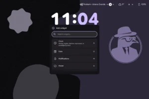
The Adaptive Revolution: How Android 17 Redefines the Multi-Device Experience

The landscape of personal computing is undergoing its most significant shift since the advent of the smartphone. With the official rollout of Android 17, Google is signaling the end of the "mobile-only" era, ushering in a new mandate for developers: adaptive-first design.
In an ecosystem populated by over 580 million large-screen devices—ranging from foldable smartphones and tablets to automotive infotainment systems, high-performance laptops, and immersive XR (Extended Reality) environments—the concept of a static app is becoming obsolete. Android 17 is not merely an incremental update; it is a structural transformation designed to ensure that applications remain resilient, responsive, and "native" regardless of the hardware they occupy.
Main Facts: The Mandate of Adaptability
The core takeaway from the Android 17 release is the removal of developer choice regarding orientation and resizability for large-screen devices. For years, Google allowed developers to opt out of these features, effectively "letterboxing" apps to maintain a rigid, phone-centric aspect ratio.
.png)
Starting with API level 37, this opt-out functionality is being retired. When developers target Android 17, their applications must natively support dynamic resizing and orientation changes on screens larger than 600dp. This is a deliberate push to force the ecosystem toward a higher quality standard. The message to the developer community is clear: if your app cannot adapt to the user’s chosen form factor, it will no longer meet the threshold for modern Android development.
To incentivize this transition, Google has introduced a new "Optimized for large screens" badge in the Google Play Store. This visual marker is intended to guide users toward high-quality, adaptive experiences, creating a direct correlation between technical compliance and discoverability.
Chronology: A Path Toward Elastic UIs
The journey toward this "adaptive-first" reality has been a multi-year effort by Google’s Android engineering team.

- The Foundation (Pre-2025): Early efforts focused on encouraging developers to adopt responsive layouts, but the adoption rate was inconsistent, leading to a fragmented user experience on foldables and tablets.
- The API Shift (Android 16): Google introduced significant changes to orientation and resizability APIs. At this stage, developers were given a "grace period" to modernize their codebases, allowing them to opt out of the new requirements while they adjusted their architectures.
- The Inflection Point (Android 17 / API 37): The grace period concludes. The new API level mandates that applications must be capable of adapting to varying display sizes without reliance on fixed-frame hacks.
- The Future (Google I/O 2026 and beyond): With the introduction of "Googlebook"—the next generation of ChromeOS built on the Android stack—the ecosystem is preparing for a future where the line between a mobile app and a desktop application is effectively erased.
Supporting Data: The Multi-Device Reality
The data driving this decision is rooted in shifting consumer behavior. Users are no longer loyal to a single piece of hardware; they are loyal to ecosystems.
Research consistently demonstrates that users who engage with multiple Android devices—for example, a user who checks a notification on their phone, continues their work on a tablet during a commute, and finishes a task on a laptop—exhibit higher levels of engagement and spend more time (and money) within those apps.
Currently, there are over 580 million large-screen devices in active use. This represents a massive, untapped market for developers who have traditionally ignored the tablet or desktop segment. By failing to adapt, developers are essentially leaving the most high-value users behind. The data suggests that "adaptive" is no longer a technical preference—it is a business necessity for any app aiming for sustained growth.

Official Responses and Strategic Guidance
Google’s leadership has framed this transition as an evolution of the "native" experience. During the recent Google I/O, the company emphasized that an app should not feel like a "stretched-out phone app" when opened on a desktop. Instead, it should feel like a purpose-built desktop application.
The Role of Jetpack Compose
Google has doubled down on its "Compose-first" strategy. Jetpack Compose is the recommended toolkit for managing the increasing complexity of adaptive UIs. By utilizing declarative UI patterns, developers can create layouts that rearrange themselves based on screen width and input methods (touch vs. mouse/keyboard) with minimal boilerplate code.
New Documentation and Tools
To support this migration, Google has published comprehensive design and development guidelines specifically for desktop-class experiences. Furthermore, the introduction of a new Desktop Emulator in Android Studio Canary provides a sandbox for developers to test their applications against the high-performance hardware specifications of the forthcoming Googlebook ecosystem.

Implications: The Death of the "One-Size-Fits-All" App
The implications of Android 17 are profound, affecting everything from UI design philosophy to long-term maintenance costs.
1. The End of "Letterboxing"
For years, many developers relied on letterboxing—placing an app inside a fixed, phone-shaped box on a large screen—to avoid dealing with complex layout logic. This is no longer a viable long-term strategy. Developers must now embrace "fluidity." This requires a fundamental redesign of navigation drawers, sidebars, and input handling.
2. The Rise of Non-Touch Input
Designing for a foldable phone is different from designing for a laptop or an automotive display. Adaptive quality now explicitly includes support for:

- Keyboard navigation: Ensuring menus can be navigated via Tab and Arrow keys.
- Trackpad/Mouse support: Handling hover states and right-click functionality.
- Stylus precision: Optimizing touch targets for pen input.
3. Desktop-Class Performance
With the advent of Googlebook, Android apps are expected to offer "laptop-class" performance. This means developers must optimize for multitasking, background processing, and efficient resource management. If an app feels sluggish or unstable when resized to a desktop window, users will perceive it as a low-quality product.
4. Cross-Platform Parity
For developers utilizing frameworks like Qt, Unity, or Web technologies, the news is equally significant. Google has affirmed its commitment to supporting these cross-platform tools, provided they adhere to the same adaptive standards as native Kotlin/Compose apps. This ensures that the Android ecosystem remains inclusive of diverse development workflows while maintaining a uniform user experience.
Conclusion: The Path Forward
The transition to an adaptive-first standard represents the maturation of the Android platform. By moving away from rigid, phone-centric constraints, Google is enabling developers to reach users in ways that were previously impossible.
.gif)
The requirement to support dynamic resizing in Android 17 is the "nudge" the industry needed to prioritize the user experience over developer convenience. While the transition may require significant effort for legacy applications, the long-term payoff is clear: an app that is built once but thrives everywhere.
Developers are encouraged to begin testing these behaviors today using the UNIVERSAL_RESIZABLE_BY_DEFAULT flag in their Android Studio configurations. As the device ecosystem continues to expand into cars, wearables, and XR, those who embrace the adaptive mindset will define the next generation of mobile computing.
The future is not a single device; it is a fluid, multi-surface reality. Android 17 provides the tools to build for that future today. Developers ready to embark on this journey should consult the official adaptive development documentation and begin the transition before the next major update cycle renders their current layouts obsolete.