
The Art of Motion: Mastering Scroll-Driven Animations for Modern Web Interfaces
In the evolving landscape of web design, the line between static documents and interactive experiences is blurring. Designers are increasingly looking for ways to inject life into standard page layouts, moving away from simple hover states toward dynamic, user-triggered movements. A compelling example of this trend is the "opposing column" scroll effect—a technique where vertical stacks of content glide in contrary directions as a user navigates down the page. While this effect may seem like a complex engineering feat requiring heavy JavaScript libraries, it is now achievable through native CSS, specifically via the power of scroll-driven animations.
Main Facts: The Intersection of Scroll and State
At its core, the opposing column effect relies on the synchronization of page scroll position with CSS animation progress. By utilizing the modern animation-timeline property, developers can bind the movement of DOM elements to the physical act of scrolling.
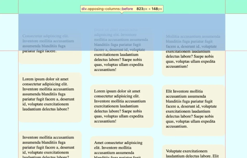
The technical architecture involves a primary container that acts as a viewport, with three distinct columns acting as children. Through the use of CSS Flexbox and Grid, these columns are arranged horizontally. When the user scrolls, the columns transition vertically—some upward, some downward—creating a visual parallax effect. The brilliance of this approach lies in the "masking" technique: by placing pseudo-elements (:before and :after) at the boundaries of the container, the content appears to emerge from and disappear into the background seamlessly, mimicking a sophisticated cinematic transition.
Chronology of Development
The journey to this implementation began with the realization that traditional JavaScript-based scroll listeners are often performance-heavy, leading to "jank" or stuttering on lower-end devices.
- Conceptualization: The designer initially aimed for a "silly idea" that felt tactile and engaging. The challenge was to keep the code lightweight without sacrificing the fluidity of the movement.
- Structural Setup: The foundation was laid using a simple HTML parent-child structure. By keeping the markup semantic and minimal, the focus remained entirely on the CSS presentation layer.
- The Masking Phase: To achieve the "vanishing" effect at the edges of the screen, the team implemented CSS variables to define a mask area. This allowed for a precise, responsive approach where the masking height scales relative to the container’s layout.
- Implementation of
view(): The most critical step was adopting theview()function. Unlikescroll(), which maps animation to the entire scrollable area,view()allows elements to animate based on their specific entry and exit points within the scrollport. This provided the granular control necessary to make the animation feel natural. - Refinement: Finally, staggered keyframes were added to the three columns to provide a sense of depth. By offsetting the movement speeds of the columns, the designer created a sophisticated, multi-layered visual experience.
Supporting Data and Technical Specifications
Achieving this effect requires a rigorous adherence to modern browser standards. As of current development cycles, the implementation relies heavily on animation-timeline, a property supported in Chrome and Safari.

CSS Architecture
The parent container is governed by a flexible layout, utilizing display: flex and max-inline-size. The masking effect is achieved through the following logic:
- The Mask: By using
linear-gradienton pseudo-elements, the developer forces a fade-out effect that aligns perfectly with the document’s background color (--opposing-bg). - The Grid: Each column utilizes
display: gridwith a definedgap, ensuring that internal items maintain consistent spacing regardless of the column’s movement speed.
Animation Range
The animation-range property is perhaps the most significant piece of the puzzle. By setting it to entry 0% cover 100%, the code instructs the browser to initiate the movement the moment an item enters the viewport and maintain that movement until it is fully covered by the exit mask. This eliminates the need for manual, frame-by-frame calculations.
Official Responses and Accessibility Considerations
A vital component of this project is its commitment to inclusivity. Motion-based design can be disorienting for users with vestibular disorders. Consequently, the implementation explicitly respects the prefers-reduced-motion media query.
When a user enables reduced motion in their operating system settings, the CSS automatically triggers an unset command for the animation and removes the masking pseudo-elements. This ensures that the user is not forced to interact with motion they may find uncomfortable, while still maintaining the structural integrity of the page layout. This "graceful degradation" approach is the gold standard for modern web development.
Implications for the Future of Web Design
The rise of scroll-driven animations signals a shift in how we perceive the "Web page." We are moving toward a medium that feels more like an interactive application than a static document.

Performance Benefits
Because these animations are handled natively by the browser’s rendering engine—and not by the main thread via JavaScript—they are significantly more performant. This allows even budget smartphones to render complex, high-fidelity animations without sacrificing battery life or scrolling smoothness.
The Developer Experience
For developers, this marks a departure from the "spaghetti code" of past years. By using CSS variables to control keyframes, spacing, and timing, a developer can update the entire feel of a site-wide animation by changing just a few values in the :root scope. This maintainability is a major boon for design systems and component-based libraries.
Cross-Browser Challenges
Despite the excitement, the current landscape is not without friction. As noted by the developer, Firefox support for animation-timeline remains an ongoing challenge. This necessitates the use of @supports (animation-timeline: view()) wrappers. This defensive coding practice ensures that while early adopters enjoy the cutting-edge experience, all users receive a stable, albeit static, version of the interface.
Conclusion
The opposing column effect is more than just a flashy design trend; it is a testament to the maturation of CSS. By moving logic that was once the domain of complex JavaScript into the stylesheet, we have enabled a new generation of interfaces that are faster, more accessible, and easier to maintain. As browser support broadens, we can expect to see these techniques become standard practice in high-end web design, allowing creators to tell stories through motion as effectively as they do through typography and imagery.
Whether you are a seasoned front-end engineer or a designer looking to bridge the gap between static visuals and code, the power to create fluid, scroll-triggered experiences is now at your fingertips. The challenge remains: how will you innovate with these tools? Will you stagger your columns, introduce randomized timing, or perhaps explore horizontal scroll-driven containers? The browser is your canvas.








