
The CSS Renaissance: Reclaiming the Web’s Visual Language
For over a decade, the web design industry existed in a state of dependency. To create "memorable" user experiences—those fluid, interactive, and visually arresting moments that define modern digital branding—developers were almost exclusively reliant on heavy JavaScript libraries. We traded performance and long-term stability for the ability to animate, transition, and manipulate the DOM.
Today, that paradigm has shifted. We are witnessing a CSS renaissance, a period where the browser engine itself has become the primary stage for visual interaction. By offloading the heavy lifting from the JavaScript main thread to the GPU, developers are finally able to craft robust, accessible, and high-performance interfaces that are independent of the volatile ecosystem of external dependencies.
The Modern Toolkit: Powering Performance Under the Hood
The capabilities of native CSS have expanded exponentially. Features such as 3D transforms, modern grid layouts, intricate clip-paths, custom properties, scroll-driven animations, and the revolutionary view-transitions have fundamentally changed the development workflow. Perhaps most importantly, the implementation of @property has finally allowed us to animate values that were previously considered "unanimatable," including the elusive "auto-height."
Beyond these properties, Scalable Vector Graphics (SVG) have been elevated from simple icons to the primary medium for building entire responsive, lightweight, and accessible websites. When paired with CSS Grid, SVGs provide a performance-first alternative to canvas-based rendering, enabling everything from interactive UI elements to fully functional video games that run natively in the browser without a single line of external script.
Defining Intent: Motion as a Narrative Tool
Before diving into the technical mechanics, it is critical to address the philosophy of motion. In the early days of "Flash-style" web design, animation was often used gratuitously. In the modern era, we must move away from the "because we can" mentality.
Every pixel that shifts, fades, or expands communicates a message. As designers and developers, we must define our intent before writing a single line of code. I recommend a methodology based on "Keyword Lists."
The Methodology of Intent
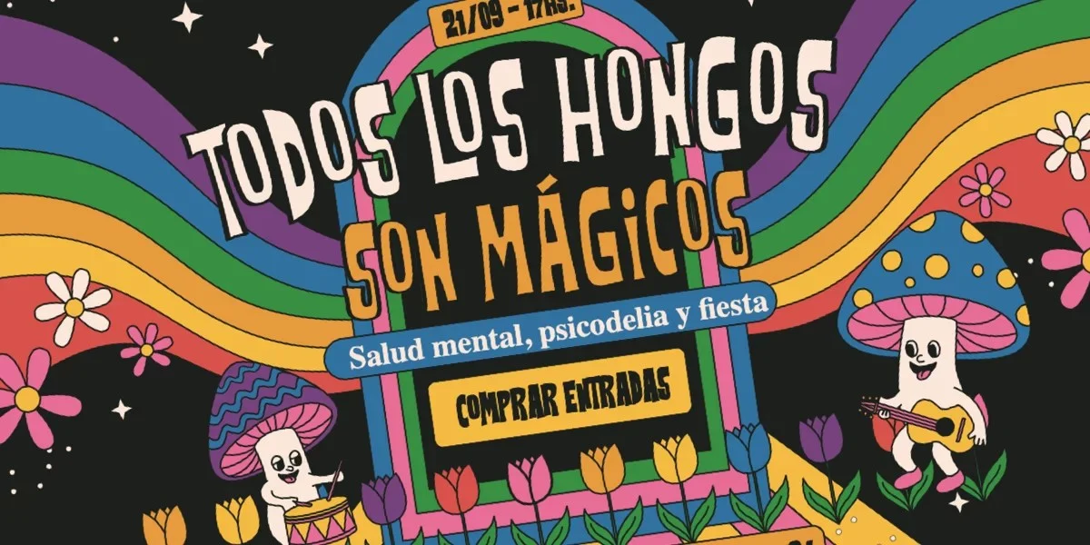
Imagine a project for a nature event focused on fungi. The visual language required to promote a "Psychedelic Mushroom Rave" is vastly different from a "Spiritual Mushroom Retreat."
- Option A: The Psychedelic Event – Keywords: Hypnotic, Kinetic, High-Contrast, Neon, Layered.
- Option B: The Spiritual Retreat – Keywords: Ethereal, Slow-Fade, Serene, Minimal, Organic.
These lists serve as a North Star for the development process. They dictate the choice of easing functions, the speed of transitions, and the complexity of the SVG paths. By sharing these lists with stakeholders, we align technical choices with the project’s emotional goals.
Split Text Animations: Balancing Aesthetics and Accessibility
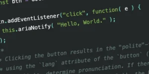
Split-text animations—where characters, words, or lines are animated independently—have become a hallmark of sophisticated web design. While traditionally handled by plugins like GSAP, they can now be achieved using CSS custom properties to stagger animation delays.
The Technical Hurdle
Using a simple loop of span elements indexed by a custom property (e.g., --i:0), we can create staggering effects that feel organic. However, the accessibility cost of this technique is high. Screen readers often struggle with text fragmented into individual DOM nodes.
Recent testing has shown that many popular approaches to splitting text lead to inconsistent behavior across screen reader/browser combinations. If text content is critical, accessibility must take precedence over flair. Developers should consider using the letter-spacing property to create reveal effects without fracturing the DOM, or simply avoid animating mission-critical text altogether. Always remember to wrap animations in a @media (prefers-reduced-motion: reduce) block to ensure the site remains usable for all.
The Geometry of Clipping vs. Masking
A common point of confusion for newer developers is the distinction between clip-path and mask.
- Clipping is a binary operation. It creates a hard boundary—a polygon, circle, or path—that acts as a stencil. It is highly performant and ideal for geometric transitions.
- Masking operates on alpha and luminance channels. It allows for soft gradients and complex, irregular transparencies.
For high-performance applications, clip-path is generally preferred because the browser can optimize the rendering of a fixed shape more efficiently than a dynamic mask. By animating a clip-path: circle(0%) to circle(100%), we can achieve a "growing" effect that feels incredibly polished while maintaining a negligible footprint on the browser’s performance budget.
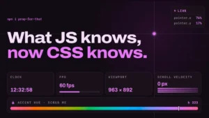
Scroll-Driven Animations: Connecting the User to the Story
Perhaps the most exciting addition to the CSS specification is animation-timeline: view(). This feature allows developers to link the progress of an animation directly to the user’s scroll position. Unlike traditional JavaScript-based scroll listeners, which can be prone to "jank" and main-thread blocking, scroll-driven CSS animations are smooth, native, and reliable.
By placing elements at different offsets using custom properties, we can create complex parallax effects where foreground elements move at different velocities than background elements. This creates a sense of depth that feels like a physical, tactile experience.
The 3D Frontier: Beyond the Flat Web
While 3D on the web has historically been synonymous with complex WebGL shaders, CSS 3D transforms have matured into a viable tool for layout design. Using the perspective property alongside transform-style: preserve-3d, we can render cuboids and depth-mapped interfaces using nothing more than standard HTML elements and CSS grid layers.
For projects requiring "hypnotic" or "dancing" visual motifs, connecting 3D rotations to scroll-driven animations creates an immersive environment that is fundamentally impossible to achieve with traditional static layouts. Tools like Layoutit or VoxCSS have demonstrated that we can now build voxel-based environments entirely within the browser’s native capabilities.
Custom Cursors and Anchor Positioning
The cursor property is frequently overlooked, yet it remains one of the most powerful tools for contextual feedback. By mapping custom cursors to specific containers, we can subtly guide user interaction. However, this must be done with restraint; accessibility concerns regarding custom cursor behavior necessitate keeping designs within the 32x32px range to ensure consistency across high-DPI displays.
Furthermore, the introduction of CSS Anchor Positioning is a game-changer for UI components. Instead of bloating the DOM with pseudo-elements for every hover state, we can now anchor a single, fluid element to any item the user hovers over. When combined with the linear() easing function, this allows for smooth, "natural" movement that feels like it belongs in a high-end desktop application.
Implications for the Future of Web Development
The transition from JavaScript-heavy interaction to native CSS capabilities is not merely a change in syntax; it is a fundamental shift in web architecture.
- Reduced Technical Debt: By removing dependencies on external animation libraries, projects become easier to maintain, faster to load, and less susceptible to the "deprecation trap."
- Sustainability: Efficient, GPU-accelerated CSS animations require less processing power, leading to reduced energy consumption on mobile devices.
- Universal Design: When used with an "accessibility-first" mindset, native CSS features provide a more consistent experience across the diverse range of devices and assistive technologies used to access the web.
Conclusion
The technical barriers that once confined web designers to rigid, static layouts have largely vanished. We now possess a suite of tools that allow for an unprecedented level of expression, all while maintaining the integrity, speed, and accessibility of the open web.
The question for the modern developer is no longer "is this technically possible?" but rather "does this movement enhance the narrative?" We are in an era where the browser is a canvas for storytelling. By utilizing these modern CSS features with intention and care, we can build digital experiences that are not only memorable but also resilient, performant, and truly inclusive. The tools are in our hands; it is time to build a more expressive web.