
The State of the Web: A Deep Dive into "What’s !important #15"
The landscape of front-end development is evolving at a breakneck pace. As we navigate the complexities of modern UI design, the fifteenth installment of the "What’s !important" series arrives as a crucial digest, synthesizing the most impactful shifts in CSS, accessibility standards, and browser capabilities. From the nuances of boundary-aware styling to the long-awaited maturity of the <select> element, this edition serves as both a roadmap and a repository of best practices for the contemporary web developer.
Main Facts: The New Frontier of CSS and Web UI
The core theme of this period is the move toward "intelligent" CSS. We are witnessing a transition from static, declarative styling to a more context-aware paradigm. The primary breakthroughs highlighted in this cycle include:
- Boundary-Aware Styling: The introduction of the
view()function, which allows elements to react dynamically to their placement within a viewport or container. - The Accessibility of Grid Lanes: While "Masonry-style" layouts have long been requested, the industry is now grappling with the inherent accessibility challenges these non-linear layouts present.
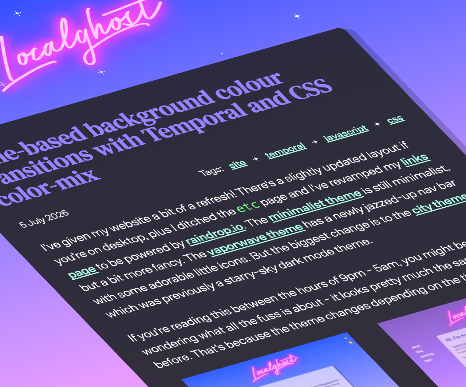
- Temporal Design: Utilizing the JavaScript Temporal API in conjunction with
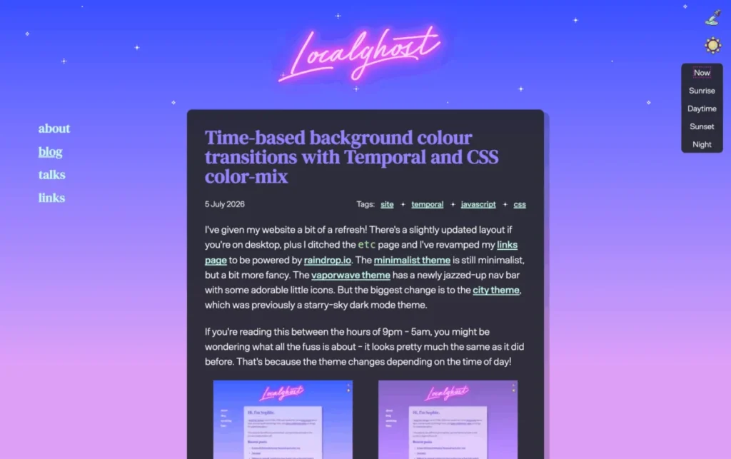
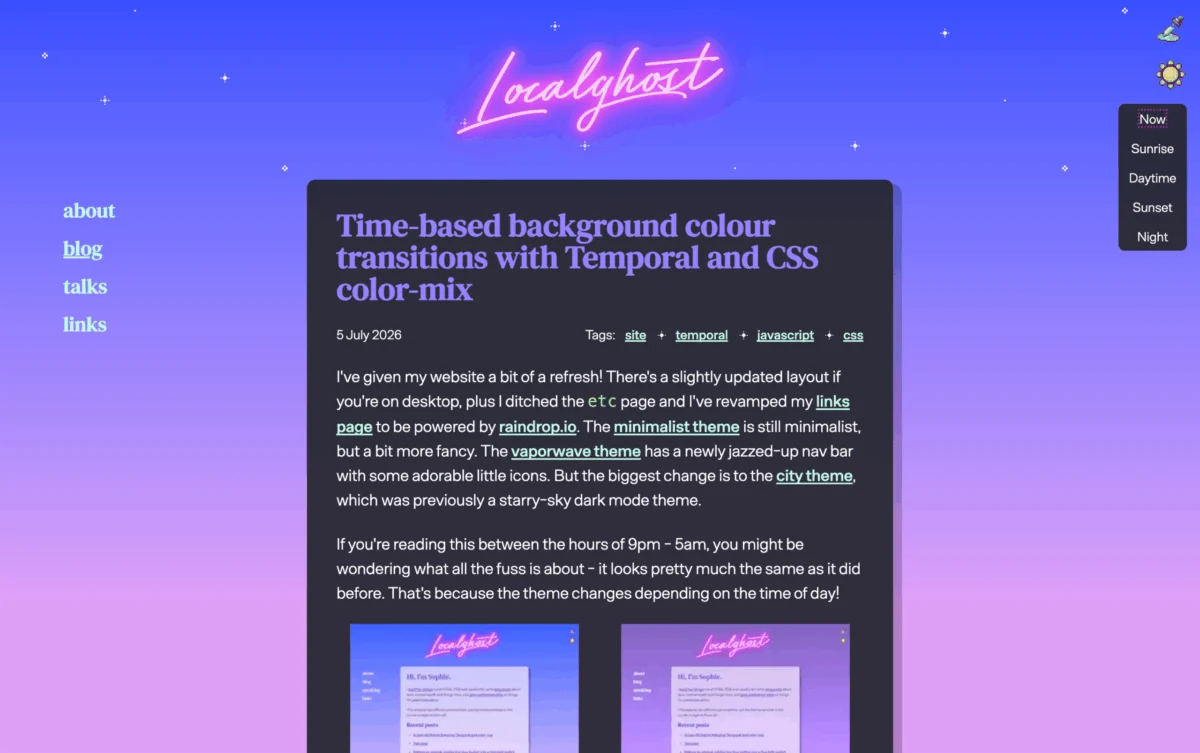
color-mix()to build interfaces that shift appearance based on time-of-day data. - The Full-Bleed Revolution: Solving the age-old problem of horizontal overflow in nested layouts using container query units.
- Component Standardization: The ongoing refinement of the customizable
<select>element, which promises to replace brittle, hacky workarounds with native, robust code.
Chronology: A Fortnight of Innovation
The evolution of these technologies did not happen in a vacuum; it occurred through a rapid-fire succession of community discourse and expert analysis.
Early July 2026: The conversation began with a deep dive into boundary-aware styling. Preethi Sam’s exploration of the view() function catalyzed discussions on how elements can better sense their environment. Simultaneously, discourse surrounding the hidden attribute and the accessibility of interactive, "invisible" elements reached a fever pitch, signaling that developers are ready to abandon outdated display hacks in favor of semantic, accessible alternatives.
Mid-July 2026: The focus shifted toward layout mechanics. The community saw a flurry of activity regarding "Grid Lanes" (the web’s answer to Masonry layouts). While enthusiasm for this layout mode was high, accessibility expert Manuel Matuzović provided a critical reality check, prompting an immediate pivot toward exploring reading-flow as a potential remedy for the inherent tab-order issues found in complex grid structures.
Late July 2026: The period concluded with a focus on UI refinement and browser-level capabilities. Google I/O 2026 served as the final stage, where Bramus and Una Kravets unveiled a staggering 35 new web platform features, forcing the industry to reconcile with the sheer volume of incoming API updates.
Supporting Data and Technical Breakthroughs
The technical rigor behind these updates is substantial. For instance, the fix for full-bleed CSS—a layout challenge that has plagued developers since the inception of responsive design—now relies on container query units. By moving away from absolute positioning and negative margins, developers can now achieve edge-to-edge layouts that are natively robust.
The "Goldilocks" Select Height
Jake Archibald’s recent work on the <select> element addresses a fundamental UX flaw: sizing. Previously, standardizing the height of a dropdown across browsers was a nightmare of vendor prefixes and browser-specific quirks. By utilizing the modern customizable <select> architecture, developers can now ensure consistent vertical rhythm without sacrificing accessibility or the browser’s native optimization.
The FixCSS Initiative
Perhaps the most symbolic update in this cycle is the launch of "FixCSS" by Declan Chidlow. By aligning with the CSS Working Group’s own internal audit of "regrettable" CSS naming conventions—most notably the desire to replace border-radius with corner-radius—FixCSS acts as a form of "syntactic debt relief." It represents a growing sentiment that the language should evolve to be more intuitive, even if it means retroactively addressing naming inconsistencies.
Official Responses and Industry Discourse
The industry reaction to these developments has been a mix of excitement and cautious pragmatism. The CSS Working Group’s publication of their "mistakes" list has provided a rare, transparent look at the standards process. By acknowledging that border-radius was a linguistic misnomer, the group has opened the door for a more user-centric approach to property naming.
Regarding the accessibility of grid lanes, the response has been remarkably fast. Within days of Matuzović highlighting the dangers of non-linear grid navigation, proponents of the layout began testing reading-flow properties. This rapid feedback loop—where a problem is identified by the accessibility community and a potential solution is proposed and tested by the layout community—is a testament to the current health of the web ecosystem.
Implications: The Future of Web Development
What does this mean for the average developer? The implications are three-fold:
- Semantic Rigor: We are moving toward a future where we no longer need to "trick" the browser into performing common UI tasks. With native support for things like customizable selects and advanced grid behaviors, the reliance on third-party JavaScript libraries for basic UI functionality is rapidly diminishing.
- Environmental Awareness: The adoption of
view()and time-based design patterns (like the macOS-style dynamic backgrounds) suggests that the web is becoming an "environmentally aware" medium. Websites are no longer static documents; they are dynamic interfaces that adapt to the user’s specific temporal and spatial context. - The "Web Platform" Complexity: With 35 new features entering the fray, the cognitive load on developers is increasing. The challenge for the next year will not be "what can we do," but "what should we do." As the browser capabilities expand, the need for architectural discipline—ensuring that we don’t over-engineer our layouts—will become the most critical skill in a developer’s toolkit.
As we look ahead to the next installment of "What’s !important," the trajectory is clear: the web is becoming more powerful, more accessible, and significantly more complex. The developers who thrive in this new era will be those who balance the hunger for new, experimental features—like border-shape or view()—with a steadfast commitment to the foundational principles of accessibility and clean, maintainable CSS.
The "fix" for CSS is not just a collection of new properties; it is a fundamental shift in how we conceive of the digital workspace. Whether it is finally perfecting the full-bleed layout or refining how we interact with form elements, the community is moving closer to a web that is as predictable as it is beautiful. Stay tuned—if the last two weeks are any indication, the next two will be just as transformative.








