The Death of the Tri-State Toggle: Why Web Design Needs to Simplify Dark Mode
In the evolving landscape of web design, few UI patterns have become as ubiquitous—or as cluttered—as the "Dark Mode" toggle. For years, developers have defaulted to a three-state selection menu: Light, Dark, and System. It is a pattern born from a desire to give users maximum control. However, a growing chorus of UI/UX experts, led by web standards advocate Lea Verou, is challenging this convention. The argument is simple: by forcing users to navigate a three-state choice, we are adding unnecessary cognitive friction to a feature that should be invisible.
The push to replace the clunky three-state dropdown with a streamlined, two-state toggle is not merely an aesthetic preference; it is a fundamental rethinking of how websites should interact with user intent and operating system (OS) preferences.
The Core Problem: Cognitive Dissonance in Navigation
When a user visits a website, their primary goal is rarely to configure the site’s color palette. They are there to read content, complete a transaction, or use a tool. When we place a persistent, three-state toggle in the global navigation bar, we are effectively asking the user to perform an administrative task that is tangential to their actual goal.
The three-state pattern—offering "Light," "Dark," and "System"—creates a paradox of choice. It forces the user to consider the "System" setting, which is often already the active state. If the user’s OS is already set to dark, and the website reflects that, the inclusion of a "System" button is redundant. If the user decides they want the site to remain light regardless of their OS, they override the system.
Lea Verou’s critique, outlined in her recent analysis, suggests that a "good two-state control" can effectively manage these scenarios. By defaulting to the OS setting and providing a binary "override" toggle, developers can achieve the exact same functionality without the visual clutter of a three-state interface.
Chronology of a Design Shift
The evolution of dark mode has been rapid. When OS-level dark modes were first introduced by Apple and Microsoft, websites scrambled to support them via the prefers-color-scheme CSS media query. Initially, this was a passive experience: the website simply "listened" to the user’s OS.
As dark mode gained popularity, developers began adding manual toggles to satisfy users who wanted to deviate from their system settings. Initially, these were simple binary switches. However, as developers sought to be more "complete" in their implementations, the "System" option was added, turning binary switches into radio-button groups or complex dropdown menus.
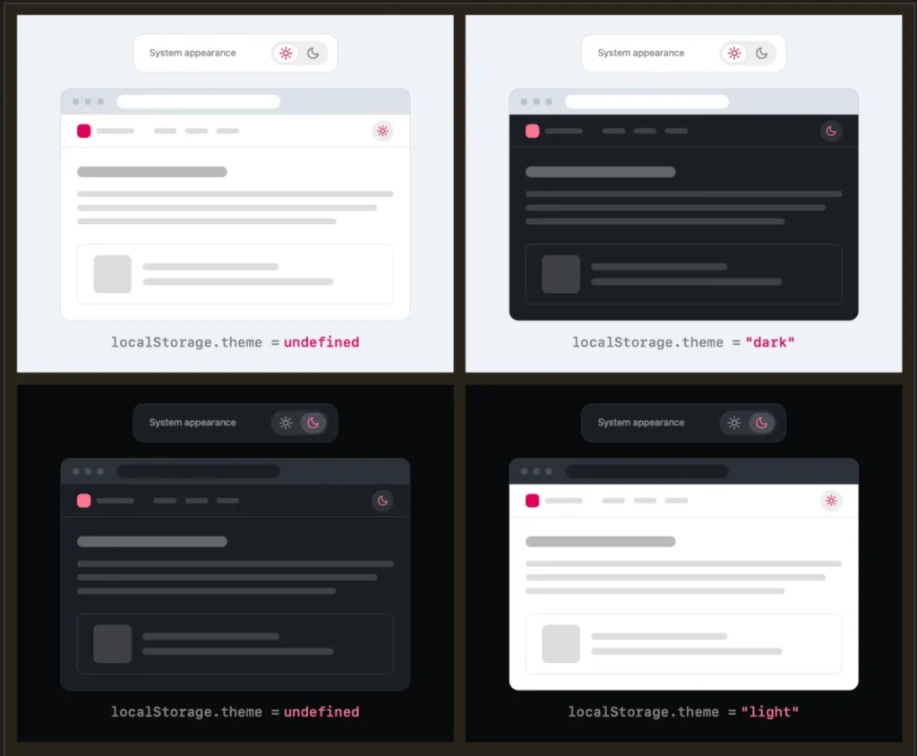
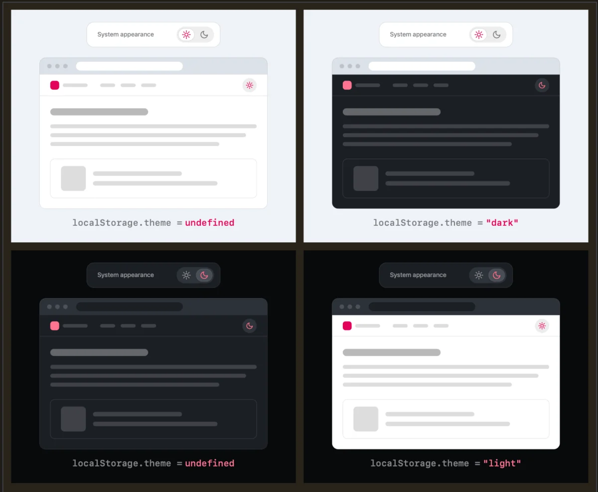
In 2026, the conversation shifted. Critics began to note that these complex menus were not helping users—they were distracting them. Verou’s recent work crystallized this, arguing that the "System" setting is a default state, not a third choice. If a user wants to override, they should simply select the opposite of their current state. Once that override is set, it is stored in localStorage, persisting through future sessions. The "System" state, in this paradigm, is simply the state where no override has been applied.
The "Invisible" UI: Why Less is More
The most compelling argument for the two-state model is the concept of "invisible UI." If a website can accurately reflect a user’s environment by default, it succeeds in being helpful without requiring user input.
If a user visits a site and it appears in their preferred mode, the UI has done its job perfectly. If the user wants to change it, they simply click a button to "toggle" to the other mode. Does this create an issue when the user wants to return to their original, system-dictated preference? Verou argues that this is a non-issue.
"Remember, this control is entirely tangential to the actual user goal," Verou notes. If a user overrides their system setting and later decides they want to revert to the system default, they are likely to notice the discrepancy only when their OS switches themes. At that point, the fix is a single click. The "override" state is a temporary preference, and the burden of managing it should not be front-loaded onto the user through a complex, always-visible navigation element.
The Role of Persistent UI
It is important to distinguish between ephemeral settings and persistent UI. The guidance to simplify applies specifically to the toggles that remain visible in the site header. These are the elements that compete for the user’s attention. By reducing the complexity of these headers, designers can lower the "cognitive cost" of navigating a site.
Supporting Perspectives: The Browser vs. The Website
One of the most interesting developments in this discussion is the philosophical divide regarding where the "preference" should live. As noted by industry observers, there is a strong argument that color scheme preferences should be handled by the browser or the OS, not by individual websites.
Chris Coleman, a prominent voice in the design community, captured this sentiment: "All I ever wanted was for my OS to be dark, not every website I look at. It was a huge leap by the browser vendors to tie all web content to that system preference."
This suggests that the "System" option in a website’s toggle is actually a symptom of a larger issue: websites are over-relying on OS signals. If browsers provided more granular control over how they communicate preferences to websites, the need for a "System" override on every individual site might vanish entirely. Until that day, the two-state toggle remains the most elegant compromise.
When Does the Three-State Toggle Still Make Sense?
While the movement toward simplicity is strong, there are edge cases where a three-state control remains appropriate. Verou identifies two specific scenarios:
- High-Complexity Dashboards: In professional software where users have very specific, granular needs, providing explicit control over the UI state (e.g., a "Force Light" vs. "Force Dark" vs. "Auto" configuration) can be part of the tool’s utility.
- Accessibility-Focused Environments: For users who rely on specific contrast settings for vision-related accessibility, a more explicit control structure can provide the necessary reassurance that their environment will remain stable, regardless of OS changes.
However, for the vast majority of blogs, news sites, and e-commerce platforms, these scenarios do not apply. The goal for these sites should be to stay out of the user’s way.
Implications for Web Standards and Future Development
The implications of this shift are twofold: developers should focus on cleaner code and better user experiences.
For developers, moving from a three-state system to a two-state system simplifies the JavaScript logic required to handle localStorage. You are no longer managing three distinct states, but rather a single "preference" key that can be null (use system) or defined (override). This reduces the surface area for bugs and makes the codebase easier to maintain.
For designers, this shift represents a return to the "User-First" philosophy. We are moving away from the "Dashboard-ification" of the web—the tendency to give users every possible setting—and toward a model where the website acts as a smart, responsive entity that anticipates the user’s needs.
The Ultimate Solution: No Toggle at All?
Perhaps the most radical implication is the possibility of removing the toggle entirely. If a website is built with robust CSS that respects the prefers-color-scheme media query, the need for a manual toggle may diminish significantly.
If a site is designed to be accessible and aesthetically pleasing in both light and dark modes, and the browser handles the transition automatically, the "toggle" becomes a redundant element that serves only to remind the user that they are in a digital environment.
In her follow-up publication, Verou underscores that this guidance is specifically for those who insist on providing a persistent toggle. If your site doesn’t need a toggle, the best UI is no UI at all.
Conclusion
The debate over the dark mode toggle is, at its heart, a debate over what the web is for. Is it a platform for users to manage their environment, or is it a medium for content? By stripping away the unnecessary "System" option and embracing a clean, binary approach, we reduce cognitive load and move closer to a web that is more intuitive, more responsive, and more focused on the user’s true objective.
The industry is moving toward a standard of minimalism. Whether it is through the adoption of the two-state model or the eventual elimination of the toggle altogether, the message is clear: the best technology is that which serves the user without making itself the center of attention.