The CSS State of the Union: Edition #18 and the Evolution of Modern Web Styling
Welcome to the latest installment of What !important (#18). As the seasons shift, so too does the landscape of web development. The past few weeks have been a whirlwind of innovation, bringing us closer to a more declarative, performant, and intuitive CSS ecosystem. From the arrival of the <geolocation> element to the long-awaited arrival of flex-wrap: balance, the standards bodies and browser vendors are working at a blistering pace.
This edition serves as a comprehensive analysis of the recent breakthroughs in CSS, exploring the technical nuances, the arguments surrounding user experience, and the implications these updates have for the future of the web.
Main Facts: The New Frontier of CSS
The web platform is currently undergoing a structural transformation. We are moving away from JavaScript-heavy workarounds for common UI patterns and toward native CSS solutions that are faster, more accessible, and easier to maintain.
Key developments include:
- Interest Invokers: A new paradigm for handling UI state transitions, such as tooltips, without complex event listeners.
- The
<geolocation>Element: A standardized approach to requesting user location data that aims to bridge the gap between hardware permissions and UI design. - The Custom Highlight API: A powerful tool enabling developers to style text ranges natively via CSS, powering new utilities like MicroLighter.
- The Class Prefix Selector: A syntactic sugar proposal that could revolutionize how we scope and select CSS classes.
Chronology: A Fortnight of Innovation
The velocity of these releases suggests that the browser vendors are aligned on a mission to simplify the developer experience.
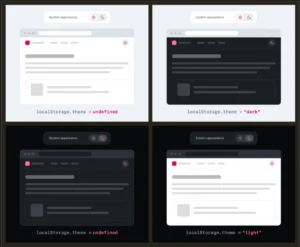
- August 10–18: The debate over "Dark Mode" reached a fever pitch. While Lea Verou championed the simplicity of a two-state toggle, Bramus argued for the necessity of tri-state toggles (Light, Dark, and System).
- August 20: Bramus unveiled the "Class Prefix Selector," a proposal that addresses the performance overhead of attribute selectors.
- Late August: Ahmad Shadeed provided the definitive guide on
flex-wrap: balance, signaling a move toward automated, aesthetically pleasing layout distribution. - Current Status: Chrome continues to lead as the primary testing ground for these experimental features, though the industry is pushing for broader cross-browser interoperability.
Supporting Data: Understanding the Technical Shifts
Tooltips and the "Interest" Paradigm
Abhishek Jakhar recently highlighted the necessity of delay-then-instant tooltip patterns. The core challenge in UX is twofold: prevent accidental triggers while ensuring the UI feels responsive. If a user hovers over an element, a slight delay prevents flickering; however, once the user moves to the next item, the tooltip should vanish instantly to avoid visual clutter.
Chris Coyier pushed this further by integrating interest-delay-start and interest-delay-end. These properties represent a shift in how we handle "interest" in the DOM. By delegating the timing logic to the browser, we eliminate the need for setTimeout calls in JavaScript, reducing the potential for layout thrashing and memory leaks.

The Rise of flex-wrap: balance
For years, designers have struggled to ensure that flex containers distribute items evenly across rows, particularly when the number of items changes dynamically. Inspired by the success of text-wrap: balance, the introduction of flex-wrap: balance allows the browser to perform a calculation on the container’s dimensions and child elements to distribute them perfectly. Ahmad Shadeed’s analysis confirms that this feature isn’t just about aesthetics; it is about reducing the fragility of grid-like flex layouts.
CSS Grid and Custom Properties
Temani Afif’s work on injecting CSS Grid information into custom properties remains one of the most clever hacks of the year. By mapping grid metadata—such as row/column count and cell coordinates—into CSS variables, developers can now trigger hover-proximity effects that were previously impossible without calculating bounding box coordinates in JavaScript. This technique bridges the gap between static CSS layouts and dynamic, state-aware interfaces.
Official Responses and Industry Discourse
The discourse surrounding these changes is not merely technical; it is philosophical. When Bramus introduced the class prefix selector—a syntax allowing developers to write .something-* ... —it sparked an immediate industry response. While the proposal is currently in the conceptual stage, Geoff Graham and other CSS experts have weighed in on its potential to replace the inefficient [class^="something-"] attribute selectors.
The consensus? The current attribute selector method is a performance bottleneck for the browser’s style engine. A dedicated class prefix selector would allow the engine to index classes more efficiently, leading to faster render times for massive design systems like Tailwind or Bootstrap.
Regarding the named-feature() function within @supports, the community response has been one of cautious optimism. Being able to query if a browser respects specific positioning behaviors—like anchor positioning—solves a massive "black box" problem in progressive enhancement. If a feature is "undetectable," developers have historically been forced to rely on user-agent sniffing, a practice that is widely discouraged. This new function brings clarity to the murky world of cross-browser support.
Implications: The Future of Web Development
The End of "JavaScript for Everything"
The primary implication of these updates is that the "JS-heavy" era of UI development is waning. We are witnessing the maturation of CSS as a programming language. Features like the Custom Highlight API and native flex-wrap: balance suggest that the browser is becoming smarter about layout and text management.
The Challenge of Progressive Enhancement
While the excitement is palpable, the "Chrome-first" nature of these updates creates a challenge for developers. Relying on interest-invokers or named-feature() requires a robust fallback strategy. The industry is trending toward a model where modern features are "enhanced" for Chrome users, while legacy browsers receive a functional, if less elegant, experience.

Accessibility and UX Consistency
The debate over two-state versus tri-state dark mode toggles highlights a fundamental issue: there is no industry standard for user-controlled environment settings. While Lea Verou’s preference for a simple binary switch is user-friendly, Bramus’s tri-state argument addresses the reality of power users who want to override system settings without losing the ability to return to "Auto" mode. As we implement these features, the focus must remain on the user’s agency.
Performance Gains
By moving logic into CSS, we are offloading work from the main thread. When the browser handles syntax highlighting (via ::highlight()) or tooltip timing (via interest-invokers), we remove the heavy lifting from the JavaScript engine. This results in faster Time-to-Interactive (TTI) metrics and smoother animations, which are critical for the mobile-first web.
Conclusion
As we transition into autumn, the CSS ecosystem is richer and more capable than it has ever been. The tools we discussed today—from the granular control offered by the Geolocation API enhancements to the sheer utility of the class prefix selector—are not just "nice-to-haves." They are the building blocks of a more efficient, accessible, and performant web.
The lesson from this edition of What !important is clear: keep an eye on the bleeding edge, but continue to build for the entire spectrum of the web. Progressive enhancement is no longer just a philosophy; it is the only way to harness the power of modern CSS without leaving your users behind.
Stay tuned for our next update, as we continue to track the rapid evolution of the web platform. Until then, keep your styles clean and your specificity low.