The Evolution of the Web Dialog: A Comprehensive Guide to the Native <dialog> Element
It has been nearly a decade since the native HTML <dialog> element was introduced to the web standards landscape, promising to solve one of the most persistent headaches for front-end developers: the creation of accessible, functional, and performant modal windows. Despite its maturity, the <dialog> element remains a subject of ongoing discovery, nuanced implementation, and evolving best practices. Whether you are a seasoned engineer or a developer looking to streamline your UI components, understanding the full scope of this element—from basic markup to advanced animations and accessibility considerations—is essential.
Main Facts: The Anatomy of a Dialog
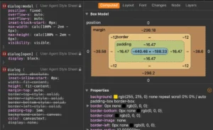
At its core, the <dialog> element is a semantic HTML container designed to represent a part of a document that a user can interact with to perform a task. Unlike generic <div> overlays, the <dialog> element is built into the browser’s User Agent (UA) stylesheet, providing built-in focus management, "inert" state handling, and keyboard shortcuts.
Basic Markup
A standard implementation begins with a simple tag pair:
<button id="dialog-button">Open Dialog</button>
<dialog id="dialog">
  <p>Greetings, developer!</p>
  <button id="dialog-close">Close</button>
</dialog>
Crucially, the element does not open by default. While developers can add the open attribute manually, this is rarely the desired behavior for a modal. Instead, the element relies on two primary JavaScript methods: .show() and .showModal().

The distinction between these two is critical. Using .show() treats the dialog as a standard pop-up, lacking a backdrop and failing to trap focus. In contrast, .showModal() elevates the dialog to the browser’s "Top Layer," adds a native backdrop, automatically centers the content, and forces the background page to become inert—meaning users cannot interact with the rest of the site until the dialog is dismissed.
Chronology: From Custom Hacks to Native Standards
For years, the web development community relied on third-party libraries like jQuery UI or custom-coded solutions to handle modals. These solutions were notoriously fragile, often failing to trap focus (causing screen readers to "leak" into the background content) or requiring complex CSS hacks to center elements vertically and horizontally.
- The Early Era (Pre-2015): Modals were built using
position: fixed, z-index layering, and heavy JavaScript event listeners to manage focus trapping and keyboard navigation. - The Standardization Phase (2015–2020): Browser vendors began adopting the
<dialog>specification. However, inconsistent support, particularly in Safari, led to a slow adoption rate. - The Modern Era (2021–Present): With universal browser support, the focus has shifted from "how to make it work" to "how to style it efficiently." Recent innovations like the
::backdroppseudo-element andstarting-stylehave finally allowed developers to achieve high-end design without sacrificing accessibility.
Supporting Data: Accessibility and Performance
Accessibility is the primary argument for using native elements over custom implementations. When using a library, it is easy to accidentally break the tab order or fail to announce the dialog to assistive technologies.
The Accessibility Checklist
- Focus Management: When a modal is triggered via
.showModal(), the browser automatically shifts focus to the first focusable element inside. - Keyboard Navigation: The
Esckey is bound to theclose()method by default in modern implementations, providing a consistent user experience. - Inertness: When the dialog is active, the rest of the DOM becomes
inert. This is a massive performance and security win, preventing stray clicks or accidental submissions from background forms.
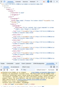
Note on Labeling: Developers often make the mistake of using a simple "X" for a close button. Without a descriptive label, screen readers may fail to identify the button’s purpose. The best practice involves using a visually hidden <span> that provides context, such as "Close modal," while keeping the visual icon accessible-hidden via aria-hidden="true".

Official Responses and Standards Evolution
The W3C and browser vendors continue to iterate on the Dialog API. A major development currently in experimental stages is the concept of Invoker Commands. This feature aims to eliminate the need for JavaScript entirely when triggering common interactions. By adding command="show-modal" and commandfor="my-dialog" attributes to a button, the browser handles the lifecycle of the dialog natively.
This aligns with the web’s shift toward "declarative" programming, where HTML is empowered to handle logic that previously required script-heavy boilerplate. As of mid-2026, while support for these commands is experimental, they represent the future of web components: lower maintenance, higher performance, and reduced code complexity.
Implications: The Popover vs. Dialog Debate
A common question arises: Should I use a <dialog> or the newer Popover API?
The distinction is not about aesthetics, but about intent. The Dialog API is intended for "modal" interactions—tasks that require the user’s full attention and stop other processes. The Popover API, conversely, is designed for "non-modal" interactions, such as tooltips, custom select menus, or transient information displays.

- Choose
<dialog>when: You need to trap focus, you require a backdrop to dim the background, or the interaction is critical to the current workflow (e.g., a confirmation form or a sign-up modal). - Choose Popover when: You want a transient element that can be easily dismissed by clicking outside of it, and you do not want to interrupt the user’s primary flow.
Styling and Animation: Beyond the Default Box
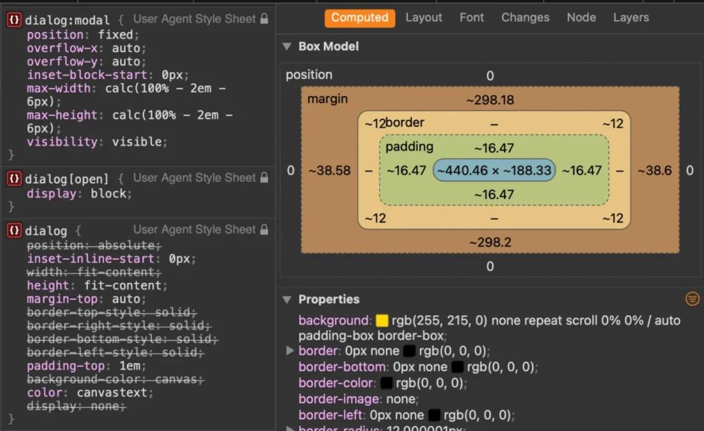
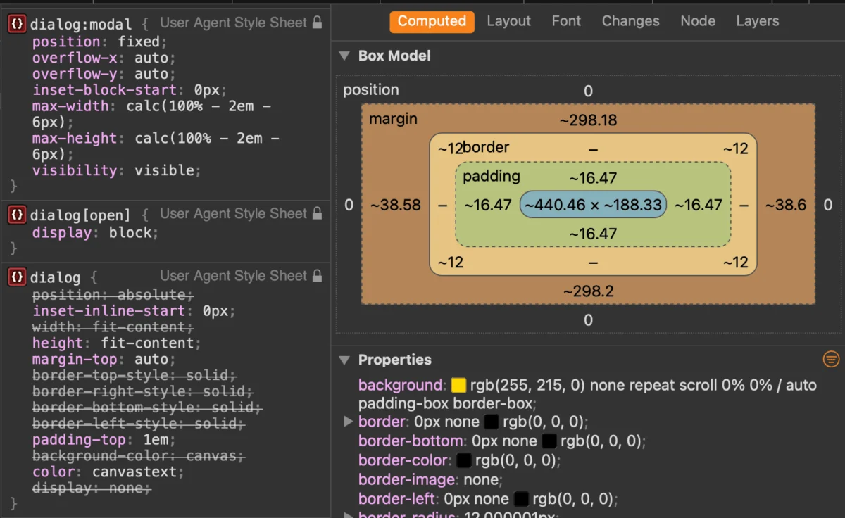
The native aesthetic of the <dialog> element—a standard white box with a thick border—is often insufficient for modern design systems. However, styling must be done with care.
The Backdrop
The ::backdrop pseudo-element allows for complete control over the area behind the modal. Developers can apply blur effects, custom colors, or even images to the backdrop, creating a "glassmorphism" effect that significantly improves the perceived quality of the UI.
Animating the Entrance
One of the most requested features for modals has been smooth transitions. Historically, animating an element that toggles between display: none and display: block was impossible without complex hacks. The introduction of the @starting-style at-rule has solved this.
@starting-style
  dialog:open
    opacity: 0;


dialog
  transition: opacity 0.5s ease;
  opacity: 0;


dialog[open]
  opacity: 1;
This allows developers to define the "from" state, enabling the browser to calculate the transition correctly. Combined with properties like scrollbar-gutter: stable, these techniques ensure that the UI does not "jump" or layout-shift when a modal is opened, maintaining a polished experience.

Conclusion
The <dialog> element has matured into one of the most powerful tools in the web developer’s arsenal. By leveraging native browser functionality for focus management and modal behavior, developers can create faster, more accessible, and more maintainable applications.
As we look toward the future—with the potential for declarative invoker commands and deeper CSS integration—it is clear that the web is moving toward a standard where complex UI patterns no longer require heavy third-party dependencies. For developers, the challenge is no longer about building these features from scratch, but about mastering the native capabilities already sitting in the browser, waiting to be utilized.
Stay informed, keep an eye on the browser support for experimental features, and remember: if there is a native HTML element for the job, it is almost always the right choice.