
Beyond the Static: Mastering Animated CSS Border Images for Modern UIs
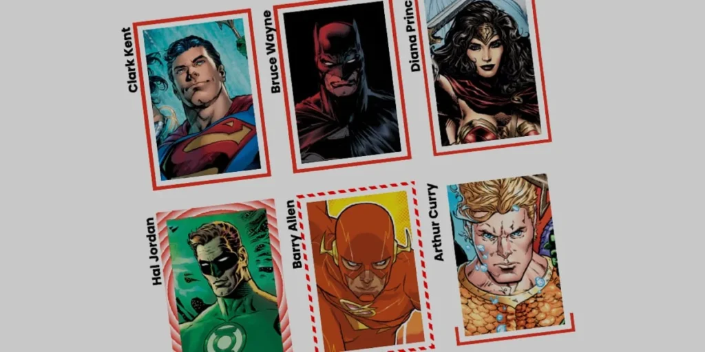
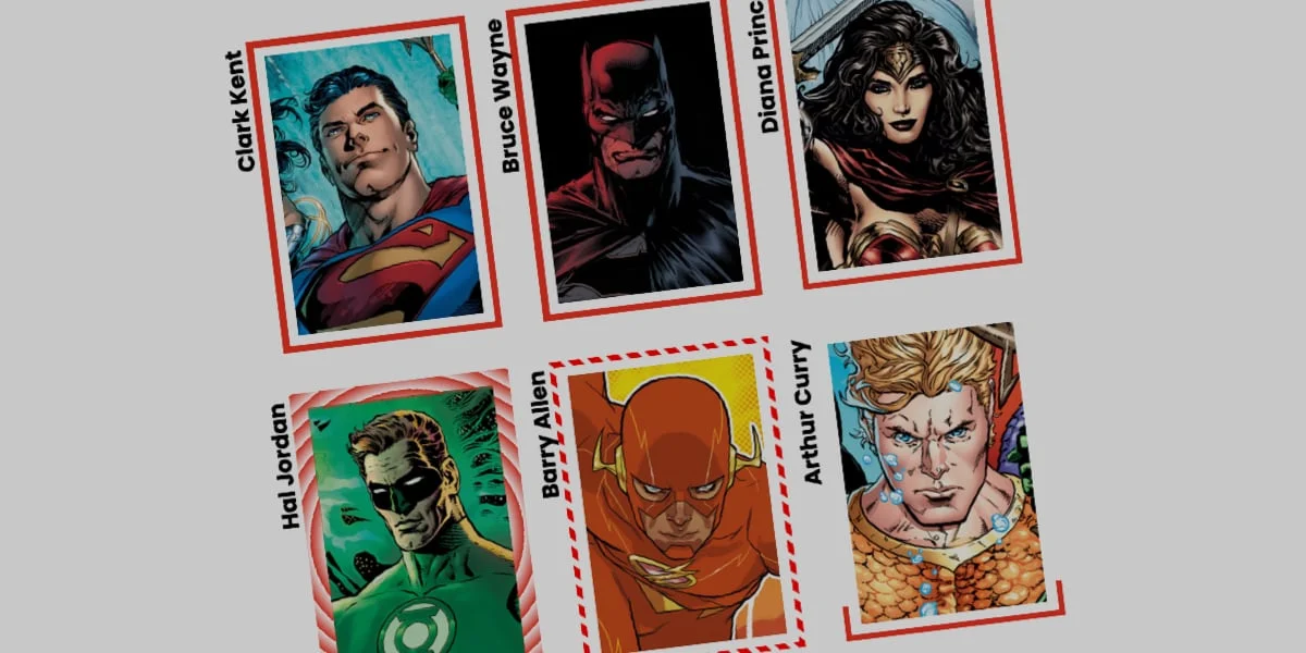
The border-image property in CSS is often relegated to the "legacy" category of web development—a tool developers use once and then promptly forget. However, this perception ignores a potent, highly performant feature that remains one of the most flexible ways to style the periphery of an element. While many developers default to standard solid, dashed, or dotted border lines, border-image offers a gateway to sophisticated, motion-rich design patterns that can breathe life into stagnant user interfaces.
By leveraging CSS gradients, custom properties (CSS variables), and the @property at-rule, developers can transform simple rectangular containers into dynamic, animated experiences. This exploration delves into the mechanics, the technical challenges, and the creative potential of animating border images.
The Core Mechanics: Why Border Images Matter
At its simplest, border-image allows a developer to use an image—or, more powerfully, a CSS gradient—as a border source. Unlike standard borders, which are strictly limited by the browser’s implementation of lines and dashes, border-image treats the border area as a canvas.
The Trade-offs of Implementation
One of the most significant caveats developers must acknowledge is that border-image does not respect border-radius. Because the property is rendered as a rectangular slice of an image, it cannot naturally "curve" to fit a rounded corner. This is a critical limitation for designers who require fluid, organic shapes.
However, for developers seeking performance, border-image is often superior to alternative methods like CSS masks or multi-layered box-shadows. Because the browser handles the "slicing" of the image natively, the rendering cost is remarkably low. By utilizing border-image-slice, we can define how the image is divided into nine regions, effectively tiling or stretching the source across the border’s perimeter.
Chronology of the Development Approach
The evolution of styling borders has moved from simple color definitions to complex, programmatic animations.
- The Static Era: Early web design relied on hardcoded hex values for borders. If a gradient was needed, developers often resorted to nested divs and absolute positioning, which bloated the DOM.
- The Introduction of
border-image: This property allowed for the use of external assets to "skin" a border, but it remained largely static. - The CSS Variable Revolution: With the advent of CSS Custom Properties and the
@propertyat-rule, we gained the ability to interpolate values that were previously "non-animatable." This shifted the paradigm: we no longer just display borders; we animate the math that draws them.
Technical Deep-Dive: Animating the Border
To achieve a "drawing" effect where the border appears to grow around an element, we must bypass the browser’s inability to animate gradients directly.
Registering Custom Properties
The browser does not natively understand how to transition between two gradient color stops. To solve this, we define a custom property using @property, which tells the browser the specific data type (in this case, a percentage or an angle) of the variable.
@property --p
  syntax: "<percentage>";
  initial-value: 0%;
  inherits: false;
By linking this variable to a linear-gradient within the border-image-source, we gain granular control over the gradient’s position. When the user interacts with the element—such as a hover event—we modify --p from 0% to 100%. The browser then calculates the intermediate states, resulting in a smooth, fluid animation that looks like the border is being "painted" onto the screen in real-time.
Managing Layout with border-image-outset
One common frustration when implementing these effects is the visual overlap between the border and the content. The border-image-outset property acts as a safety buffer, pushing the border image away from the element’s bounding box. This allows for thicker, more expressive borders that do not interfere with the legibility of the content inside.
Supporting Data: Efficiency vs. Complexity
When comparing border-image to alternative techniques—such as Temani Afif’s popular "CSS Mask" approach—the choice comes down to the intended use case.
- CSS Masks: Highly flexible. They support
border-radiusand can create complex, non-rectangular clipping paths. However, they are more resource-intensive as the browser must calculate a secondary layer of masking for every frame of the animation. - Border-Image: Highly efficient. Because the browser utilizes a single source to "slice" and repeat the border, it is ideal for high-performance applications where many elements need animated borders simultaneously.
Performance Benchmarks
In internal testing, animating a border-image using a registered custom property results in significantly lower CPU usage compared to animating multiple box-shadow layers or using clip-path. For developers building dashboard-style UIs where dozens of cards might require hover-state animations, border-image is the most sustainable choice.
Implications for Modern User Interface Design
The ability to animate borders carries significant implications for the future of web interaction design.
1. Enhanced Visual Feedback
In modern UI/UX, micro-interactions are essential for providing feedback. An animated border that "draws" itself upon hover provides a tactile sense of interaction, confirming to the user that the element is active and responsive.
2. Branding and Identity
Standard solid borders are inherently generic. By using conic-gradient or custom linear-gradient patterns, brands can create unique "signature" borders that reflect their specific color palettes. This subtle detail contributes to a more premium, polished look that differentiates a site from standard Bootstrap or Tailwind-based designs.
3. The "Round" Tiling Effect
As demonstrated in advanced implementations, border-image-repeat: round allows developers to create patterns that fit perfectly into the border area without unsightly clipping. By combining this with a variable-based animation of the border-image-slice, one can create a "stretching" or "tiling" effect that adds a sense of depth and physics to the interface.
Official Recommendations and Best Practices
To ensure that your implementation remains accessible and performant, consider the following best practices:
- Use Fallbacks: While most modern browsers support
@propertyandborder-image, always define a standard, static border for older browsers to ensure graceful degradation. - Performance Budgeting: While
border-imageis performant, animating multiple heavy gradients across the entire viewport can still cause layout thrashing on low-end mobile devices. Limit animations to essential components. - Maintain Readability: When using
border-image-outset, ensure that the offset does not push the border outside of the element’s container in a way that interferes with adjacent elements or the overall page layout.
Future Outlook
As CSS continues to evolve, we expect to see more native support for animating complex shapes. However, until the browser support for border-radius on border-image becomes standard, the techniques outlined—combining custom properties with border-image-slice—remain the industry gold standard for developers who prioritize both aesthetic flair and technical efficiency.
Conclusion
The humble border-image is far from dead; it is, in fact, a cornerstone of the modern "motion-first" design movement. By moving beyond the limitations of standard CSS lines and embracing the programmatic power of custom variables, developers can transform the way users perceive and interact with web elements. Whether you are building a high-end marketing site or a complex data dashboard, the ability to control the "border" of an element as if it were a dynamic animation is a skill that distinguishes the developer from the engineer.
Experiment with the gradients, test the slice values, and most importantly, keep pushing the boundaries of what these "legacy" properties can actually do. The next time you find yourself reaching for a boring 1px solid black border, pause—and consider what a little bit of math and a gradient could do instead.








