Mastering the Native HTML <dialog> Element: A Decade of Web Architecture Evolution
It has been nearly a decade since the introduction of the native HTML <dialog> element, a milestone that promised to simplify one of the most persistent pain points in web development: the creation of accessible, functional modals. Yet, despite its maturity, the element remains a subject of ongoing discovery. Developers frequently find themselves revisiting documentation to clarify the nuances of its API, styling capabilities, and the subtle behavioral differences between standard pop-ups and true, top-layer modals.
This comprehensive guide serves as a technical deep dive into the architecture of the <dialog> element, exploring its past, its current implementation standards, and the future of declarative UI control.
The Foundations: Marking Up the <dialog>
At its most fundamental level, the <dialog> element is a semantic container for content that sits apart from the primary document flow. The implementation is straightforward:
<button id="dialog-button">Open Dialog</button>
<dialog id="dialog">
  <p>Hello! I am a native dialog.</p>
</dialog>
By default, the element remains hidden. While one could manually toggle the open attribute, the standard approach relies on the JavaScript show() method. However, developers must distinguish between the two primary ways of invoking this element: show() and showModal().

Using show() treats the element as a non-modal pop-up—a simple layer on the page. In contrast, showModal() transforms the element into a true modal, which automatically centers the dialog, creates a ::backdrop element to obscure the background, and enables the Esc key to dismiss the window. In almost every enterprise or user-focused application, showModal() is the correct architectural choice.
Chronology of Closing Mechanics
The evolution of closing a dialog has moved from complex manual event listeners to elegant, native solutions. Initially, developers relied on element.close() triggered by custom JavaScript events.
Today, the industry is shifting toward a declarative future. By placing a <form> with method="dialog" inside the element, browsers handle the closure automatically upon submission. This removes the need for custom JavaScript entirely for simple dismissal workflows. Furthermore, the emerging Invoker Commands API represents the next phase of this evolution. Using command="show-modal" and commandfor="id" attributes, developers will soon be able to trigger modal states directly in HTML, marking a significant departure from the imperative, script-heavy patterns of the past.
Supporting Data: Accessibility and UX
Accessibility is not an afterthought with the <dialog> element; it is baked into its core. When showModal() is invoked, the browser automatically applies the inert attribute to the rest of the page. This ensures that background elements are unreachable via keyboard navigation or mouse clicks, effectively trapping focus within the modal.

However, the "close" button remains a point of contention. Designers often prefer an "X" icon, which poses significant challenges for screen readers. The industry standard has solidified around a hybrid approach:
- Include a visually hidden
<span>containing descriptive text (e.g., "Close modal"). - Use an
aria-hidden="true"attribute on the icon itself to prevent screen readers from announcing meaningless symbols.
Furthermore, developers must be mindful of initial focus. Because the browser shifts focus to the first interactive element (often the close button), accidental triggers can occur. In complex dialogs, setting an explicit tabindex on a primary input field is often a more ergonomic choice for the user.
Styling: The Art of the ::backdrop
The ::backdrop pseudo-element is the canvas upon which we define the "modal experience." While browsers provide a default, subtle tint, modern design systems demand more. By applying backdrop-filter: blur(10px) or custom background images, developers can create a sense of depth that keeps the user contextually aware of the content behind the modal.
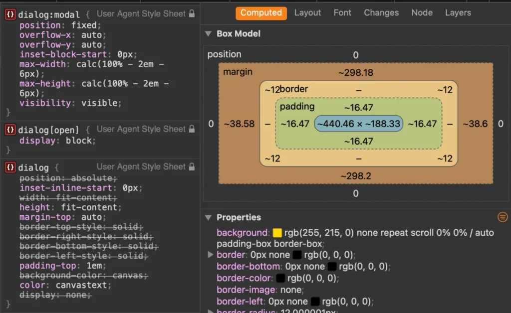
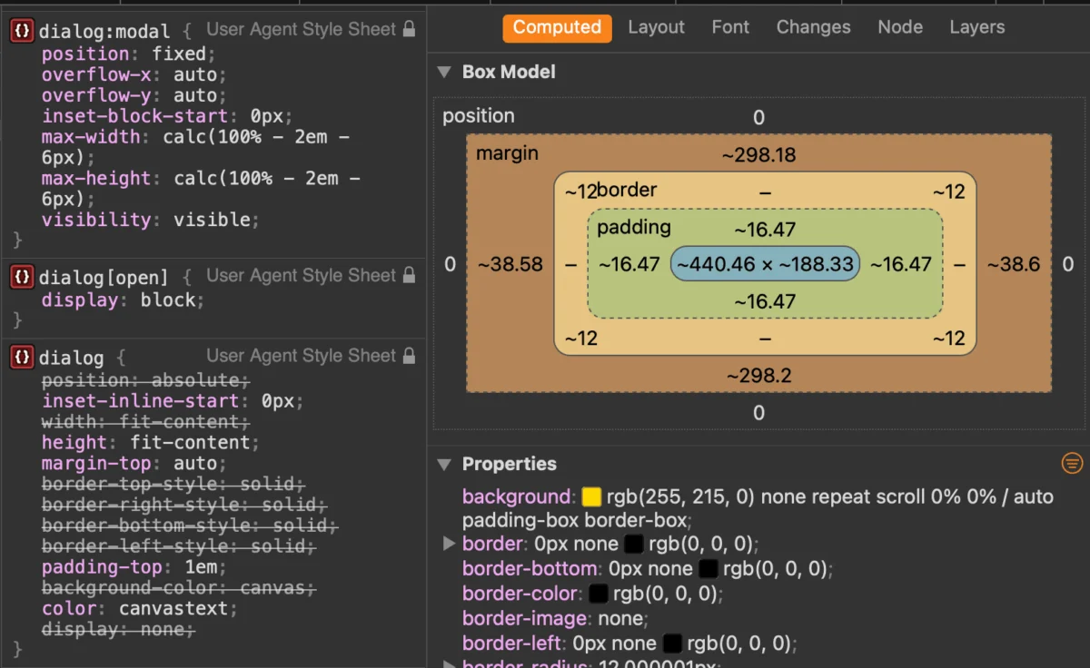
When styling the dialog itself, it is crucial to target the [open] attribute or the :modal pseudo-class. Selecting the element globally can lead to unexpected UI behavior, particularly when the element is closed. Additionally, to avoid the "layout shift" caused by the disappearance of scrollbars when a modal opens, the use of scrollbar-gutter: stable; is highly recommended.

Implications: The Scroll Issue and overscroll-behavior
One of the most persistent frustrations with modals is the background "scroll-through" effect. For years, developers implemented complex overflow: hidden toggles on the body tag.
Recent advancements in the CSS specification—specifically overscroll-behavior—provide a more elegant solution. By setting overscroll-behavior: contain; on both the dialog and its ::backdrop, developers can effectively lock the background content. As of Chrome 144, this behavior is more robust, though the body:has(dialog[open]) overflow: hidden; pattern remains a highly effective, widely supported fallback for ensuring the page remains static while the user interacts with the modal.
Animating the Entry and Exit
Historically, animating a dialog was difficult because the element was removed from the DOM (or set to display: none) instantly. The introduction of the @starting-style at-rule has finally solved this. By defining a starting state, developers can now trigger smooth transitions for opacity and transform properties as the dialog enters the viewport.
While some have looked to the View Transitions API for these effects, it is important to note that the top-layer nature of modals makes them a poor candidate for current view-transition implementations. Stick to CSS transitions or animations for the most reliable results.

Official Guidance: Dialog vs. Popover
A common question arises: When should I use a Dialog versus the Popover API?
The distinction is defined by intent. A Dialog is designed for high-priority user interaction—tasks that require the user’s full attention and block other actions (the "modal" pattern). A Popover, conversely, is intended for non-blocking content, such as tooltips, dropdown menus, or ephemeral UI information.
The accessibility implications are profound. A <dialog> handles focus trapping, modality, and the Esc key natively. A <popover> does none of these things. Attempting to force a popover into a modal role will result in an inaccessible interface that requires massive amounts of custom JavaScript to reach the same level of compliance that the <dialog> element provides out of the box.
Conclusion
The <dialog> element has matured from a misunderstood experiment into the cornerstone of modern web interactivity. By leveraging its native ability to manage the top layer, handle focus, and provide semantic accessibility, developers can build faster, cleaner, and more robust applications. As we look toward the adoption of Invoker Commands and deeper CSS integration, the future of the native dialog remains bright—and much simpler than it was ten years ago.