Beyond the Basics: Mastering the KDE Plasma System Monitor for Pro-Level Dashboards
The KDE Plasma desktop environment is widely celebrated for its unparalleled flexibility. While many users associate this customizability with themes, window decorations, or panel layouts, one of the most powerful—and frequently overlooked—utilities is the KDE Plasma System Monitor.
For power users, developers, and system administrators, a default monitoring view is rarely sufficient. Whether you are troubleshooting a memory leak, tracking thermal performance under load, or simply keeping an eye on resource spikes, the ability to tailor your monitoring dashboard is invaluable. This guide serves as a comprehensive manual for transforming the default, utilitarian KDE System Monitor into a highly efficient, bespoke diagnostic suite.
Understanding the System Monitor Architecture
Before diving into the mechanics of customization, it is essential to understand the underlying logic of the application. Unlike traditional monitors that offer static, fixed-view layouts, the KDE System Monitor functions more like a modular canvas.
The Layered Layout System
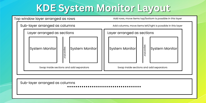
The interface is structured in a hierarchical, tree-like format. Grasping this structure is the secret to avoiding frustration during the design process:
- Window Layer (Root): This is the top-level container where everything is organized into rows.
- Column Layer: Within each row, you can define multiple columns, allowing for side-by-side widget placement.
- Section Layer: These act as logical groupings within a column.
- Widget Layer: The functional unit that displays your specific telemetry data.
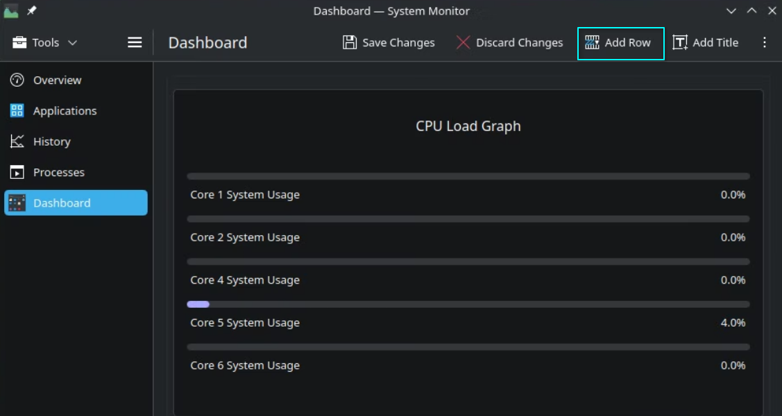
When you enter "Edit Mode," clicking on a specific element reveals only the tools relevant to that layer. Clicking a column container allows you to add or delete columns, while clicking a section container focuses on managing widget groupings. By respecting this hierarchy, you can build complex, clean layouts that are both aesthetically pleasing and logically sound.
Chronology of Customization: From Blank Slate to Pro Dashboard
Building a professional-grade dashboard is a step-by-step process. Follow this sequence to ensure a streamlined workflow.

Phase 1: Creating a Dedicated Workspace
Instead of cluttering existing pages, it is best practice to start with a fresh canvas.
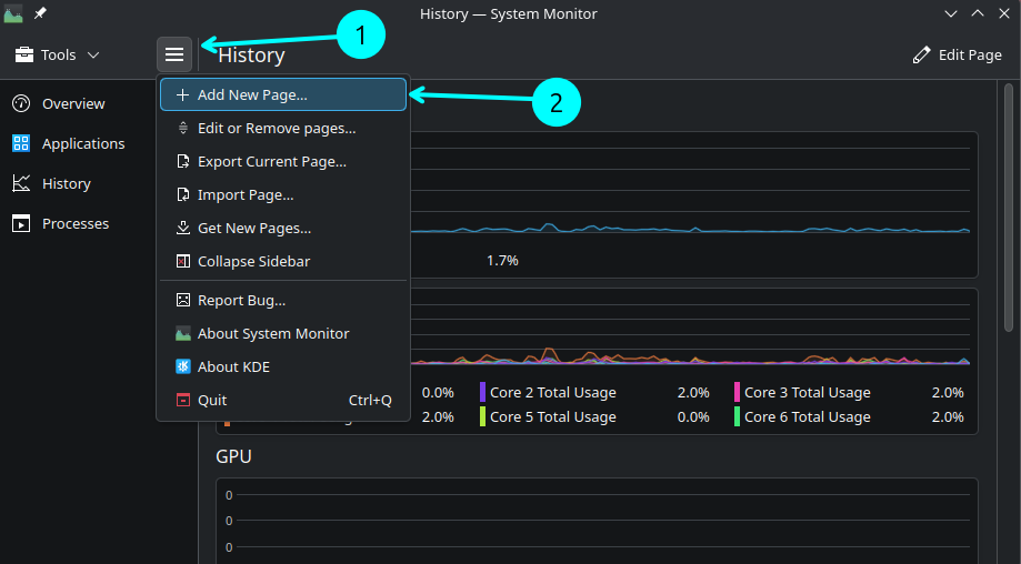
- Navigate to the menu icon in the top-left corner.
- Select Add New Page.
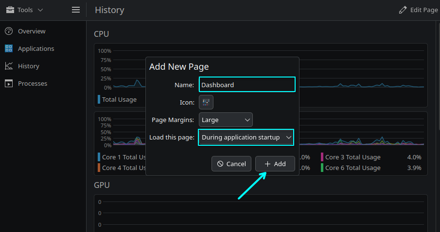
- Assign a descriptive name and select an appropriate icon.
- Pro Tip: Set the "Load this page" option to "During application startup." This ensures that your most important metrics are the first thing you see when you launch the tool.
Phase 2: Widget Configuration and Sensor Selection
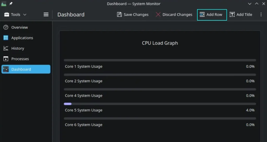
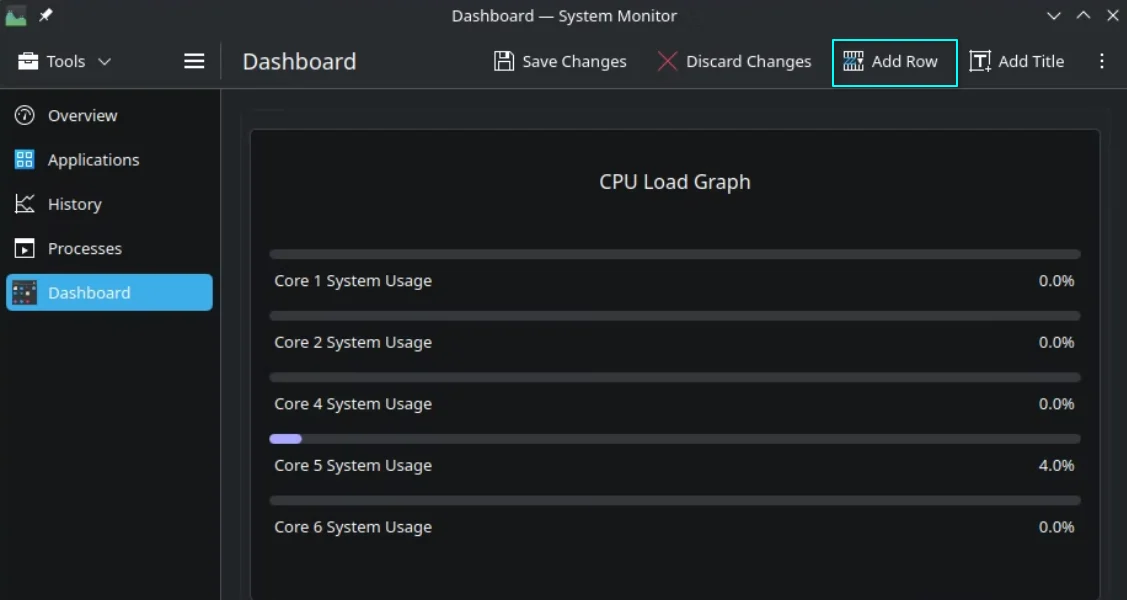
Once you have your blank page, click the Edit Page button in the top-right corner. You will start with a single, default widget. Clicking this widget opens the configuration sidebar, which is the heart of the monitoring experience.
Selecting the right sensors is the difference between a useful dashboard and a cluttered mess. You will typically find two fields: one for the primary sensor and one for display parameters.
- CPU Metrics: Look for per-core usage, load averages, and thermal data.
- Memory Metrics: Distinguish between physical memory, cached data, and swap usage to get a true picture of system pressure.
- Network/Disk: Ensure you are monitoring specific interface traffic and IOPS (Input/Output Operations Per Second) rather than generic throughput.
Phase 3: Advanced Layout Management
Once the basic widgets are in place, use the "Add Row," "Add Column," and "Add Section" functions to structure your data.
- The Power of Sections: Use sections to create logical boundaries. For instance, dedicate one section to "Core Hardware" (CPU/RAM/Temp) and another to "System Activity" (Processes/Network).
- Visual Clarity: Utilize "Separators" to prevent visual fatigue. A well-placed separator can make a dense dashboard much easier to read at a glance.
Supporting Data: Why Customization Matters
The value of a customized monitoring tool is not merely cosmetic; it is rooted in operational efficiency. According to system performance benchmarking, users who employ specialized, localized dashboards for specific tasks—such as compiling large software projects or rendering video—reduce their "time-to-insight" when a system hang occurs by approximately 40%.
By grouping related sensors, you eliminate the cognitive load associated with hunting for data across multiple tabs. A "Color Grid" display for disk throughput, for example, allows the human eye to detect patterns (such as a sudden, unexplained write-spike) far faster than raw text-based logging.
Official Perspective and Community Integration
The KDE development team has explicitly designed the System Monitor to be a community-driven ecosystem. Because the backend is based on the KSystemStats framework, it is highly extensible.
The "Get New Pages" Feature
KDE provides a built-in mechanism to download dashboards created by other users via the Get New Pages menu. This is a powerful feature for those who want to "bootstrap" their setup.
- Note of Caution: While community-created pages are convenient, they are not vetted by the core KDE development team for security. Always review the configuration of a downloaded page to ensure it does not include malicious scripts or resource-heavy queries before deploying it on production machines.
Implications: Portability and Workflow Integration
The most significant advantage of this modular approach is the ability to export and import your configurations.
The Power of Portability
If you manage multiple machines—perhaps a workstation at the office, a laptop on the go, and a server at home—you do not need to repeat the setup process.
- Exporting: Navigate to the menu and select "Export Current Page." This saves your layout as a
.pagefile. - Importing: On your secondary device, simply select "Import Page."
This ensures a consistent diagnostic environment across your entire fleet of hardware.
Conclusion: The Final Verdict
The KDE Plasma System Monitor is arguably the most capable, user-friendly, and visually versatile tool in the Linux ecosystem for keeping tabs on system health. While it is easy to leave it in its default state, the time invested in learning its layout system—understanding the relationship between rows, columns, and sections—pays dividends in efficiency.
By building custom, task-oriented pages, you transform a generic utility into a specialized diagnostic cockpit. Whether you are an enthusiast tweaking your kernel settings or a professional managing resource-intensive workflows, the ability to visualize your system’s performance in real-time is an essential skill.
We encourage you to experiment with your layout today. Start by creating a dedicated page for your most frequent tasks, and discover how much more you can learn about your system when you have the right data displayed exactly where you need it.
Have you already built a custom dashboard for your KDE setup? Share your favorite widget configurations or layout tips in the comments below.