
Mastering Movement: A Comprehensive Guide to the CSS translateX() Function

In the modern landscape of web development, the ability to manipulate space and motion is paramount to creating engaging user interfaces. Among the various tools provided by the CSS Transforms Module, the translateX() function stands out as a fundamental utility for horizontal displacement. Whether it is used to animate a subtle UI transition or to power complex, high-performance web animations, translateX() serves as a cornerstone for developers aiming to elevate the interactivity of their projects.
Main Facts: Understanding the translateX() Mechanism
At its core, the translateX() function is a CSS transform method that shifts an element along the horizontal axis (the X-axis). Unlike traditional layout properties like margin or position: relative, which manipulate the document flow, translateX() functions as a post-layout rendering operation.
When you apply translateX() to an element, you are essentially telling the browser to render that element at a specific offset from its original position. Because this transformation occurs during the "composite" stage of the browser rendering pipeline, it is highly efficient. It avoids triggering expensive layout reflows or repaints, making it the preferred method for high-performance animations where 60 frames per second (FPS) is the target.
Defining the Syntax
The syntax is straightforward and follows the standard function-based approach in CSS:
transform: translateX(value);The value can be any valid <length-percentage> unit. A positive value pushes the element to the right, while a negative value pulls it to the left. For example:
translateX(50px)moves the element 50 pixels to the right.translateX(-20%)moves the element 20% of its own width to the left.
Chronology and Evolution of CSS Transforms
The history of CSS transforms is a testament to the maturation of the web as an application platform. Before the introduction of the CSS Transforms Module, developers were forced to rely on complex hacks—such as absolute positioning or JavaScript-heavy DOM manipulation—to create movement.
The Origins
In the early 2000s, moving an element meant changing its left or top properties. This was problematic because changing these properties forced the browser to re-calculate the position of every subsequent element in the DOM tree, leading to significant performance bottlenecks, particularly on mobile devices with limited processing power.
The Level 1 Specification
The CSS Transforms Module Level 1, currently maintained as an Editor’s Draft by the CSS Working Group (CSSWG), revolutionized this by offloading these tasks to the GPU. By treating the element as a "layer" that can be moved, rotated, or scaled, browsers were finally able to decouple visual animation from the underlying layout engine. translateX() emerged as the simplest, most intuitive manifestation of this shift.
Supporting Data and Performance Metrics
The architectural advantage of translateX() over property-based animation (like left or margin-left) is grounded in the browser’s "Rendering Pipeline."
Layout vs. Paint vs. Composite
- Layout: When you change
left, the browser must recalculate the geometry of the page. This is a "layout shift" that impacts surrounding elements. - Paint: When you change background colors, the browser must re-rasterize the pixel information.
- Composite: This is where
transformlives. The browser takes the already-rendered element and moves it to a new location on the screen. Because the element’s geometry hasn’t changed, the browser simply moves the "texture" of the element.
Performance benchmarks consistently show that animations utilizing transform consume significantly less CPU power than those relying on positional CSS. In complex applications, such as data-heavy dashboards, this can be the difference between a fluid, responsive UI and a stuttering, unresponsive experience.
Practical Applications in Modern UI
To understand the utility of translateX(), one must look at how it is applied in production environments.
The Sidebar Slide
A common design pattern is the off-canvas navigation menu. To achieve this, developers shift the sidebar completely off-screen using translateX(-100%). When a menu button is triggered via JavaScript, the class is updated to translateX(0), bringing the menu into view with a smooth transition. This is not only performant but also allows for accessible interactions that feel natural to the user.

Infinite Marquees
The marquee effect is a staple of modern web design, often used for client logos or promotional banners. By using translateX() within a @keyframes animation, developers can create an infinite loop that moves the marquee content from its original position to a negative percentage (usually -50%) of its container’s width. By resetting the position precisely at the right moment, the illusion of an endless, seamless stream of content is created.
Skeleton Shimmer
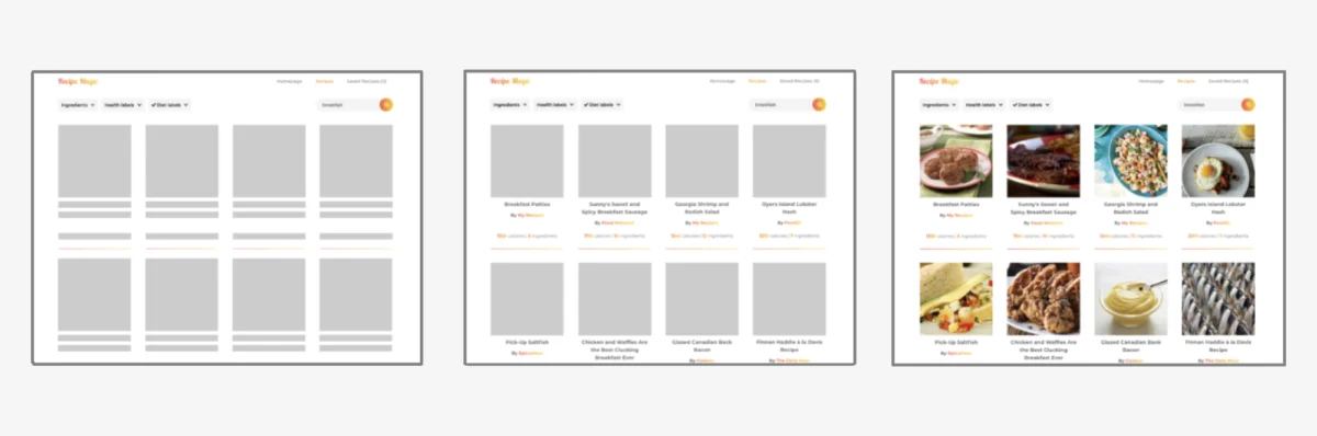
Skeleton screens have replaced traditional "loading spinners" as the standard for perceived performance. To give these skeletons a "shimmering" effect, developers apply a pseudo-element (::after) that spans the skeleton and uses translateX() to sweep a gradient across the element. This creates a polished, high-end feel that keeps users engaged while the actual content fetches from the server.
Addressing Common Pitfalls: The Pointer Pseudo-Class Trap
One of the most persistent issues developers face when using translateX() is the "hover-flicker" effect.
If you apply a transform: translateX() directly to an element upon :hover, and that transformation moves the element away from the cursor’s coordinates, the browser immediately registers a mouseleave event. The element snaps back to its original position, the cursor once again triggers the :hover state, and the cycle repeats indefinitely.
The Solution:
Professional best practice dictates that the interaction state should be managed at the parent level. By applying the :hover state to a container (the parent), you ensure that the cursor remains within the interactive bounds of the parent element, even while the child element is visually displaced.
.container:hover .target-element
  transform: translateX(20px);
Implications for Web Accessibility and Layout Flow
The fact that translateX() does not affect the document flow is both its greatest strength and a potential hazard.
Visual vs. Logical Position
When an element is moved with translateX(), the space it originally occupied remains "reserved." This means that if you translate an element 500px to the right, you may inadvertently create a massive, empty gap in your layout. Developers must be cognizant of this "ghost space."
Furthermore, because transform does not change the layout, screen readers and keyboard navigation may still perceive the element in its original, pre-transformed location. This can lead to a disjointed experience for users with visual impairments if the visual UI and the logical DOM structure become too detached.
Future Outlook and Browser Compatibility
Today, translateX() enjoys universal support across all modern browsers, including mobile Safari, Chrome, Firefox, and Edge. The CSSWG continues to iterate on the CSS Transforms Module, with Level 2 introducing 3D transformations (translateZ()) and more granular control over transform origins.
As the web continues to evolve toward more immersive, app-like experiences, the reliance on high-performance animation tools like translateX() will only grow. The shift from layout-heavy animations to compositor-driven transforms represents a mature understanding of browser internals—a standard that every modern frontend developer must master.
Summary
- Performance:
translateX()operates on the compositor thread, preventing layout thrashing. - Flexibility: It supports both absolute lengths (
px) and relative percentages (%), making it responsive by design. - Best Practices: Always handle hover states on parent containers to avoid event-loop flickers.
- Layout Awareness: Remember that while the element moves, the layout space it occupied remains, necessitating careful planning in complex UI grids.
By integrating translateX() thoughtfully, developers can move beyond static pages, crafting dynamic, fluid digital environments that meet the high expectations of today’s web users. Whether you are building a simple sidebar or a complex, animated dashboard, the principles of horizontal translation remain an essential part of the professional developer’s toolkit.








