
Beyond the Limits: Mastering Creative Typography with CSS Letter-Spacing
In the evolving landscape of web development, typography is no longer a static element. It is a dynamic, expressive tool that defines the brand identity and user experience of modern interfaces. However, designers and front-end developers have long lamented the lack of granular control over text. Specifically, the absence of an ::nth-letter pseudo-selector has been a significant "holy grail" for those looking to manipulate individual characters without resorting to heavy JavaScript or complex DOM wrapping.
While the CSS Working Group continues to deliberate on the future of text-level selectors, developers are finding that the tools we already possess—specifically the letter-spacing property—are far more powerful than previously realized. By moving beyond simple kerning adjustments, we can unlock sophisticated, fluid, and highly performant text-reveal animations.
Main Facts: The Hidden Potential of the Glyph Box
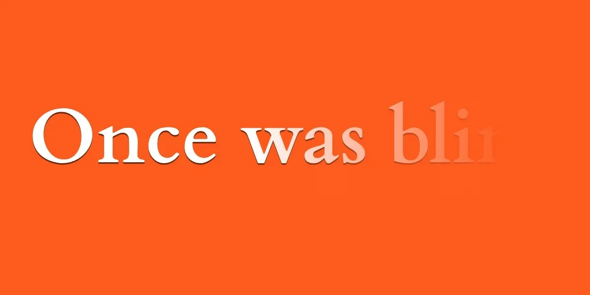
The core of this technique lies in the behavior of the letter-spacing property. In standard usage, it is a utility for adjusting the gap between letters to improve legibility. However, when pushed to its limits—specifically through the use of negative values—it transforms into a powerful animation engine.
A negative letter-spacing value does more than just move letters closer; it physically shrinks the width of the individual glyph boxes. When the value is sufficiently negative, these boxes collapse entirely, forcing the characters to stack on top of one another. Combined with a color: transparent declaration, this allows developers to "hide" full words within a single point of origin.
Key technical facts:
- The
chUnit: The CSSchunit is relative to the width of the "0" (zero) glyph. It serves as the ideal unit for these effects because it scales proportionately with the font size. - Animatability: The
letter-spacingproperty is fully animatable, meaning it works seamlessly with thetransitionandanimationproperties. - Performance: Because these effects rely on native CSS layout properties rather than expensive DOM manipulation or layout-thrashing JavaScript, they maintain high performance, even on mobile devices with limited processing power.
Chronology of CSS Text Manipulation
The quest for granular text control has been a multi-decade journey for web standards.
- The Early Web (1996–2000): Typography was restricted to basic font stacks. Any advanced effect required images or Flash.
- The Pseudo-Element Era (2000–2010): The introduction of
::first-letterand::first-lineprovided the first real foothold for styling specific segments of text. These remain the only native way to target text without wrapping it in<span>tags. - The Rise of
letter-spacing(2010–2018): Developers began usingletter-spacingfor subtle UI design, but few considered it a viable tool for complex animations. - The Modern Era (2018–Present): With the widespread adoption of CSS variables and robust hardware-accelerated transitions, developers began experimenting with "collapsing" text effects. We are now in a period where "hacky" workarounds are becoming standard, creative design patterns.
Supporting Data: Why Native CSS Beats JavaScript
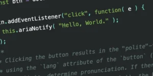
For years, the industry standard for letter-by-letter animation was a library like GSAP (GreenSock) or Lettering.js. These tools work by injecting a <span> around every single character in a text block.
While effective, this approach has significant downsides:
- DOM Bloat: A single paragraph with 500 characters suddenly becomes 500 individual elements. This drastically increases the memory footprint and the time required for the browser to render the page (Layout and Paint times).
- Accessibility Concerns: Screen readers may attempt to read these broken-up spans as individual units, causing fragmented speech patterns.
- Maintenance: If the text is dynamic (e.g., fetched from a CMS), the developer must write complex JavaScript to re-inject those spans every time the content changes.
Using the letter-spacing technique, the DOM remains clean and semantic. The HTML simply contains the raw text, ensuring that search engines and assistive technologies can read the content exactly as intended, while the visual "trickery" is handled entirely by the browser’s rendering engine.
Official Perspectives: The Future of ::nth-letter
The CSS Working Group has acknowledged the developer demand for a true ::nth-letter selector. However, the implementation is notoriously difficult. Unlike a <div>, a character is not a standard box element. Implementing a pseudo-selector that can target the third, fifth, or tenth letter requires the browser to calculate the rendering state of the entire string in real-time, which creates significant performance overhead.
For now, the consensus remains that developers should leverage existing "box-based" selectors. By utilizing ::first-letter alongside letter-spacing and text-indent, developers can create "progressive reveal" animations that simulate the look of an ::nth-letter selector without the performance cost.
Implications for Web Design
The implications of these techniques are profound for UI/UX design.
1. Interactive Micro-interactions
As demonstrated by the checkbox-reveal pattern, we can now create state-based typography. By using :checked or :hover states to toggle letter-spacing from -1ch to 0ch, developers can create elegant "unfolding" effects. This is particularly useful for navigation menus, accordions, or "read more" buttons, where the transition from a hidden state to a revealed state adds a premium feel to the interface.
2. Branding and Acronyms
The UNICEF example—where an acronym expands into a full name—is a blueprint for modern interactive branding. Using ::first-letter to keep the leading character visible while the remainder of the word is hidden behind it creates a "magic" reveal effect that keeps the user engaged.
3. Responsive Typography
Because these animations are tied to relative units (ch), they are inherently responsive. If the font size changes at a different breakpoint, the letter-spacing calculations remain proportional, ensuring that the text collapses and expands perfectly regardless of the device screen size.
4. Accessibility
It is vital to note that these effects must be handled with care. Any animation that shifts content should ideally be wrapped in @media (prefers-reduced-motion: no-preference) queries. Furthermore, because these effects rely on hiding text (color: transparent), designers must ensure that the "hidden" state is truly unreachable by screen readers or that the semantic intent is preserved in the underlying HTML structure.
Moving Forward: The Developer’s Role
The limitation of the current CSS specification is not a wall; it is a canvas. By mastering the interaction between the glyph box and the letter-spacing property, we can create experiences that feel bespoke and high-end without the need for external dependencies.
As we look toward the future, the challenge to the development community is clear: explore the constraints. What happens when you combine letter-spacing with transform: rotate or text-shadow? What happens when you use cubic-bezier timing functions to create a "bouncy" or "magnetic" text reveal?
The next generation of web typography will not be defined by the selectors we are waiting for, but by how creatively we apply the properties we already have. The tools for sophisticated, character-level animation are already in your stylesheet—you simply need to adjust the space.


