
Mastering Depth: A Deep Dive into the CSS translateZ() Function
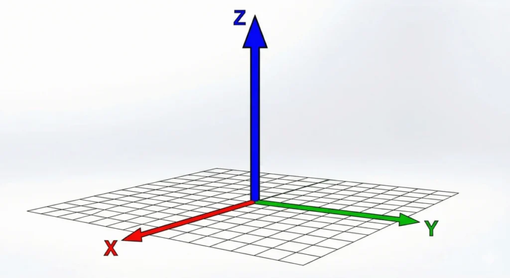
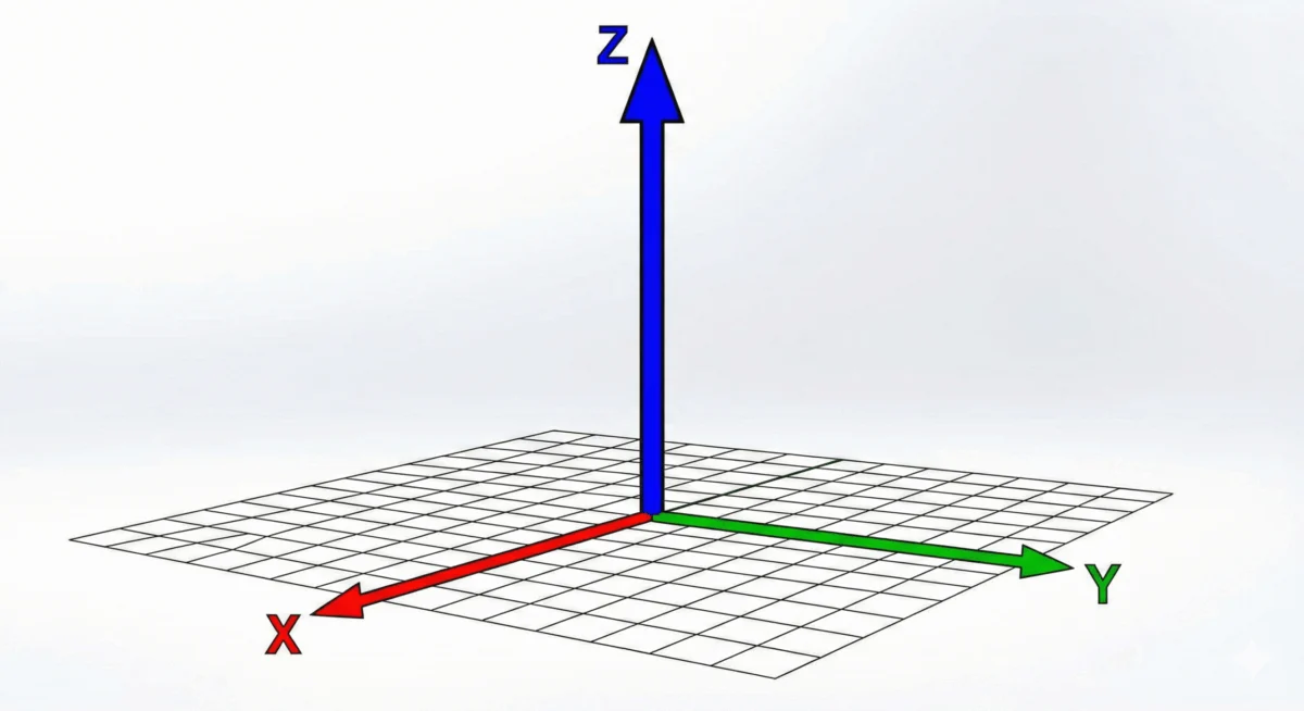
In the evolution of web design, the transition from static, flat interfaces to immersive, three-dimensional experiences has been defined by the maturation of the CSS Transform Module. Central to this transformation is the translateZ() function. While developers often reach for scale() to make elements appear more prominent, translateZ() offers a fundamentally different, physically grounded way to manipulate the spatial positioning of UI components. By shifting elements along the Z-axis—the imaginary line running perpendicular to your screen—this function allows designers to break the "fourth wall" of the browser.
Main Facts: Understanding the Third Dimension
The translateZ() function is a CSS transform method that moves an element toward or away from the viewer along the Z-axis. Unlike X or Y translations, which move items horizontally or vertically, translateZ() manipulates depth.
The most critical takeaway for any developer working with 3D space is that perspective is mandatory. Because the browser screen is inherently two-dimensional, it cannot natively render the depth implied by a Z-axis shift. Without the perspective property (defined on a parent container) or the perspective() transform function (applied to the element itself), translateZ() will appear to have no visual effect. The browser simply lacks the "camera" settings required to render that depth.
When properly implemented, moving an object toward the user (a positive translateZ value) creates a compelling optical illusion: the element appears larger. However, it is vital to distinguish this from scaling. scale() modifies the dimensions of the element’s geometry, whereas translateZ() moves the element closer to the "camera." When you rotate such an element, the geometric integrity remains, but the spatial relationship between the element and its parent becomes visible, revealing the true nature of the 3D space.
Chronology: The Evolution of CSS Transforms
The history of web-based 3D transforms is a narrative of moving rendering tasks from the CPU to the GPU.

- Early Web (1990s–2000s): The web was strictly 2D. Positioning was handled via absolute coordinates, and depth was simulated using overlapping images or Z-index stacking.
- The Transform Era (2009–2012): The introduction of the CSS Transform Module (Level 1) brought basic 2D transformations (rotation, skew, and translation). Developers began to demand more sophisticated control, leading to the draft specifications for 3D transforms.
- The 3D Standardization (2012–2016): As hardware acceleration became standard in browsers like Chrome, Firefox, and Safari, the CSS Transform Module Level 2 began to solidify the implementation of
translate3d(),perspective, andtransform-style: preserve-3d. - Modern Maturity (2017–Present): With the CSS Transform Module Level 2 reaching stable support,
translateZ()has become a standard tool in high-performance animation libraries, often utilized not just for visual depth, but for "GPU-layer promotion."
Supporting Data: Perspective vs. perspective()
A common point of friction for developers is the distinction between the perspective property and the perspective() function. While they share a name, they serve different architectural roles.
The perspective Property
When applied to a parent container, perspective sets the stage for all child elements. It defines the distance between the user’s viewpoint (the camera) and the Z=0 plane.
- Benefit: Consistency. If you have a group of elements that need to exist in the same 3D coordinate system, applying
perspectiveto the parent ensures they all obey the same vanishing point.
The perspective() Function
This is applied directly within the transform shorthand.
- Constraint: It applies only to the specific element it is declared on. Furthermore, order matters:
perspective()must be the very first function in thetransformstring. Usingtransform: translateZ(100px) perspective(800px)will fail, as the browser processes the transform stack from left to right; the perspective must be defined before the translation can be calculated.
Official Technical Implications: Performance Hacks
Beyond aesthetic depth, translateZ() has become a secret weapon for web performance optimization. In the browser rendering pipeline, elements are typically painted by the CPU. However, complex animations can cause "jank" or flickering if the CPU struggles to keep up with frame rates.
By applying transform: translateZ(0), developers can force the browser to promote an element to its own "compositor layer." This action offloads the rendering of that specific element to the GPU. Because the GPU is purpose-built for spatial calculations and matrix operations, it can handle transformations much faster than the CPU.

This technique, often referred to as "GPU-layer promotion," is the standard solution for developers encountering choppy CSS transitions. By essentially telling the browser, "Treat this element as a 3D object," the browser allocates dedicated memory for it, resulting in buttery-smooth animations.
The Philosophical Implications of 3D Web Design
The use of translateZ() represents a shift in how we perceive the "canvas" of the web. Historically, designers treated the monitor as a piece of paper. With the advent of 3D transforms, the monitor is now a window.
However, there is a danger in overusing these properties. Excessive 3D movement can lead to user disorientation or motion sickness, particularly for those sensitive to parallax effects. Furthermore, because translateZ() alters the perceived size and position of elements without changing their actual dimensions, it can break expected user interaction patterns. If an element appears to be closer to the user, they may expect to be able to "interact" with the sides of that object. If the design does not account for this, the disconnect between visual depth and functional interactivity can create a frustrating user experience.
Best Practices and Implementation
To effectively implement translateZ(), follow these professional guidelines:
- Define the Scene: Always wrap your 3D elements in a container that defines a clear
perspectivevalue (e.g.,800pxto1200pxprovides a natural, non-distorted field of view). - Preserve the Context: Use
transform-style: preserve-3don the parent if you intend to nest 3D elements within one another. Without this, nested elements will be flattened into the parent’s 2D plane. - Mind the Order: Always place your
perspective()function at the beginning of yourtransformdeclaration. - Use Sparingly for Performance: While
translateZ(0)is a great performance hack, avoid applying it to every element on your page. Each promoted layer consumes GPU memory; over-promoting elements can actually lead to memory exhaustion and performance degradation on mobile devices. - Test for Accessibility: Ensure that your 3D effects do not obscure critical UI elements or hinder keyboard navigation. A button that "moves" on hover should still maintain its focus state and remain accessible to screen readers.
Conclusion
The translateZ() function is a powerful, albeit subtle, utility in the modern CSS developer’s toolkit. Whether it is being used to create elegant, layered UI components that pop off the screen or as a low-level optimization for hardware acceleration, its utility is undeniable. By understanding the underlying physics of the Z-axis—and the browser’s need for a defined perspective—developers can transition from flat, static layouts to dynamic, tactile digital environments. As the web continues to evolve toward more immersive interfaces, mastering the third dimension will no longer be an optional skill, but a prerequisite for modern web craftsmanship.








