Mastering Scroll-Driven Animations: Creating Dynamic, Opposing Column Effects
In the evolving landscape of web design, the line between static documents and immersive, interactive experiences continues to blur. One of the most compelling trends involves "scroll-driven animations"—a technique that ties the movement of visual elements directly to the user’s interaction with the scrollbar. This approach allows designers to create depth, parallax, and motion that feels organic and deeply integrated into the page architecture.
Recently, a sophisticated design pattern has emerged: columns of content moving in opposing directions, creating a synchronized "conveyor belt" effect. While visually complex, the implementation is remarkably accessible thanks to modern CSS features.
The Core Concept: Synchronized Movement
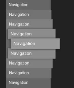
At its heart, the "opposing column" effect is a visual trick that relies on the user’s scroll position to trigger keyframe animations. Imagine three vertical columns. As the user scrolls down, the outer columns glide upward, while the center column descends. To ensure the experience remains polished, these items appear to "fade" into existence as they enter the container’s viewport and vanish seamlessly as they exit.
This design is not just a gimmick; it provides a sense of dynamism to otherwise static lists, such as feature sets, testimonials, or brand logos. By leveraging native browser capabilities rather than heavy JavaScript libraries, designers can achieve high-performance animations that feel native to the browser’s engine.
Chronology of Development
The development of this effect follows a logical progression, moving from structural definition to sophisticated visual masking.
1. Structural Foundation (The HTML)
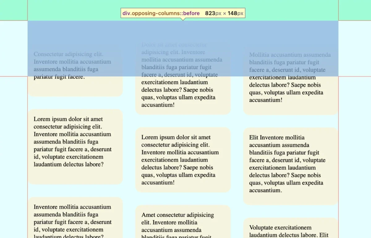
The markup is intentionally lean. We utilize a parent container (.opposing-columns) acting as the wrapper, containing three child containers (.opposing-column). Each column is populated with repeating items (.opposing-item). By keeping the DOM structure clean, we ensure that the CSS remains maintainable and the browser’s render performance stays optimal.
2. Establishing the Masking Illusion
The most critical aspect of the visual polish is the "fade." We do not manipulate the opacity of individual items. Instead, we use pseudo-elements (:before and :after) on the parent container. These elements are positioned absolutely to cover the top and bottom edges of the scroll area.
By applying a linear gradient to these pseudo-elements that matches the page’s background color, we create a "dead zone." As items move into this zone, they are effectively hidden by the solid color gradient, creating the illusion that they are receding into or emerging from the background.
3. The Animation Engine
The magic happens with the animation-timeline property. By setting this to view(), we bind the CSS @keyframes directly to the element’s position within the scrollport. Unlike traditional animations that run on a time-based loop, these animations are tethered to the user’s scroll speed, creating a direct, one-to-one relationship between the mouse wheel and the visual output.
Supporting Data: The Technical Implementation
To achieve this, the CSS must be carefully orchestrated. Below is the breakdown of the critical properties that define the movement and masking.
Defining the Masking Space
Using CSS variables allows for dynamic control. By defining --opposing-mask: 3rem;, we can consistently space the items and the masking gradients:
.opposing-columns
  position: relative;
  margin-block: var(--opposing-mask, 3rem);

  &:before, &:after
    content: "";
    position: absolute;
    inset-inline: 0;
    block-size: calc(var(--opposing-mask) * 3);
    z-index: 1;
    pointer-events: none;
The Animation Logic
The keyframes are designed to move the columns in specific directions. By using three different keyframe sets, we can create a staggered effect, preventing the visual rhythm from feeling too mechanical or repetitive.
scroll1: Moves columns from top to bottom.scroll2: Reverses the direction to create the "opposing" effect.scroll3: A mid-speed variation to add visual depth and complexity.
Official Standards and Browser Compatibility
As of current development cycles, the implementation of scroll-driven animations relies heavily on the view() function, which is part of the emerging CSS Scroll-Driven Animations specification.
Current Browser Support
- Chrome & Edge: Full support for
animation-timeline. - Safari: Support is actively evolving, with recent updates providing robust integration.
- Firefox: Support is currently in the experimental phase.
For developers, it is imperative to use the @supports (animation-timeline: view()) rule. This "feature detection" ensures that if a browser does not yet support the API, the page will gracefully fall back to a standard layout without broken animations or unsightly masking artifacts.

Implications for Web Accessibility
One of the most important considerations for any motion-based design is the user’s preference for reduced motion. The web is meant to be inclusive, and for users who experience vestibular disorders, high-speed movement can be physically distressing.
The implementation must strictly adhere to the prefers-reduced-motion media query. When this is detected, the animation should be set to unset, and the pseudo-element masks should be removed. This ensures that the content remains readable and accessible, prioritizing the user’s health over stylistic flair.
Best Practices for Modern UI
- Performance: Since these animations are handled by the browser’s compositor thread, they are significantly more efficient than JavaScript-based approaches (like ScrollMagic or GSAP).
- Maintainability: Using CSS variables for animation ranges and masks allows for rapid updates to the design system without needing to touch individual component logic.
- Future-Proofing: As the
scroll-driven-animationsspecification matures, we can expect even more precise control over scroll-linked effects, potentially allowing for more complex transformations like scaling or rotating items as they scroll.
Conclusion: The Future of Scroll-Linked Interaction
The "opposing columns" effect serves as a powerful case study for how far CSS has come in the last few years. What once required a complex stack of event listeners and frame-rate-heavy JavaScript can now be achieved with a few lines of declarative CSS.
However, the power of this technique lies in restraint. Over-animating a page can lead to "scroll fatigue," where the user feels they are fighting the page rather than consuming its content. The goal of this effect should always be to enhance the narrative or highlight specific UI elements, rather than to serve as a distraction.
As developers, we should view these new CSS capabilities as a toolkit for enhancing user engagement. Whether you are building a landing page for a new brand or an interactive portfolio, these scroll-driven techniques provide the nuance that distinguishes a modern, high-end digital experience from a traditional, static website.
The next frontier will likely involve deeper integration with View Transitions and scroll-triggered state management, allowing us to build web applications that feel more like native software than ever before. We encourage you to experiment with these timelines, test them across different viewports, and, most importantly, keep accessibility at the forefront of your design decisions. The web is moving, quite literally, and it’s time to start building for it.