
Mastering the Z-Axis: A Deep Dive into the CSS translateZ() Function
In the realm of modern web development, creating immersive, three-dimensional user interfaces has transitioned from a niche design trend to a standard expectation. Central to this evolution is the CSS translateZ() function—a powerful tool that allows developers to manipulate elements along the Z-axis, effectively granting depth to a traditionally flat, two-dimensional medium. By shifting elements closer to or further from the viewer, translateZ() serves as the cornerstone for complex 3D animations and spatial layouts.
Main Facts: Defining the Z-Axis
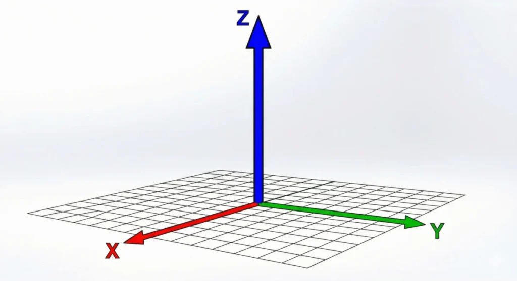
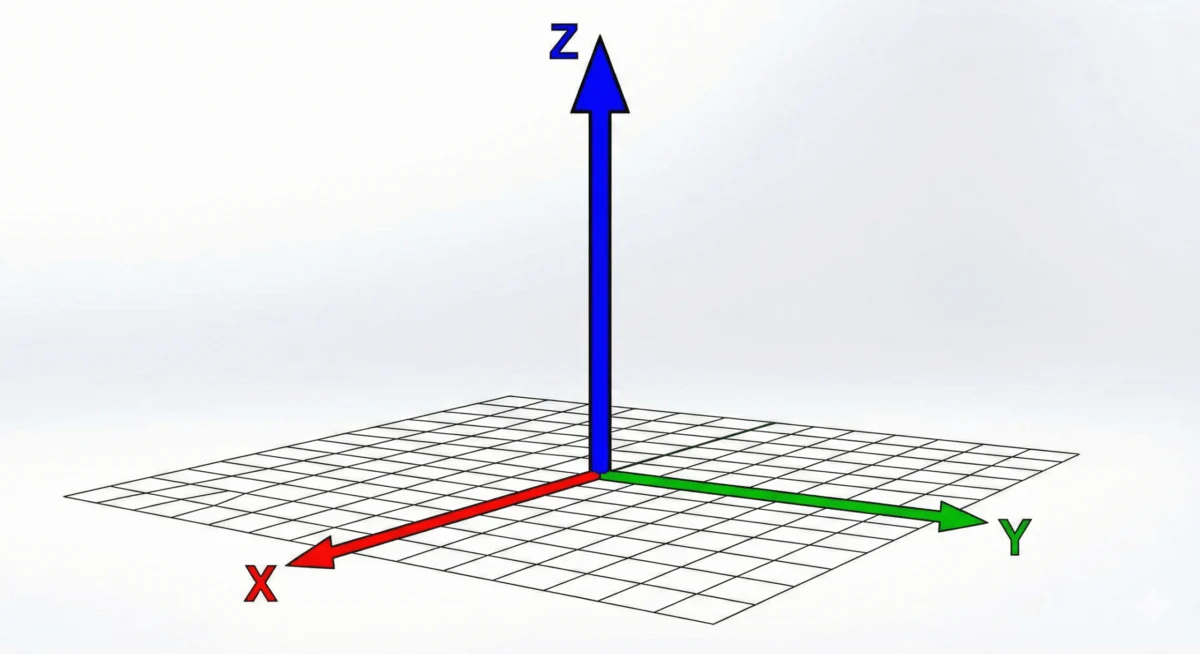
At its core, translateZ() is a functional notation used within the CSS transform property. It accepts a single <length> argument, which dictates the distance an element is moved along the Z-axis—the axis perpendicular to the screen.
When you apply translateZ(100px) to an element, you are essentially pulling that object closer to the "camera" (the user). Conversely, a negative value pushes the element deeper into the background. However, it is a common misconception that this function acts as a resizing tool. While an element moved closer via translateZ() appears larger, this is a result of perspective-based projection rather than an actual change in the element’s dimensions, as would be achieved with the scale() function.
Chronology: The Evolution of 3D in CSS
The journey of 3D transforms in CSS began with the inception of the CSS Transforms Module, later categorized into levels. The ability to manipulate elements in three-dimensional space was formally introduced as part of the CSS Transform Module Level 2 specification.
- Early Web (2D Era): Web elements were restricted to the X and Y axes. Movement was limited to basic translations, rotations, and scaling within a flat plane.
- The Introduction of 3D: With the release of the CSS Transforms specification, browsers gained the ability to interpret depth. This allowed for the implementation of the
transform-styleproperty and the introduction of 3D-specific functions liketranslateZ(),rotateX(), androtateY(). - Modern Standardization: Today, the specification is mature, with widespread adoption across all modern browser engines, including Chromium, WebKit, and Gecko, solidifying 3D transforms as a fundamental building block of modern UI/UX design.
Supporting Data: Understanding Perspective
A critical technical hurdle for developers new to translateZ() is the "invisible axis" problem. Because computer screens are two-dimensional, simply applying translateZ() to an element will produce no visible change. The browser requires a frame of reference to calculate how that depth should be rendered.

This is where the Perspective concept becomes vital. Perspective defines the distance between the user and the Z=0 plane. Without it, the browser lacks the geometry needed to render the "foreshortening" effect that makes a closer object appear larger and a further object appear smaller.
Perspective vs. Perspective()
Developers have two primary ways to establish this frame of reference:
- The
perspectiveproperty: Applied to a parent container, this sets the stage for all child elements. It creates a global "viewing distance" (e.g.,perspective: 800px;). - The
perspective()function: Applied directly to the individual element within thetransformshorthand. This is more granular but must be declared before other transform functions (e.g.,transform: perspective(800px) translateZ(100px);).
Using transform-style: preserve-3d on a parent container is often the "missing link" for developers, as it forces the browser to maintain the 3D positioning of child elements rather than flattening them back into a single 2D plane.
Official Technical Implications
From an architectural standpoint, translateZ() carries significant weight regarding browser rendering engines. It is not merely a stylistic tool; it is a performance utility.
The GPU Acceleration Hack
One of the most widely utilized "hacks" in the industry involves the use of translateZ(0). By applying this value, developers trigger hardware acceleration.

Modern browsers render web pages using the CPU for layout calculations and the GPU (Graphics Processing Unit) for composition and animation. By explicitly invoking a 3D transform, the browser is forced to promote the element to its own "layer" and offload the rendering to the GPU. This significantly improves animation smoothness and prevents the "flickering" or "jitter" often associated with complex CSS transitions or heavy scroll-linked animations.
While this technique has become standard practice, developers are cautioned to use it judiciously; creating too many GPU-accelerated layers can consume significant memory and lead to performance degradation on low-end mobile devices.
Professional Implications for UI/UX
The shift toward 3D-capable interfaces has redefined how we build websites. The ability to create "layered" interfaces—where elements float at different depths—adds a tactile quality to digital products.
- Depth Hierarchy: Using
translateZ()in conjunction with hover states allows for a subtle, professional "pop-out" effect, signaling interactivity to the user. - Performance Stability: As noted, the ability to force GPU layers via
translateZ(0)is a primary strategy for ensuring 60fps (frames per second) performance in high-traffic web applications. - Spatial Storytelling: By utilizing
preserve-3d, developers can create complex, multi-sided objects or card-flip animations that maintain structural integrity, providing a more coherent narrative experience for the user.
Conclusion
The translateZ() function is far more than a simple spatial shift. It is a gateway to the third dimension, a tool for depth-based design, and a critical performance lever. By understanding the distinction between simple translation and the necessity of perspective, developers can transcend the limitations of the flat screen. Whether you are creating high-performance, GPU-accelerated animations or building sophisticated 3D interfaces, mastering the Z-axis is a fundamental requirement for any serious frontend professional.
As browser support continues to stabilize and the CSS specification evolves, the reliance on 3D transforms will only increase. By implementing these techniques today, developers ensure their applications remain not only visually striking but also performant and accessible on the most demanding modern devices.
Quick Reference Table
| Feature | Description |
|---|---|
| Function | translateZ(<length>) |
| Requirement | Needs perspective (property or function) |
| Primary Use | Spatial depth positioning and GPU acceleration |
| Common Pitfall | Expecting visible results without perspective set |
| Performance | translateZ(0) forces hardware-accelerated layer creation |
References and Further Reading
- CSS Transform Module Level 2 Specification (W3C Draft)
- MDN Web Docs: Using CSS Transforms
- Browser Support: Baseline Status (Transforms 3D)
- GPU Layer Composition Principles in Chromium








