The "Ameyega" Phenomenon: Analyzing itch.io’s Retro-Futuristic April Fools’ Experiment

For one brief, pixelated window of time, the indie gaming community was transported back to the nascent era of computing. On April 1st, the digital storefront itch.io underwent a radical visual transformation, replacing its modern, sleek interface with a monochromatic, ASCII-heavy aesthetic dubbed "Ameyega mode." While intended as a whimsical celebration of April Fools’ Day, the event triggered a polarized response among the platform’s millions of users, highlighting the complex relationship between web design, accessibility, and community identity.
The Genesis: A Retro-Futuristic Homepage
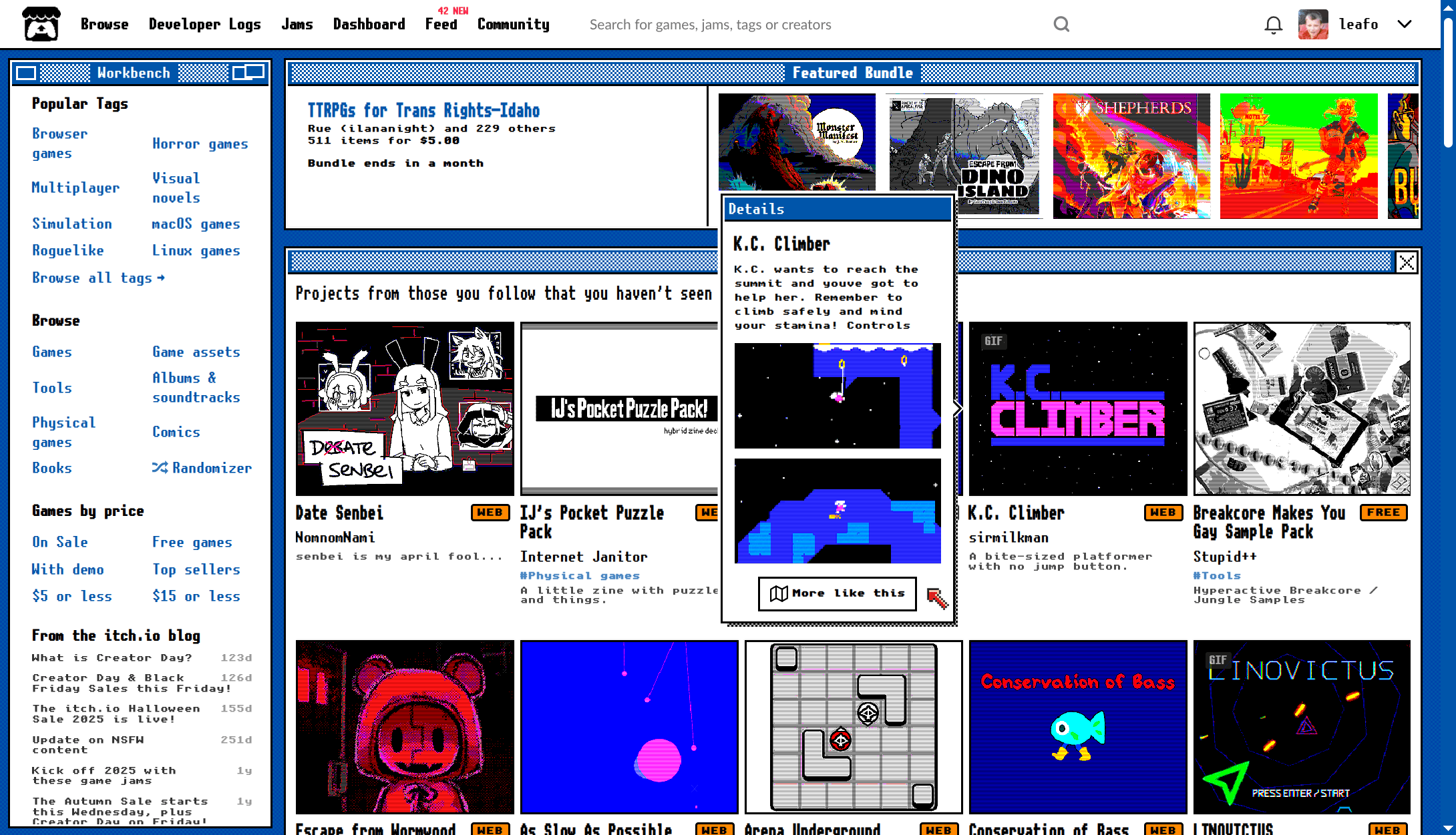
The "Ameyega" update was not merely a color swap; it was a complete architectural overhaul of the itch.io homepage. By utilizing custom fonts sourced from the UNSCII project—a collection of bitmap fonts designed for maximum readability in low-resolution environments—the developers effectively turned the browser into a terminal-style display.
The aesthetic choice was a calculated homage to the 8-bit and early BBS (Bulletin Board System) eras, characterized by high-contrast blocks, limited color palettes, and a rigid, grid-based layout. The announcement, posted by the itch.io team, was brief and lighthearted, acknowledging the delayed launch of the prank: "Happy April 1st. We’ll run this one a bit longer because I got it out late."
Despite its temporary nature, the site’s engineers opted to keep the mode accessible for a limited period via a hidden URL parameter (https://itch.io/?ameyega), allowing users to toggle the experience on or off even after the site reverted to its standard appearance. The team noted they would maintain this accessibility until the next major site-wide update.
Chronology of the Event
The timeline of the Ameyega mode was defined by a rapid escalation from novelty to controversy, and eventually, to a lingering debate about site functionality.
- April 1st (The Launch): The update went live, catching the majority of the user base off guard. Initial reactions were a mix of amusement and confusion, as the site’s usual visual hierarchy was replaced by a retro-styled layout.
- April 1st–2nd (The Peak of Discourse): As users navigated the new design, the limitations of the layout became apparent. While many praised the "charm" and "nostalgia" of the font and grid system, others reported significant friction in basic site navigation.
- April 2nd–3rd (Technical Hurdles): Reports emerged regarding compatibility issues, specifically concerning the site’s "Dark Mode" settings. Users noted that the Ameyega theme frequently overrode or broke existing CSS configurations, leading to unreadable text blocks and inaccessible menus.
- Post-Event (The Legacy): As the site returned to its default state, the discussion shifted from the prank itself to the broader implications of site updates, with many users demanding that itch.io provide more granular control over site themes in the future.
Accessibility and User Experience: A Critical Analysis
The most significant takeaway from the Ameyega experiment was the tension between aesthetic novelty and functional accessibility. While the itch.io team viewed the update as a lighthearted creative exercise, a portion of the user base found it exclusionary.
Accessibility advocates within the community pointed out that for users with visual impairments or those relying on screen readers, the sudden, drastic change in UI layout created significant barriers. One user, who identified as disabled, expressed intense frustration, stating, "I can’t watch this! How do you get this crap off?" This comment underscores the responsibility that major digital platforms hold; even for a temporary joke, the fundamental usability of the site is paramount.
Conversely, others found the high-contrast, terminal-style design refreshing. Several users noted that the layout was actually easier to read than the standard modern "white-space-heavy" design. "Please make an option to keep this, it’s so much easier to read for me," one user commented, suggesting that the "Ameyega" style could be a viable candidate for a permanent, optional accessibility theme.
The "Dark Mode" Controversy
A recurring theme in the community response was the instability of the site’s Dark Mode during the transition. For many, the implementation of Ameyega mode caused a cascading failure in the site’s CSS, forcing a bright, high-contrast theme onto users who had specifically configured their browsers for a darker, low-light experience.
The friction here was twofold. First, there was the technical failure of the theme-switching mechanism, which prevented users from reverting to their preferred viewing mode. Second, there was the frustration of feeling ignored. When a platform as central to the indie dev ecosystem as itch.io alters its UI, it disrupts the workflow of developers who rely on the platform for business, portfolio management, and community engagement. As one user noted, "It’s hurting my eyes… from the perspective of having a professional home page, the standard one is better."
Implications for Future Site Development
The "Ameyega" event serves as a microcosm for the challenges of managing a massive, community-driven platform. The feedback gathered from the event has revealed three distinct takeaways for the development team:
1. The Demand for Customization
The high volume of requests to "keep" the Ameyega mode suggests that users are hungry for more control over their environment. The community’s positive response to the retro font and grid-based layout indicates that a "Legacy Mode" or a collection of optional themes could significantly improve user satisfaction.
2. The Limits of "Pranking"
While the developer community is generally known for its playful spirit, the feedback suggests that the line between a "fun" update and a "broken" update is thin. Future experiments would likely benefit from an "opt-in" structure rather than a forced site-wide deployment. By allowing users to toggle experimental themes on or off, itch.io could maintain its playful identity without compromising the accessibility of its core services.
3. Community Engagement and Communication
The comments section on the update post became a lightning rod for broader complaints about the platform, including long-standing issues regarding community engagement and the ability to post on game pages. This highlights a classic platform-management dilemma: when an update (even a minor one) draws attention, users will use that space to address deep-seated grievances. The itch.io team’s willingness to engage—even by simply keeping the post open for discussion—is a testament to their community-centric philosophy, yet it also underscores the need for more robust channels for reporting technical issues.
Conclusion: Lessons from the Pixels
The Ameyega mode experiment was a polarizing, vibrant moment in the history of itch.io. It succeeded in its primary goal of injecting character and nostalgia into the digital space, proving that the platform is not merely a utility but a living community.
However, the event also underscored the necessity of robust UX design. Even in the spirit of play, the needs of the community—specifically regarding accessibility, customization, and reliability—must remain the bedrock of any update. Whether the "Ameyega" style returns as a permanent, optional theme remains to be seen. If nothing else, the experiment proved that the itch.io community is deeply invested in the look, feel, and future of their home. By listening to the feedback from this April Fools’ day, the platform has a unique opportunity to evolve from a static storefront into a more personalized, inclusive, and user-driven ecosystem.