The Art of Conciseness: Enhancing Digital Accessibility Through Semantic Precision
In the evolving landscape of web development, the pursuit of accessibility is no longer merely a legal compliance requirement; it is a fundamental pillar of user experience (UX) design. As digital interfaces become increasingly complex, developers and content creators are tasked with the challenge of ensuring that information is equally accessible to all users, including those who rely on assistive technologies such as screen readers.
A growing body of discourse among web accessibility experts suggests that the path to a truly inclusive web lies not in adding more descriptive labels, but in stripping away the redundant "noise" that can hinder the experience for users of assistive technology. Recent insights from industry professionals, such as Mark Underhill, have highlighted a critical, often overlooked aspect of web semantics: the unnecessary inclusion of category-defining terms in ARIA labels and alt text.
Main Facts: The Redundancy Trap
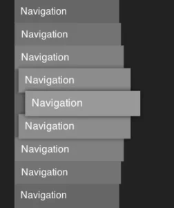
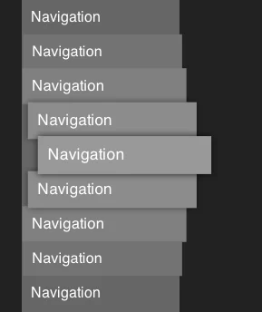
At the heart of the current debate is the usage of redundant terminology within HTML5 landmark roles and attributes. When a developer wraps a site’s menu in a <nav> tag, the browser and screen reader already identify the region as a navigation landmark. Consequently, labeling that element as "Navigation" results in the screen reader announcing, "Navigation, Primary navigation."
This phenomenon, while seemingly minor, creates an auditory clutter that can significantly degrade the browsing efficiency for users who rely on screen readers. When a user navigates a page, they are looking for specific content; repetitive, tautological labels force them to process redundant information, turning a simple navigation task into a repetitive exercise in listening to self-evident facts.
This principle extends far beyond navigation labels. It is a core tenet of accessible design that if a semantic element already conveys the nature of the content, the descriptive text should focus on the unique identity of that content, rather than its category.
Chronology: The Evolution of Accessibility Best Practices
The evolution of these standards has moved from "more is better" to "less is more."
- The Early Web (1990s–2000s): Accessibility was largely an afterthought. Alt text was often sparse, and semantic structure was minimal.
- The Rise of ARIA (2010s): With the introduction of Accessible Rich Internet Applications (ARIA), developers were given powerful tools to make complex web applications accessible. However, this period also saw the "over-labeling" phenomenon, where developers, in an effort to be helpful, began applying verbose labels to almost every interactive element.
- The Modern Semantic Shift (2020s–Present): A consensus has emerged among accessibility advocates that the misuse of ARIA—specifically adding descriptive labels to elements that are already semantically defined—is detrimental. Experts like Mark Underhill and platforms like Piccalilli have begun championing the "less is more" approach, focusing on cognitive load reduction as a primary accessibility metric.
Supporting Data: Cognitive Load and Screen Reader UX
The importance of this shift is grounded in the cognitive load theory as applied to assistive technology. When a screen reader user visits a webpage, they often use keyboard shortcuts to jump between landmarks. If every landmark is redundantly labeled, the user must listen to a significantly higher number of syllables to identify where they are on the page.
The Impact of Alt Text Length
Research into alt text optimization consistently indicates that users prefer efficiency. While early guidance suggested that alt text should be descriptive enough to replace the image, contemporary standards suggest that context is king. If an image is a decorative element, it should be hidden from screen readers entirely. If it is functional, the alt text should describe its function, not the medium.
A common mistake cited by accessibility audits is the inclusion of "image" or "photo" in alt text. For instance, an alt tag reading "image of a dog running in the park" is inefficient compared to "dog running in the park." The screen reader software already informs the user that the element is an image; stating it again is redundant and wastes the user’s time.
Official Responses and Expert Consensus
Industry experts are increasingly vocal about the need for standardized, succinct labeling. The consensus is that accessibility is not about volume of description, but about the quality of information.
"There’s no need to include the word ‘navigation’ in your nav labels," writes Mark Underhill. "It’s not the end of the world, but it is unnecessarily repetitive."
This sentiment is echoed by those who maintain the Web Content Accessibility Guidelines (WCAG). While the guidelines themselves do not explicitly forbid the word "navigation" in labels, they emphasize the principle of "Minimize Cognitive Load." By removing redundant identifiers, developers adhere to the spirit of the WCAG guidelines, which prioritize user efficiency and clarity above all else.
Furthermore, CSS-Tricks and other developer-centric platforms have hosted extensive discussions on the "novel-length" problem. Long, descriptive strings in alt text or aria-labels can cause screen reader users to lose their place or become frustrated by the length of time it takes to parse an element. The recommendation is clear: keep labels succinct, descriptive, and functional.
Implications for Future Development
The implications for web designers and developers are significant. Moving forward, the focus must shift from "checking boxes" to "refining the experience."
1. Training and Workflow Adjustments
Developers must be trained to recognize the semantic value of the tags they use. If a developer uses a <button> element, they do not need an aria-label that says "Button to submit form." The screen reader will announce "Submit form, button." Understanding the browser’s native announcements is the first step toward better accessibility.
2. The Role of Content Strategy
Content writers and UX designers must collaborate to ensure that labels are not just accessible, but intuitive. This involves auditing site navigation and image descriptions to remove redundant terminology. It requires a shift in mindset: seeing the screen reader not as a tool that needs to be fed information, but as a navigator that needs to be guided efficiently.
3. Automated Auditing vs. Manual Review
While automated accessibility tools can catch missing alt text, they often fail to catch the nuance of redundant text. An automated tool will see that an aria-label exists and mark it as "passing." However, only a human audit or a user test can reveal that the label is redundant and annoying. Therefore, manual accessibility testing must remain a priority in the development lifecycle.
Conclusion: The Path Toward Inclusive Design
The journey toward a fully accessible web is a process of constant refinement. By embracing the principle of conciseness, developers can create a more inclusive environment that respects the time and cognitive bandwidth of all users.
Removing the word "navigation" from a navigation label or dropping the word "image" from an alt tag may seem like a minor adjustment, but in the aggregate, these changes represent a profound shift in how we approach digital accessibility. It is a move away from the performative nature of compliance and toward a design philosophy rooted in empathy and efficiency.
As we continue to build the digital infrastructure of the future, let us remember that the most effective accessibility features are often the ones that are invisible—those that allow the user to reach their destination with the least amount of friction possible. In the world of screen reader navigation, silence is often just as important as the words we choose to include. By reducing clutter, we provide more than just accessibility; we provide a seamless, enjoyable, and equitable user experience for everyone.