
The Evolution of Motion: Mastering Scroll-Driven Animations in Modern Web Design
In the fast-paced world of front-end development, the line between static documents and interactive digital experiences has blurred. Designers and developers are constantly seeking ways to inject life into the page—not through heavy JavaScript libraries, but through the native power of the browser. One of the most compelling trends emerging from this pursuit is the implementation of "opposing column" animations, where content moves in divergent directions as a user scrolls. While once a complex endeavor requiring heavy performance overhead, this effect is now accessible through modern CSS features.
Main Facts: The Power of Native Scroll-Driven Animations
At its core, the opposing column effect relies on the principle of synchronization between the user’s scroll position and the movement of DOM elements. By leveraging CSS scroll-driven animations, developers can now trigger visual transitions that are directly bound to the scrollbar’s progress.
The primary technical innovation here is the animation-timeline property. Previously, creating this type of interactive parallax required JavaScript scroll listeners, which often led to performance bottlenecks, jank, or "layout thrashing." By moving this logic into the browser’s rendering engine, developers ensure that the animations are performant, fluid, and battery-efficient. The technique described here utilizes a flex-based layout wrapped in a parent container, using pseudo-elements to create a "masked" effect that allows items to fade seamlessly into view.
Chronology: A Step-by-Step Implementation
Building this experience is a modular process that begins with a clean, semantic HTML structure and concludes with precise CSS orchestration.
Phase 1: The Structural Foundation
The markup is intentionally minimalist. By using a parent container (.opposing-columns) and three distinct child columns, we establish a clean grid-like hierarchy. This simplicity is vital; by keeping the HTML lean, we allow the CSS to act as the primary engine for layout and behavior.
Phase 2: Styling and The Masking Illusion
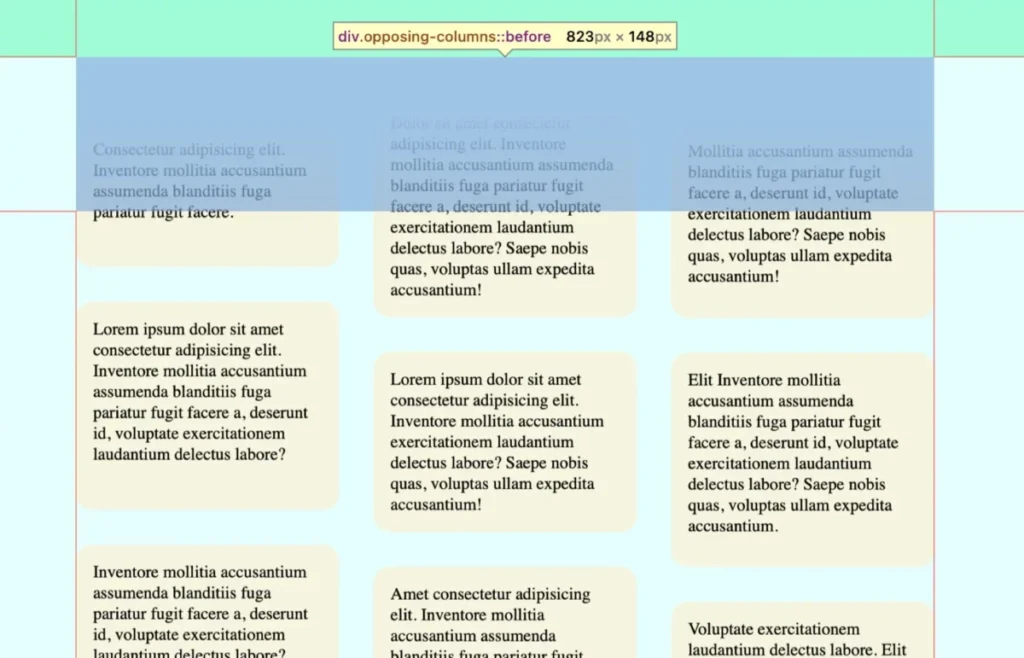
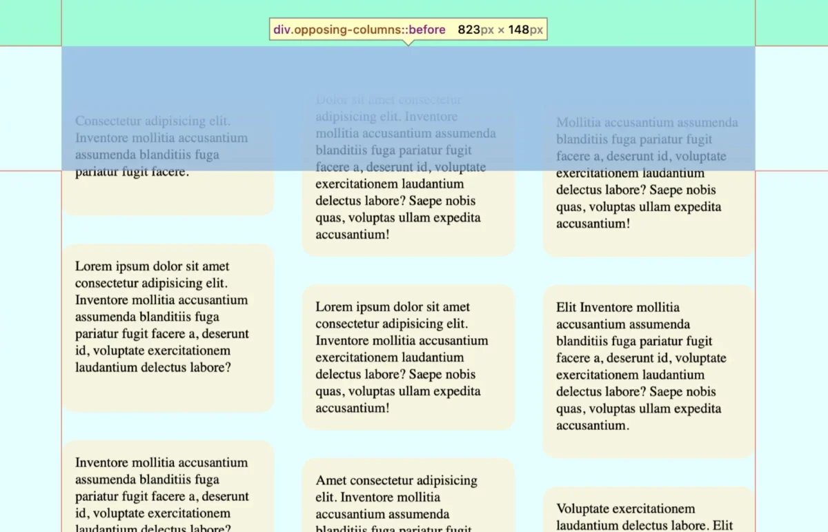
A critical design requirement for this effect is the "disappearing" act—the items must appear to emerge from nothing and fade into nothing. This is achieved by setting a background-color on the root document and applying that same color to the :before and :after pseudo-elements of the parent container. By creating a linear-gradient that transitions from the background color to transparent, the pseudo-elements act as physical "masks" that hide the contents of the columns as they exit the viewport.
Phase 3: Defining the Animation Logic
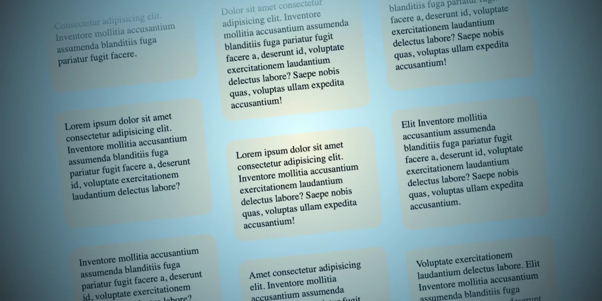
The technical "magic" occurs through the view() function. Unlike traditional CSS animations that rely on time-based durations, view() tracks the position of an element within the "scrollport." By setting the animation-range to entry 0% cover 100%, we tell the browser to begin the movement exactly as the item enters the parent container and conclude it as it leaves.
Supporting Data: Performance and Browser Compatibility
For developers implementing this, browser support remains the primary metric for success. As of the current development landscape, Chrome and Safari lead the implementation of animation-timeline.
- Performance Metrics: By offloading scroll calculations to the browser’s compositor thread, this method avoids the main-thread congestion typically caused by
onscrollevent listeners in JavaScript. - Accessibility Considerations: The implementation strictly adheres to the
prefers-reduced-motionmedia query. It is a fundamental best practice to ensure that animations can be disabled entirely for users who experience vestibular discomfort, ensuring that the visual flair does not compromise the usability of the site. - Fallback Strategies: Given that Firefox is still in the process of rolling out full support for these specifications, the use of
@supports (animation-timeline: view())is highly recommended. This allows developers to provide a sophisticated, scroll-linked experience to modern browser users while falling back to a static or simpler CSS-based layout for others.
Official Responses and Industry Consensus
The web development community has responded to the introduction of scroll-driven animations with cautious excitement. CSS Working Group members and lead maintainers of major browser engines view these features as the next logical step in the "CSS-ification" of web interactions.
The consensus among industry experts—from the contributors at CSS-Tricks to independent design studios—is that these tools represent a democratization of high-end animation. Where previously only teams with dedicated motion designers and JavaScript engineers could achieve "Apple-esque" scroll transitions, the barrier to entry has now been lowered to basic CSS proficiency. However, a recurring note of caution from the community is the risk of "animation fatigue." There is an industry-wide agreement that such effects should be used to guide user attention or provide subtle delight, rather than to distract from the primary content or utility of the page.
Implications for Future Design Trends
The successful implementation of opposing scroll columns has significant implications for the future of UI design:
1. The Decline of "Scroll-Jacking"
For years, the industry was plagued by "scroll-jacking"—scripts that hijacked the browser’s native scroll behavior to force animations. The new CSS standard renders these intrusive scripts obsolete. By keeping the scroll behavior native, the browser retains control over the experience, resulting in a more predictable and user-friendly interaction.

2. Performance-First Design
As these native features gain traction, we are likely to see a shift toward "Performance-First Design." Designers will no longer need to fear the performance costs of adding motion. This allows for a more fluid, organic integration of visuals that feel like a natural extension of the document, rather than an overlay.
3. Responsive Motion
The approach detailed in this article emphasizes the use of media queries to restrict complex motion to larger screens. This is a critical implication for responsive design: motion is now treated as a "progressive enhancement." On smaller devices, where screen real estate is limited and performance is more sensitive, the design gracefully reverts to a standard, readable format.
4. A New Standard for Interaction Design
As developers experiment with scroll-driven animations, we can expect to see a surge in unconventional layouts. From horizontal scrolling galleries to staggered, multi-directional column layouts, the standard for what constitutes an "interactive" webpage is being rewritten.
Conclusion: Looking Ahead
The opposing column animation is more than just a clever visual trick; it is a testament to how far CSS has evolved. It demonstrates that with the right combination of modern properties—flexbox, grid, and view() timelines—developers can create complex, performant, and accessible motion experiences with only a few lines of code.
As browser support continues to stabilize across the board, we encourage designers and developers to experiment with these tools. Whether you are building a landing page for a creative portfolio or an interactive narrative, the ability to weave motion into the very fabric of the scroll is a powerful addition to the modern web developer’s toolkit. The question is no longer whether we can make the web move, but rather, how we can use that motion to make the web a more engaging, efficient, and beautiful place to browse.
What will you build next? The scroll is in your hands.








