The Future of Motion: Chrome Pioneers Scroll-Triggered Animations
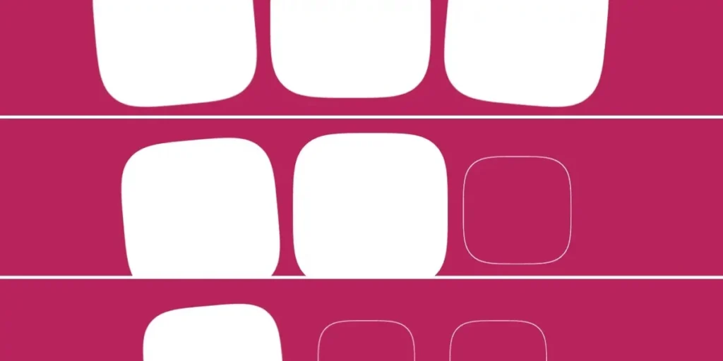
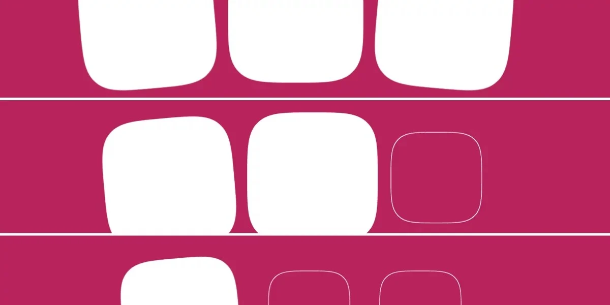
In a significant advancement for web interactivity, Google has officially integrated scroll-triggered animations into Chrome 146. This milestone marks the first time a major browser has natively implemented a mechanism that decouples animation playback from the scroll position, effectively bridging the gap between traditional CSS keyframes and the dynamic responsiveness previously reserved for complex JavaScript event listeners.
For web developers, this represents a fundamental shift. While "scroll-driven" animations—where an element’s animation is locked to the exact pixel-by-pixel progress of the scrollbar—have existed for some time, scroll-triggered animations operate differently. They behave more like an intelligent CSS version of the Intersection Observer API: once a specific scroll threshold is crossed, the animation fires for its defined duration, independent of the user’s scrolling speed.
The Technical Evolution: From Driven to Triggered
To understand the weight of this update, one must distinguish between the two primary ways browsers handle motion. In a scroll-driven scenario, using properties like animation-timeline: scroll(), the animation is a slave to the scrollbar. If the user stops scrolling, the animation freezes; if the user scrolls backward, the animation plays in reverse. It is a synchronized, continuous state.
Scroll-triggered animations, however, utilize the new timeline-trigger property. By defining a dashed identifier (an ident) and a range—such as view() entry 100%—developers can instruct the browser to "fire and forget" an animation. The animation runs for its set duration (e.g., 300ms) once the element meets the designated viewport criteria.
This decoupling is a massive win for performance and maintainability. Previously, achieving this effect required heavy JavaScript observers that often struggled with layout thrashing or performance bottlenecks. Now, this logic is handled entirely by the browser’s rendering engine.
Chronology: The Road to Native Triggers
The path to Chrome 146 was paved by years of CSS Working Group discussions regarding the limitations of standard CSS animations.
- Pre-2023: Developers relied heavily on third-party libraries like GSAP or custom Intersection Observer scripts to animate elements as they entered the viewport.
- 2024: The introduction of Scroll-Driven Animations (SDA) provided the foundation, allowing developers to link animation progress to scroll containers. However, the community quickly realized that not every animation should be "driven." Sometimes, you simply want a fade-in effect to trigger once an element appears.
- Q1 2026: Google Chrome engineering teams began prioritizing the
animation-triggersspecification, aiming to provide a declarative way to handle discrete, time-based events tied to scroll states. - April 2026: Chrome 146 is released, officially shipping support for
timeline-triggerandanimation-triggerproperties, marking the first browser engine implementation of this standard.
Dissecting the Implementation
The implementation relies on three distinct pillars: the animation declaration, the timeline-trigger condition, and the animation-trigger settings.
1. Defining the Trigger
The timeline-trigger property acts as the "when." By setting timeline-trigger: --trigger view() entry 100% exit 0%;, developers define exactly when the animation should engage. The entry 100% syntax ensures the animation only starts once the entire element is fully inside the viewport, while exit 0% dictates when the trigger should reset.
2. Controlling the Action
Once the trigger is defined, the animation-trigger property dictates the "how." Keywords such as play-forwards, play-backwards, and play-once provide granular control over the element’s behavior.
For instance, the play-once keyword creates a "lock-in" effect. If you want a headline to fade in once and stay there, this is the definitive method. Conversely, play-forwards combined with play-backwards allows for elegant UI transitions where elements gracefully reverse their animations if the user scrolls back up, preventing the jarring "flashing" effect common in earlier CSS transition attempts.
Supporting Data and Advanced Patterns
The true power of this feature lies in its ability to handle complex, staggered animations without the need for manual indexing in JavaScript. By utilizing modern CSS functions like sibling-count() and sibling-index(), developers can create sophisticated, cascading entry effects that perform with native-level efficiency.
Consider a grid of cards. By calculating a stagger interval—--stagger-interval: calc(300ms / sibling-count());—developers can define an animation delay based on the card’s position in the DOM. This results in fluid, professional-grade motion that feels cohesive across the entire page, all while keeping the CSS declaration block remarkably slim.
The Role of Animation Actions
The CSS Working Group has provided a robust suite of keywords for <animation-action>, which allows for conditional logic:
| Action | Effect |
|---|---|
play-forwards |
Animates 0% to 100%. |
play-backwards |
Animates 100% to 0%. |
play-once |
A "one-and-done" execution. |
pause |
Freezes animation state. |
reset |
Returns animation to the 0% state. |
Official Perspective and Industry Implications
The consensus among web standard advocates is that this is a "double-edged sword." While the capability is undeniably powerful, it introduces a new layer of complexity to the CSS specification.
"We are moving toward a web where motion is treated as a first-class citizen," says one lead browser engineer. "However, the challenge is ensuring that developers do not over-animate. The goal of these tools is to enhance user experience, not to create a ‘noisy’ web environment where every element is constantly shifting based on scroll position."
The implications for the broader web ecosystem are significant:
- Performance: By moving this logic from the JavaScript main thread to the browser’s compositor thread, developers can expect smoother frame rates and lower CPU usage on mobile devices.
- Accessibility: Because these are native CSS properties, they respect the user’s
prefers-reduced-motionmedia query by default, provided developers implement their@keyframeswith accessibility in mind. - Design Systems: Design systems can now encapsulate complex entrance animations within shared CSS tokens, ensuring that "scroll-in" effects are consistent across an entire enterprise application.
Final Thoughts: Is It Ready for Production?
While Chrome 146 has set a new precedent, developers must weigh the risks of early adoption. As with all new CSS features, cross-browser compatibility remains the primary hurdle. Until Firefox and Safari implement these specifications, developers will need to rely on feature queries (@supports) or provide meaningful fallbacks.
Furthermore, the learning curve is steep. Mastering the interplay between timeline-trigger ranges, animation-fill-mode, and the various <animation-action> keywords requires a mental shift from "document-based" design to "time-and-scroll" design.
In conclusion, scroll-triggered animations represent a maturation of the web as a platform. They provide the precision of JavaScript with the performance of CSS. While it may take time for the developer community to fully embrace the complexity of the specification, the days of jittery, script-heavy scroll animations are numbered. Chrome 146 has provided the toolset; now, the design community must determine the best ways to wield it.