
The Silent Efficiency: Why Redundancy in Accessible Web Design Hurts the User Experience
In the evolving landscape of digital accessibility, the goal is rarely to add more, but rather to refine what is already there. A recent discussion sparked by developer Mark Underhill has brought to light a subtle but pervasive issue in web development: the inclusion of redundant terminology within ARIA labels and HTML structures. When developers label a navigation region as "Primary Navigation," they may believe they are providing clarity. In practice, however, they are often creating a stutter in the user experience for those relying on screen readers.
This article explores the nuances of accessible labeling, the importance of succinctness, and why the "less is more" philosophy is the cornerstone of inclusive design.
Main Facts: The Pitfalls of Redundant Labeling
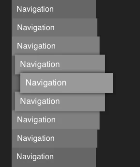
The core of the issue lies in how assistive technologies, such as screen readers (e.g., NVDA, JAWS, or VoiceOver), interpret semantic HTML and ARIA (Accessible Rich Internet Applications) labels. When a developer wraps a menu in a <nav> tag and assigns it an aria-label="Primary Navigation," the screen reader software parses this information literally.
When a user navigates to this region, the screen reader announces: "Navigation, Primary navigation."
For a sighted user, the word "navigation" is visually implied by the context of a menu. For a screen reader user, the announcement is a repetitive, unnecessary hurdle. The browser and the screen reader already identify the <nav> element as a navigation landmark. Adding the word "navigation" to the label is redundant, effectively forcing the user to listen to the same word twice in rapid succession.
The "Alt-Text" Parallel
This phenomenon is not unique to navigation menus. It is frequently observed in the use of alt text for images. A common mistake among novice content managers and developers is to describe an image by starting with "Image of…" or "Picture of…".
Because the browser already communicates the role of the element as an <img> tag, the screen reader will naturally inform the user, "Image: [Description]." If the alt text reads "Image of a sunset," the screen reader announces, "Image: Image of a sunset." This adds noise to an interface that should prioritize brevity and clarity.
Chronology: The Evolution of Accessible Web Standards
The journey toward modern accessibility standards has been a long transition from "coding for the visual" to "coding for the semantic."
- Pre-2010s: Accessibility was often treated as an afterthought or a "bolt-on" feature. Developers focused on visual layout, often ignoring how screen readers parsed the DOM (Document Object Model).
- The Rise of WCAG: As the Web Content Accessibility Guidelines (WCAG) became the industry benchmark, the focus shifted to meaningful structure. The introduction of HTML5 landmarks (
<nav>,<main>,<header>,<footer>) replaced many of the clunky, redundant ARIA roles that developers had been using to "hack" accessibility. - The Modern Era: Today, the community has moved past merely making things "accessible" to making them "efficient." Leading voices in the web development community—such as Mark Underhill and those contributing to platforms like Piccalilli—have begun advocating for a "minimalist" approach to ARIA, arguing that well-structured HTML is inherently more accessible than poorly labeled ARIA.
Supporting Data: Why Succinctness Matters
The cognitive load placed on screen reader users is significantly higher than that of sighted users. A sighted user can scan a page in seconds, ignoring headers and footers to find the main content. A screen reader user, however, must process information linearly or navigate through a list of landmarks.
The Cost of Verbosity
Research into UX accessibility suggests that "interaction friction" is a primary cause of abandonment for users with disabilities. When an interface is cluttered with redundant labels:
- Increased Time-to-Task: Users spend more time listening to labels and less time engaging with the content.
- Cognitive Fatigue: Processing repeated, unnecessary words creates a "clutter" that makes it harder to identify the actual content of the page.
- Loss of Trust: When an interface feels poorly optimized, users may assume the entire site lacks accessibility, leading to a loss of confidence in the platform.
Industry experts emphasize that accessible names should be descriptive enough to distinguish the element from others on the page, but short enough to be digestible. If there is only one navigation menu on the page, it often needs no label at all. If there are two—such as a "Global Navigation" and a "Secondary Sidebar Navigation"—the labels should be distinct but concise, focusing on the destination rather than the type of element.
Official Responses and Industry Standards
The consensus among accessibility advocates is clear: Let the browser do the heavy lifting.
The World Wide Web Consortium (W3C) standards explicitly advise against redundant labeling. In the documentation for ARIA, it is noted that the role of an element is already part of the accessibility tree. By reinforcing that role in the label, developers are essentially shouting into an echo chamber.
Expert Insights
Developers like Andy Bell (founder of Piccalilli) have frequently highlighted the "accessible name length" issue. In his analysis of faux-nested interactive controls, he notes that while accessibility is the goal, "accessibility theater"—the act of adding labels that look good in a code audit but perform poorly in practice—is a trap.
"It doesn’t have to be a novel," writes one developer on CSS-Tricks regarding alt text. The same principle applies to ARIA labels. If a button’s purpose is to "Submit," there is no need for an aria-label that says "Submit form button." The button element is already identified as a button, and the text "Submit" provides the necessary context.
Implications: The Future of Inclusive Design
The move toward cleaner, more succinct code has profound implications for the future of the web.
1. Improved Maintainability
When developers stop over-labeling, the codebase becomes leaner. Managing aria-labels can become a maintenance nightmare when those labels are unnecessarily complex. By relying on native HTML5 elements and simple, descriptive text, developers reduce the risk of labels becoming outdated or contradictory.
2. A Shift in Developer Mindset
The trend encourages developers to stop "fixing" things that aren’t broken. Instead of layering ARIA over every element, the industry is pushing for "HTML-first" development. If a developer uses a <button> tag instead of a <div> with an onclick listener, they don’t need to add role="button". The element is already accessible. By extension, if they use a <nav> tag, they don’t need to describe it as navigation.
3. Enhancing User Autonomy
Ultimately, these changes are about respect. When we design for accessibility with precision, we show respect for the user’s time and cognitive resources. We stop treating screen reader users as individuals who need "extra" information and start treating them as users who benefit from the same clean, intuitive, and efficient design as everyone else.
Conclusion: The "Less is More" Mandate
As the digital landscape becomes increasingly complex, our approach to accessibility must remain grounded in simplicity. The lessons provided by experts like Mark Underhill are not merely technical tips; they are a fundamental shift in how we view the user experience. By trimming the fat—removing the redundant "navigation" labels, stripping the "image of" from our alt text, and keeping our accessible names succinct—we move closer to a web that is truly inclusive.
The goal of accessibility is to disappear into the background, providing a seamless experience where the user interacts with the content, not the interface. By practicing "thoughtful omission," we ensure that the technology powering the web serves the user, rather than standing in their way. In the end, the best accessibility is often the accessibility you don’t even notice—because it works exactly as it should.