The Web Development Digest: Innovations, Standards, and the Future of the Browser

Welcome to What’s !important #14. While the cadence of stable browser releases has slowed over the past fortnight, the underlying ecosystem of web development is anything but stagnant. From experimental CSS functions that push the boundaries of design to deep architectural shifts in how we approach cross-platform functionality, the last two weeks have provided a treasure trove of innovation. In this edition, we move beyond the headlines to analyze the technical implications of recent developments in CSS, Web Audio, and browser standards.
Main Facts: A Snapshot of Current Innovation
The current landscape of web development is characterized by a push toward "native" capabilities—features that allow developers to achieve complex results with minimal overhead. The highlights include:
- Hyperblam: A radical approach to Web Audio that leverages Web Components to bypass JavaScript for music generation.
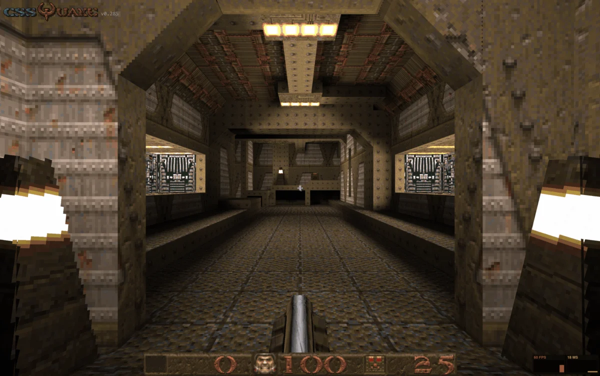
- CSS Quake: A demonstration of how modern CSS architecture, via PolyCSS, can handle the rendering demands of legacy gaming.
- The Rise of
field-sizing: A new Baseline standard that brings responsive, content-aware sizing to<select>elements. - Modern Theming: A convergence of
@property,light-dark(), andcontrast-color()that defines the new gold standard for CSS-based design systems.
Chronological Overview: Two Weeks in Web Standards
The development cycle does not move in a straight line, but the last fourteen days have seen a distinct progression from playful experimentation to serious standardization.
Early Week 1: The Playful Frontier
The period opened with a focus on "impossible" web feats. Heydon Pickering’s Hyperblam captured the community’s imagination by proving that the Web Audio API can be harnessed through HTML-driven Web Components, effectively decoupling music production from heavy JavaScript reliance. Shortly thereafter, the team at Layoutit released CSS Quake. Building on the momentum of the recently released CSS DOOM, this project uses PolyCSS to port the 1996 classic Quake into the browser using pure CSS rendering techniques.
Mid-Period: Technical Deep Dives
The focus then shifted toward practical implementation. Temani Afif published a comprehensive guide on CSS Gap Decorations, exploring the untapped aesthetic potential of the space between grid and flex items. Simultaneously, Polypane released an exhaustive study on the CSS random() function. Although currently restricted to Safari, the experiments—ranging from bokeh effects to animated auroras—demonstrate how random() could fundamentally change how we build generative art on the web.
Late Period: Standardization and Strategy
The final stretch was defined by administrative and strategic discourse. Manuel Matuzović finalized the conversation around field-sizing: content, noting its arrival in Firefox 152. Simultaneously, Bramus reignited the debate on platform parity, arguing that forcing identical experiences across desktop, mobile, and secondary input devices is a design anti-pattern. The period concluded with the Web Engines Hackfest in Galicia, which shifted the focus from specific features to the long-term health and direction of web engines.

Supporting Data and Technical Implications
The Mechanics of field-sizing: content
The adoption of field-sizing: content marks a significant improvement in UI/UX accessibility. Historically, the <select> element has been a rigid, difficult-to-style component that often broke grid layouts when the selected option was significantly longer than the input container.
By setting field-sizing: content, developers now allow the browser to calculate the width of the element based on the selected option’s text length. A critical edge case noted by developers is the interaction with the size attribute. When size is used to create a multi-line list box, field-sizing: content overrides the default behavior, forcing the display of all options. This requires a shift in how developers handle scrollable dropdowns to ensure they do not overflow their containers in unexpected ways.
The CSS Theming Ecosystem
Modern theming is no longer just about toggling a class on the <body> element. As Una Kravets outlined, we have entered an era of "declarative design systems." The combination of:
@property: Allowing for typed custom properties that can be animated.light-dark(): Simplifying color-scheme switching without media queries.contrast-color(): Dynamically calculating readable text colors against arbitrary backgrounds.@container style(): Applying styles based on the computed values of custom properties.
These tools, now all considered "Baseline," allow for themes that are not just "light" or "dark," but truly context-aware.
Official Responses and Industry Discourse
The discourse surrounding these updates highlights a growing consensus: the web is becoming less of a "one size fits all" medium and more of a fluid, adaptive environment.
The Platform Parity Debate
Bramus’s recent post regarding platform-specific functionality has resonated deeply with the developer community. The prevailing sentiment is that developers have spent too much effort fighting the platform to create "pixel-perfect" parity that, in reality, hampers the user experience. By embracing features like the Document Picture-in-Picture API or overscroll actions, developers can lean into what makes a specific device unique rather than treating it as a generic viewport.

Insights from the Web Engines Hackfest
The Web Engines Hackfest served as a reminder that behind every CSS property is a team of engineers negotiating the future of the web. Marina Aísa’s documentation of the event highlighted the necessity of face-to-face collaboration. The consensus from the event was clear: while accessibility and performance are paramount, the future of the web depends on cross-browser interoperability. The discussions in Galicia regarding accessibility suggest that future browser updates will focus more on "in-browser" assistance for users with disabilities, moving away from relying solely on author-provided ARIA labels.
Implications for Future Development
As we look toward the remainder of 2026, several clear trends emerge for the front-end developer:
- The Death of the "Polyfill-First" Mentality: With features like
random()and advancedcolorfunctions gaining ground, the reliance on massive JS-based libraries to simulate CSS behaviors is waning. The web platform is finally catching up to the design requirements that were once only possible through heavy scripting. - Design Systems as "Smart" CSS: The new theming standard means that developers should stop hard-coding hex values. By adopting
contrast-color()andlight-dark(), teams can build design systems that are inherently resilient to accessibility issues and theme changes. - Prioritizing Input Modality: Moving forward, "responsive design" must expand its definition. It is no longer just about the width of the screen; it is about the modality of the input. Websites of the future will be built to handle mouse, touch, voice, and keyboard input as distinct experiences rather than secondary fallbacks.
A Note on What’s Next
While the last two weeks have been relatively quiet in terms of stable browser releases, the "Quick Hits" indicate that this is merely the calm before the storm. With Chrome 150 shipping, we expect a flurry of new features related to advanced scroll-driven animations and more robust container query support.
The web is evolving. It is becoming more capable, more accessible, and—perhaps most importantly—more expressive. Whether you are using it to build a browser-based recreation of a 90s shooter or a highly accessible, fluid UI, the tools at our disposal are more powerful than they have ever been. Keep experimenting, keep breaking things, and we will see you in two weeks for the next installment of What’s !important.