
What’s !important: The Mid-Year Web Development Roundup
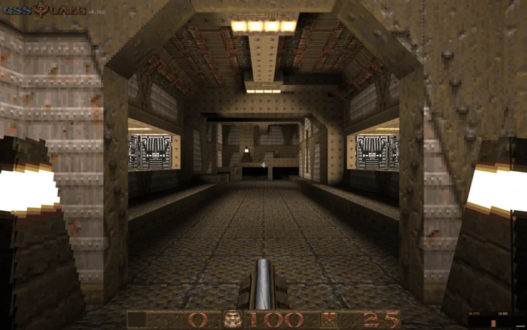
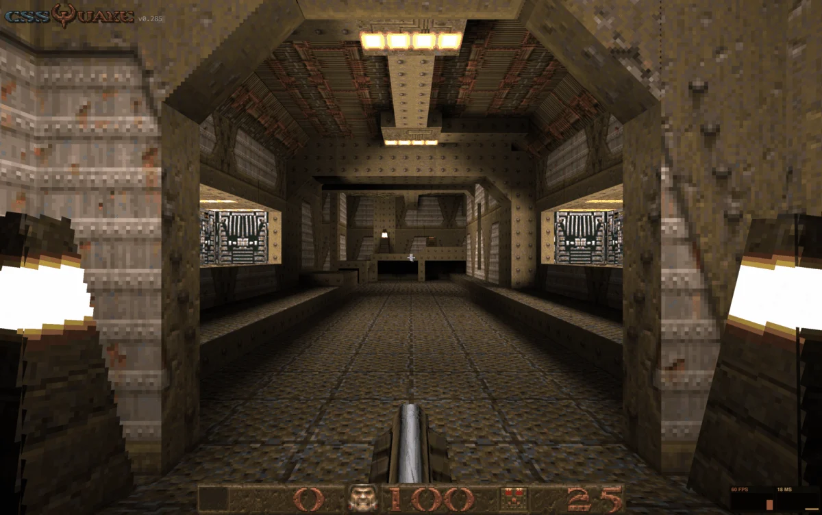
In the rapidly evolving landscape of web standards and browser technology, the past two weeks have been defined by a fascinating paradox: while major stable browser releases have been relatively sparse, the innovation occurring within the developer ecosystem has been nothing short of explosive. From the retro-inspired revival of classic gaming in the browser to the maturation of sophisticated CSS layout and theming specifications, the web platform is currently undergoing a period of intense creative experimentation.
This edition of What’s !important serves as a deep dive into the projects, specifications, and community discussions shaping the next iteration of the web.
Main Facts: The Intersection of Art and Architecture
The current state of the web is characterized by a "democratization of complexity." Developers are finding increasingly inventive ways to leverage existing APIs—like Web Audio and advanced CSS properties—to bypass traditional dependencies.
Key takeaways from this cycle include:
- Hyperblam: A shift toward HTML-driven audio, reducing reliance on heavy JavaScript frameworks.
- CSS Quake: A demonstration of how modern layout engines are pushing the limits of what was once considered "static" design.
- The Baseline Shift: New CSS features like
field-sizingandcontrast-color()have reached stable browser support, signaling a new era for accessible and fluid interface design.
Chronology of Developments
The last fourteen days have seen a rapid succession of releases and community discourse.
Week 1: Experimental Frontiers
The week opened with the emergence of Hyperblam, spearheaded by Heydon Pickering. By utilizing Web Components to interface with the Web Audio API, Pickering demonstrated that the browser’s declarative layer is more capable than previously assumed. Shortly thereafter, the development community shifted its focus to CSS Quake. Following the success of CSS DOOM, this port of the 1996 classic proved that CSS is no longer merely a tool for styling; it is an engine for rendering high-fidelity, interactive experiences.
Week 2: Standardization and Community
The second half of the fortnight was dominated by professional discourse. The Web Engines Hackfest in A Coruña, Galicia, served as a focal point for engineers to debate the future of web standards. Simultaneously, industry experts like Una Kravets and Bramus published critical insights into the modern theming stack and the necessity of platform-specific design, respectively.

Supporting Data: Innovations in CSS and Accessibility
The Power of random()
Polypane’s recent experiments with the random() function in CSS have opened a Pandora’s box of aesthetic possibilities. While currently limited to Safari, the potential for generating dynamic, non-repeating layouts—from falling petal animations to randomized polaroid stacks—suggests a future where web design feels less like a rigid grid and more like a fluid, organic environment.
Fluid Form Elements
The introduction of field-sizing: content represents a significant win for usability. As documented by Manuel Matuzović, this property allows <select> elements to automatically adjust their width to match the content of their selected <option>. This eliminates the need for arbitrary width declarations and ensures that UI elements remain legible regardless of the localized string length.
Modern Theming Stack
The industry is coalescing around a new standard for theming, built upon four pillars:
@property: Allows for the registration of custom properties with types, enabling smooth transitions for complex values.light-dark(): Simplifies the toggle between color schemes based on user system preferences.contrast-color(): Dynamically calculates the most readable text color against a background, a massive leap forward for automated accessibility.@container style(): Allows styles to be applied based on the state of parent elements, rather than just viewport dimensions.
Implications: The Death of "Pixel Perfection"
One of the most profound shifts in recent discourse is the move away from the "one-size-fits-all" design philosophy. Bramus recently challenged the industry to reconsider the assumption that websites must look and function identically across all platforms.
As we see the rise of Interest Invokers, Overscroll Actions, and the Document Picture-in-Picture API, the implication is clear: the web is becoming an adaptive medium. A user on a desktop with a high-precision mouse requires a fundamentally different interaction model than a user on a tablet with an assistive touch interface. Forcing a unified experience is not merely unnecessary; it is, in many cases, a detriment to usability.
By embracing platform-specific behaviors, developers can create more inclusive and performant experiences that respect the unique capabilities of the device in the user’s hand.
Insights from the Web Engines Hackfest
The Web Engines Hackfest highlighted that the future of the web is not just about new features, but about the people behind the standards. Marina Aaisa’s documentation of the event emphasized a recurring theme: the necessity of bridging the gap between browser implementation and human accessibility.

Discussions in A Coruña weren’t limited to technical specifications; they touched upon the environmental impact of web bloat and the ethical responsibility of developers to ensure that the web remains a tool for universal communication. The consensus was clear: browsers must evolve to provide better native hooks for accessibility tools, rather than leaving the burden entirely on the individual developer.
Official Perspectives and Future Outlook
While stable browsers like Chrome are preparing for upcoming iterations (such as the imminent arrival of Chrome 150), the community is looking toward "Quick Hits" and developmental builds to gauge the velocity of change.
The industry is currently in a "maturation phase." We are moving past the "wild west" of early CSS experiments into a period where these tools are becoming standardized, reliable, and accessible. The synergy between tools like contrast-color() and field-sizing demonstrates a clear trend: the browser is becoming more intelligent, doing the heavy lifting of layout and accessibility calculations that were once handled by complex JavaScript libraries.
A Call to Action for Developers
If there is a central theme to this cycle, it is that the developer’s role is shifting. As browsers adopt more powerful native features, the responsibility is moving from writing the logic to orchestrating the platform’s capabilities.
We encourage you to:
- Audit your current CSS: Identify where you are using JavaScript to solve problems that CSS can now handle natively.
- Embrace Fluidity: Start testing
field-sizingand responsive theming patterns to reduce code complexity. - Engage with Standards: Follow the discussions from events like the Web Engines Hackfest. The future of your workflow is being written in these rooms.
As we look toward the next two weeks, we anticipate a flurry of activity as Chrome 150 rolls out. The web platform is not just surviving; it is thriving, and the tools available to us today are more powerful than at any point in the last decade. Stay curious, keep experimenting, and don’t be afraid to break the mold—because, as the developers of CSS Quake have shown us, the browser is capable of far more than we ever dared to imagine.
See you in the next edition of What’s !important.








