Mastering Depth: A Comprehensive Guide to the CSS translateZ() Function
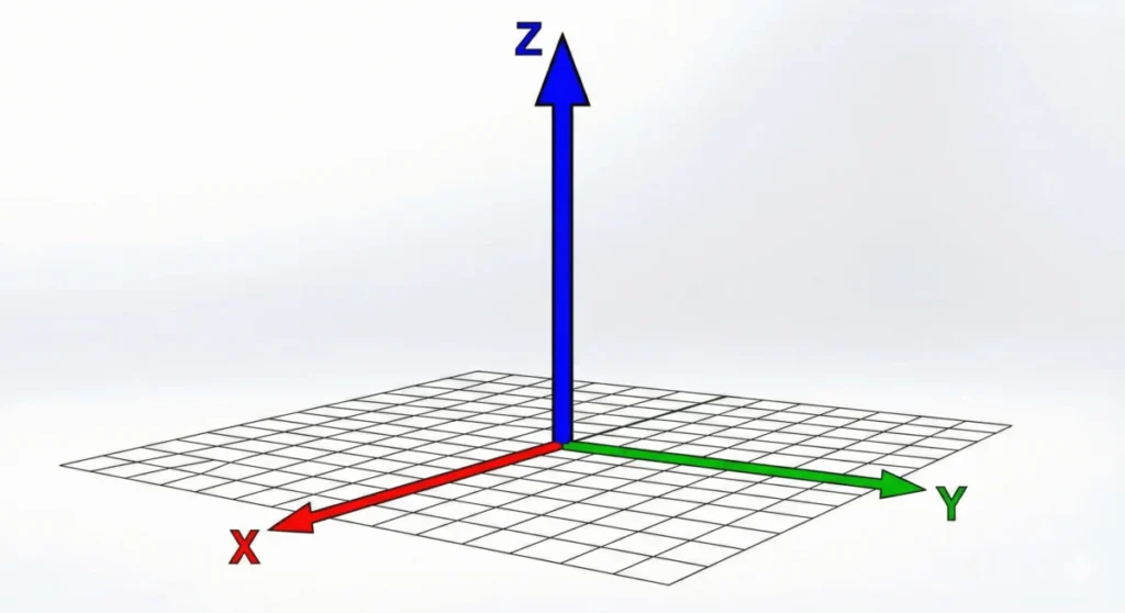
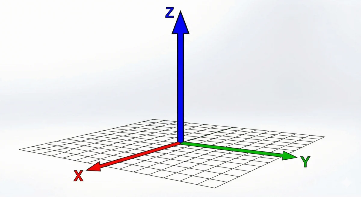
In the evolution of web design, the transition from flat, static layouts to immersive, three-dimensional interfaces represents one of the most significant leaps in user experience engineering. Central to this transformation is the CSS translateZ() function, a powerful tool within the CSS Transform Module Level 2 that allows developers to manipulate elements along the Z-axis. By moving elements closer to or further from the viewer, translateZ() breaks the constraints of the traditional two-dimensional screen, adding a tactile sense of depth to the digital canvas.
Main Facts: Defining the Z-Axis in CSS
The translateZ() function is a specific transform method designed to shift an element’s position in 3D space. While most developers are familiar with translateX() and translateY() for horizontal and vertical movement, translateZ() introduces the third dimension.
When you apply translateZ(100px) to an element, you are essentially pulling that object 100 pixels closer to the screen surface. However, a common point of confusion—and a frequent pitfall for newcomers—is the assumption that this function acts as a scaling tool. It does not. Because the object is moving closer to the viewer (the "camera" in 3D parlance), it appears larger due to the rules of perspective, but its actual dimensions remain unchanged.
For this function to have any visible impact, the browser must be informed that it is operating within a 3D environment. This is achieved through the perspective property or the perspective() function. Without a defined perspective, the browser flattens the Z-axis displacement, rendering the translateZ() call effectively invisible.
Chronology: The Evolution of 3D Transforms
The concept of 3D transforms in CSS did not emerge overnight. It arrived as part of the broader effort to bring sophisticated graphical capabilities to the web, minimizing the need for external assets like images or complex canvas-based animations.
- Early Web (1990s–2000s): Browsers were strictly 2D environments. Movement was limited to pixel-based offsets using absolute positioning.
- The Transform Era (2009–2012): With the introduction of CSS Transforms (Level 1), developers gained the ability to rotate, scale, and skew elements. While 2D transforms were revolutionary, they lacked depth.
- The 3D Specification (2012–Present): The CSS Transform Module Level 2 introduced the Z-axis. This allowed for hardware-accelerated rendering and a true 3D coordinate system, enabling developers to build "parallax" effects and complex UI components like rotating cards and spatial menus.
- Modern Standardization: Today,
translateZ()is a cornerstone of the CSS specification, fully supported by all modern rendering engines, ensuring consistent behavior across desktop and mobile devices.
Supporting Data: Understanding Perspective and Projection
To truly grasp how translateZ() behaves, one must understand the relationship between the viewer and the object.

The Role of Perspective
Perspective is the mathematical projection of 3D space onto a 2D plane. In CSS, the perspective property dictates the "depth" of the viewing frustum. A lower value (e.g., 300px) creates a more dramatic, wide-angle lens effect, where elements grow or shrink rapidly as they move along the Z-axis. A higher value (e.g., 2000px) creates a flatter, more orthographic look, where the Z-axis distance is less visually pronounced.
The perspective Property vs. perspective() Function
While they share a name, their application differs significantly:
perspectiveproperty: Applied to a container element. It establishes a 3D context for all children. This is the preferred method for building complex scenes.perspective()function: Applied directly within thetransformshorthand of a specific element. This is useful for isolating the perspective effect to a single item, though it can lead to inconsistent results if multiple elements are intended to share a single, unified 3D space.
The Power of preserve-3d
For nested elements to respect the 3D space of their parent, you must use the transform-style: preserve-3d property. Without this, the browser "flattens" the child elements into the plane of the parent, effectively negating any complex 3D stacking or rotation you might have implemented.
Official Technical Perspectives
According to the W3C CSS Transform Module Level 2 specification, translateZ() is defined as:
translateZ() = translateZ(<length>)
The technical documentation emphasizes that the function takes a single length argument. Positive values move the element toward the user (making it appear larger), while negative values move the element away (making it appear smaller).
Engineers at major browser vendors often note that translateZ() is more than just a visual tool; it is a performance optimization flag. By using the "Z-hack"—applying transform: translateZ(0)—developers can force an element onto its own "compositor layer." This allows the browser to offload the rendering of that element to the GPU (Graphics Processing Unit) rather than the CPU. This is particularly vital for preventing "flickering" or jittery animations, as it allows the GPU to manage the transition smoothly, resulting in a buttery-smooth 60 frames-per-second experience.

Implications for Modern Web Development
The inclusion of translateZ() in the developer’s toolkit has profound implications for web performance and UI design.
1. Performance Optimization
The "GPU-acceleration hack" is perhaps the most common real-world use case. In complex web applications with high-density content, CPU-based rendering can lead to performance bottlenecks. By signaling the browser to use hardware acceleration via translateZ(0), developers can ensure that animations remain fluid, even when the rest of the page is under heavy load.
2. UI/UX Innovation
The ability to move elements on the Z-axis allows for "spatial design." Designers can now create cards that lift off the page on hover, depth-based navigation menus, and immersive parallax scrolling effects that feel significantly more organic than traditional 2D transitions.
3. Avoiding Common Pitfalls
Despite its utility, developers must be wary of over-using 3D transforms. Over-nesting elements with preserve-3d or forcing too many layers onto the GPU can lead to excessive memory consumption, which may degrade performance on lower-end mobile devices. The key is balance: use translateZ() to add depth where it adds value, and use the GPU-acceleration hack sparingly for critical animations rather than as a global "fix-all."
4. Compatibility and Future-Proofing
Because the function is well-defined within the CSS Transform Module Level 2, it is a stable feature of the web. As browsers continue to optimize their rendering pipelines, the efficiency of these 3D transforms will only improve. Developers who master the Z-axis today are better positioned to leverage the next generation of web interfaces, including those integrated with AR/VR (Augmented and Virtual Reality) standards as they migrate into the browser environment.
Conclusion
The translateZ() function is a testament to the maturity of CSS. What was once the domain of complex JavaScript libraries or native gaming engines is now a standard, high-performance feature of the web. By understanding the interplay between perspective, depth, and hardware acceleration, developers can move beyond the "flat" web and create experiences that are truly multi-dimensional. Whether you are seeking to add a subtle hover effect or optimize a high-traffic dashboard, mastering the Z-axis is an essential step in modern frontend development.