Beyond the "Choke Hold": How Apple Addressed the iMessage Voice Button Frustration in iOS 27


For years, the small, seemingly innocuous audio button nestled within the iMessage text input bar has been a source of quiet, widespread frustration for millions of iPhone users. It is a classic example of "feature creep"—a UI element intended to streamline communication that, for many, serves only as a disruptive shortcut that interrupts music playback and triggers accidental voice recordings.
The issue recently reached a fever pitch in the public consciousness when global pop icon Justin Bieber took to Instagram to voice his exasperation. Bieber’s viral post, which jokingly threatened the engineers at Apple with a "choke hold" if the interface wasn’t adjusted, resonated with a massive audience. While the tech giant rarely admits to responding to individual celebrity complaints, the arrival of iOS 27 has brought a quiet, highly requested revolution to the iMessage interface. Users now finally possess the agency to customize—or entirely remove—the button that has haunted their texting experience for years.
The Chronology of a UI Controversy
The integration of the voice message button into the text field was originally designed to accelerate the shift toward asynchronous audio messaging. In an era where platforms like WhatsApp and Telegram had normalized "voice notes," Apple sought to make sending audio as frictionless as possible. By placing the microphone icon directly alongside the text entry field, Apple intended to minimize the number of taps required to capture a thought.
However, the design choice lacked a critical fail-safe: physical proximity. Because the icon sits directly adjacent to the space where users tap to bring up their keyboards or initiate a message, accidental touches became a daily nuisance.
The timeline of the backlash evolved in three distinct phases:
- The Silent Frustration (2020–2023): Users began noting the issue on forums like Reddit and MacRumors. The primary complaint was not just the accidental recording, but the immediate cessation of media playback (Spotify, Apple Music, or Podcasts) the moment the button was tapped.
- The Viral Tipping Point (2025): Justin Bieber’s Instagram post acted as the catalyst. By articulating the frustration of a common user, he validated the annoyance of millions. His comment, "The send button should not have multiple functions in the same spot," became a rallying cry for UI purists who prefer functionality over clutter.
- The Resolution (iOS 27): With the release of iOS 27, Apple introduced a granular settings menu that effectively ends the debate by allowing users to define exactly what—if anything—occupies that space in the text field.
Mastering the iMessage Text Field
The most significant change in iOS 27 is the introduction of a customization suite hidden within the system settings. Apple has moved away from a "one-size-fits-all" approach, recognizing that the needs of a power user differ significantly from those who prefer a minimalist interface.
How to Reclaim Your Interface
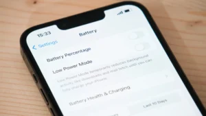
If you find the voice recording button a hindrance, you can now modify it by navigating to Settings > Apps > Messages > Show in Text Field. Within this menu, you are presented with three distinct choices:
- Waveform/Record Icon: This preserves the default experience, allowing for one-tap voice message recording.
- Dictation Microphone: This replaces the voice note trigger with a simple dictation tool, which is far less prone to accidental, long-form recording sessions.
- None/Hidden: For the minimalist, this removes the button entirely from the text input bar, eliminating the possibility of an accidental touch once and for all.
If these changes do not manifest immediately after updating, Apple recommends a standard "force quit" of the Messages app. By swiping up from the bottom of the screen, pausing, and flicking the Messages app away, you clear the cache, allowing the new settings to take effect upon the next launch.
Where Did the Functionality Go?
A common misconception among users is that removing the button deletes the feature. In the interest of maintaining accessibility, Apple has ensured that these functions remain deeply integrated into the iMessage ecosystem, just relocated to more intentional touchpoints.
Accessing Audio and Dictation
If you opt to remove the button, you don’t lose the ability to send voice notes. You can access these features via:
- The App Drawer: Tapping the "+" icon (or the app icon menu) provides a dedicated entry point for audio clips. This creates a "two-step" process, which acts as a safeguard against accidental activation.
- Dictation: Dictation remains accessible via the microphone icon that appears on the keyboard itself (when the keyboard is active), which is spatially distinct from the text entry bar.
Implications: The Shift Toward User-Centric Design
The decision to allow users to toggle UI elements is a significant pivot for Apple, a company historically known for its "my way or the highway" approach to interface design. The implication here is two-fold: the importance of accessibility and the maturing of the iOS ecosystem.
AI and Automation in iOS 27
Beyond the button fix, iOS 27 represents a major leap in how we interact with our messages. A new AI-driven engine is now embedded within the text field, capable of suggesting context-aware phrases and automating tasks. For instance, if a message contains a time or a date, the AI can suggest adding that event directly to your Calendar or Reminders without you ever leaving the app. This is a clear attempt to make the "text field" more than just a place to type—it is becoming a command center for your digital life.
The iPhone Duo and Larger Displays
The UI refinements in iOS 27 are not merely cosmetic; they are structural preparations for the future of Apple’s hardware. The introduction of the "iPhone Duo"—a device boasting a significantly larger, more complex display—requires an OS that can handle more sophisticated inputs. The new drawing app, which allows for handwritten notes and advanced markup tools directly within the thread, utilizes the extra screen real estate provided by these newer models.
Cross-Device Synchronization
Furthermore, the ability to use one phone number across two separate iPhones has bridged a long-standing gap for power users. When combined with the improved RCS (Rich Communication Services) support, which now includes the ability to edit and unsend messages to non-Apple users, the messaging landscape has become more unified and forgiving.
Conclusion: A Victory for the User
The saga of the "accidental voice note" is a fascinating case study in modern software development. It highlights the tension between technological advancement—in this case, the rapid deployment of voice-first communication—and the realities of human ergonomics.
Justin Bieber’s viral outburst was not merely a celebrity complaint; it was a symptom of a design friction point that had grown too large to ignore. By providing the granular controls in iOS 27, Apple has demonstrated a willingness to listen to the "voice of the user."
For the average person, the result is a cleaner, more intuitive, and significantly less frustrating experience. Whether you choose to keep your audio button, swap it for dictation, or hide it entirely, the power is finally in your hands. iOS 27 proves that even the most stubborn UI elements can evolve, and that sometimes, the best way to improve an app is to give the user the tools to make it their own.
As we look toward the future of mobile communication, the lessons of the "choke hold" incident remain clear: in the pursuit of seamless interaction, Apple must balance its innovation with the preservation of user control. With the latest update, they have struck that balance perfectly, ensuring that your messages remain under your control—not the other way around.