The Great UI Debate: Why Your Dark Mode Toggle Might Be Over-Engineered
In the modern web ecosystem, the "Dark Mode" toggle has become a standard UI component, a staple of header navigation, and an expected feature for any self-respecting digital product. However, a recent, rigorous critique by web developer and standards advocate Lea Verou has ignited a fascinating conversation among UI/UX professionals. The core of the debate is deceptively simple: Do we actually need three-state toggles (Light, Dark, and System), or are we cluttering our interfaces with unnecessary cognitive load?
The Core Argument: Complexity vs. Intent
For years, the design pattern for theme switching has gravitated toward a tripartite menu: a toggle that explicitly allows users to choose "Light," "Dark," or "System Default." The assumption behind this design is that users want granular control over how their browser interprets a website’s color palette.
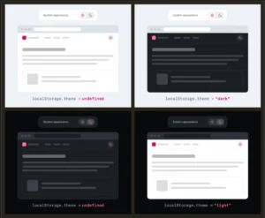
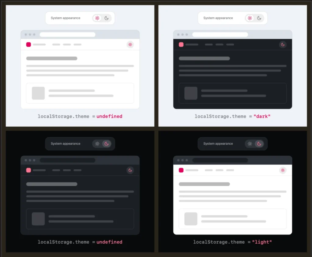
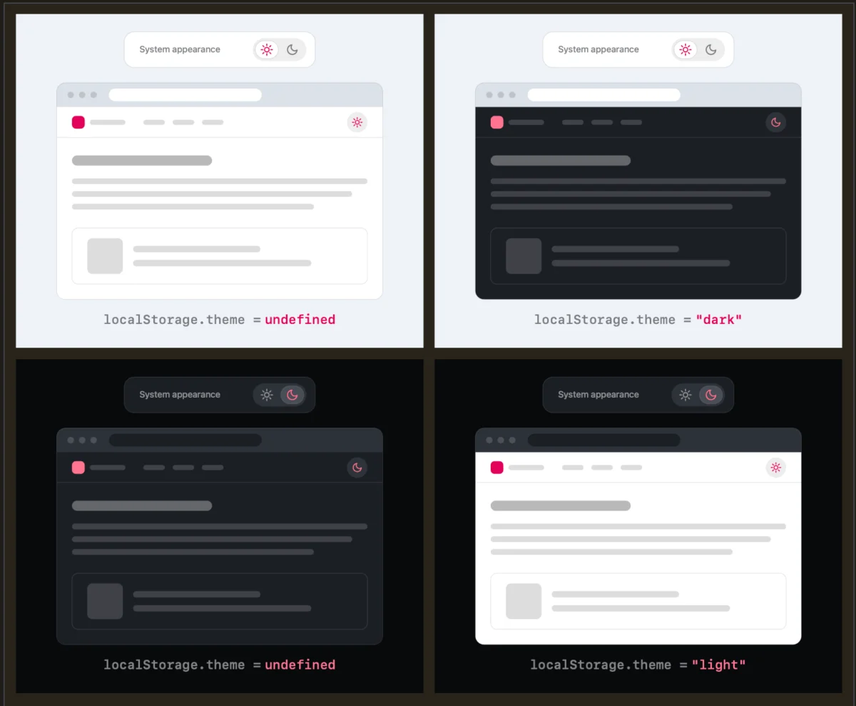
Lea Verou argues that this approach is an example of "over-engineering" a simple user preference. In her view, a "good two-state control" can effectively encompass all three states. By defaulting to the system preference—the industry standard—and providing a simple override, the UI can remain clean. When a user clicks a button to switch from their current system-set light mode to dark mode, that action serves as the override. The system stores that preference in localStorage, effectively signaling: "Ignore the system setting; use this specific theme instead."
The brilliance of this approach lies in its minimalism. It removes the "System" option from the UI, which often confuses users or adds visual friction to navigation bars that are already crowded with essential links and search bars.
Chronology of the Discussion
The conversation began in early August 2026, when Verou published her analysis of dark mode implementation patterns. Her initial post highlighted the redundant nature of explicitly listing "System" as a toggleable option.
Shortly after the post gained traction, the developer community—including prominent figures on platforms like Bluesky and various tech blogs—began to dissect the nuances of state management. The debate evolved from a simple question of "should we include a button?" to a deeper philosophical inquiry into how browsers and websites interact with user intent.
By mid-August 2026, the discourse reached a boiling point, leading Verou to publish a follow-up article. This follow-up was essential for clarification: she emphasized that her recommendation is strictly for persistent toggles found in global navigation bars. In contexts where a user is managing deep system settings, a tri-state control might still be valid, but for the average content site, it is largely unnecessary.
Supporting Data and User Experience Principles
The primary argument for stripping away the third state is the reduction of "cognitive dissonance." Every additional button or option in a UI increases the amount of processing time required for a user to scan the interface.
The Psychology of Choice
When a user encounters a menu with three options, they are forced to evaluate the relationship between "System" and the other two modes. Does "System" mean "the setting I had before," or "the setting my OS currently uses?" This ambiguity creates a micro-moment of hesitation.
Conversely, a two-state toggle provides immediate feedback. If a user is currently viewing the site in "Light" mode, the only logical action is a button that says "Switch to Dark." Once clicked, the UI updates, and the button label changes to "Switch to Light." The system handles the logic of "System vs. Override" in the background, which is where it belongs.
The "Persistent Toggle" Problem
As Verou noted, the toggle is "entirely tangential" to the primary goal of the visitor. Most users visit a website to read an article, purchase a product, or access information. If the toggle is always visible in the header, it must be as unobtrusive as possible. By reducing the complexity of the toggle, designers allow the content to take center stage, which is the ultimate goal of any website.
Official Responses and Industry Perspectives
The community reaction has been largely supportive, though not without nuance. Industry veterans have pointed out that the current state of "Dark Mode" is perhaps a symptom of a larger architectural issue.
Chris Coleman, a vocal participant in the discussion, raised a point that resonated with many: "All I ever wanted was for my OS to be dark, not every website I look at." He argued that the current trend of tying every web element to a system preference was a "huge leap" by browser vendors. This perspective shifts the focus from how we build toggles to whether we should be building them at all.
If the browser itself provided a robust, standardized way to set per-site preferences, the need for custom UI toggles might vanish entirely. However, until that browser-level standard is realized, Verou’s two-state model stands as the most elegant compromise.
Two Scenarios Where Three States Remain Relevant
While Verou advocates for simplicity, she is not dogmatic. She acknowledges that there are specific edge cases where a three-state toggle remains a functional necessity:
- Administrative Settings Panels: In a dedicated "Appearance" or "User Preferences" menu, the user expects to see the full range of options. Here, the UI is not competing for attention with content; the goal is to provide comprehensive control. A tri-state toggle—or even a radio button group—is appropriate because the user has entered a space explicitly designed for configuration.
- Complex Multi-Theme Environments: In products that support more than just "Light" and "Dark" (e.g., high-contrast modes, sepia modes, or custom branding themes), a simple two-state toggle is insufficient. In these instances, the complexity is a requirement of the product’s function rather than a failure of UI design.
Implications for Web Design and Development
The implications of this debate for developers and designers are profound. The industry is currently moving toward a more "opinionated" style of UI design, where the goal is to minimize user effort by making intelligent, informed defaults.
Technical Implementation
From a technical standpoint, implementing the two-state pattern requires a clean separation of concerns. Developers should:
- Default to System: Use the
prefers-color-schemeCSS media query to match the user’s OS preference by default. - Store the Override: When the user clicks the toggle, store that choice in
localStorage. - Scripted Priority: On page load, the script should check
localStoragefirst. If a preference exists, apply it. If it does not, fall back to the system media query. - Handle "Reversion": As Verou noted, if a user toggles back to the system preference, you can clear the
localStoragevalue. This "unsets" the override, allowing the site to resume following the system settings—a behavior that most users find intuitive and satisfying.
The "No Toggle" Future
Perhaps the most significant takeaway from the discussion is the suggestion that, in some cases, the best UI is no UI at all. If a website is designed with high-quality color palettes that respect the prefers-color-scheme media query, many users will never feel the need to toggle the mode manually.
By investing time in robust CSS variable systems and accessible contrast ratios, developers can build sites that "just work." This removes the need for a toggle, cleans up the navigation bar, and creates a more seamless experience.
Conclusion
The debate sparked by Lea Verou serves as a reminder that UI design is rarely about adding features—it is about removing them until only the essential remains. In the rush to follow trends like "Dark Mode," many developers have blindly copied complex patterns without considering the impact on the user experience.
By adopting a two-state, system-first approach for persistent navigation toggles, we can reduce clutter and provide a more focused experience. It is a small change in implementation, but it represents a larger shift toward thoughtful, human-centric design. As the web continues to evolve, the most successful interfaces will be those that anticipate user needs without demanding their attention.
For those interested in refining their own site’s theme-switching logic, the guidance is clear: simplify the UI, respect the system, and keep the focus where it belongs—on the content.