
Beyond the Box: The CSS border-shape Revolution
For years, web developers have been locked in a paradoxical struggle with CSS shapes. We have mastered the art of clipping elements into exotic geometries using clip-path and mask, yet we have remained perpetually frustrated by the inability to easily apply borders, box shadows, and outlines to these non-rectangular forms. When you clip an element, you clip everything—including the borders.
However, a new wave of CSS specifications is changing the paradigm. With the arrival of the shape() function and the corner-shape property, we have entered an era where complex geometry is no longer a "hack-filled" nightmare. The latest, and perhaps most significant, piece of this puzzle is the border-shape property. It promises to do for border-styling what clip-path did for geometry, fundamentally altering how we design the edges of our digital canvas.

The Evolution of CSS Geometry: From shape() to border-shape
To understand why border-shape is being hailed as a "game-changer," we must first look at the recent, rapid progression of CSS layout specifications.
shape() and corner-shape: The Foundation
The shape() function, now reaching Baseline support, was the first domino to fall. By allowing developers to use SVG-like syntax directly within CSS for clip-path and offset-path, it removed the reliance on complex, hard-to-read path() data. It made the creation of custom paths accessible, readable, and highly performant.

Simultaneously, the corner-shape property emerged. While border-radius has served us for decades, it was strictly limited to rounding corners. corner-shape allows developers to define corner styles—such as scoop, bevel, notch, or squircle—as first-class citizens. When paired with border-radius, this allows for design systems that feel far more modern and sophisticated than the standard "soft-rounded" aesthetic.
The Problem with Clipping
The primary limitation of existing tools like clip-path is that they function like a cookie cutter. They slice through the element, its background, and—most crucially—its borders. If you wanted a bordered hexagon, you couldn’t simply apply border: 5px solid red to a clip-path polygon, because the border would be cut off along with the rest of the element. Developers resorted to complex workarounds, such as using mask images or multiple stacked elements, to simulate borders.

The Arrival of border-shape
The border-shape property solves this by decoupling the shaping of an element from the clipping of its content. Instead of removing the parts of the box you don’t want, border-shape instructs the browser to render the borders and decorations along a defined path.
Technical Mechanics: Stroke vs. Fill
According to the current W3C specifications, border-shape offers two distinct modes based on the number of arguments provided:

- Stroke Mode (Single
<basic-shape>): The border acts as a stroke along the path. The width of the border is determined by theborder-widthproperty, effectively outlining any custom shape without the need for complex SVG manipulation. - Fill Mode (Two
<basic-shape>s): This is the "cutout" powerhouse. The first shape defines the outer boundary, while the second defines the inner boundary. The border is rendered as the space between these two paths, allowing for precise control over the thickness and geometry of the frame.
Implications for Modern Web Design
The implications of this property go far beyond convenience; they invite a fundamental shift in design language.
1. Eliminating "Hack-Based" UI
The era of using before and after pseudo-elements to create decorative frames for buttons or cards is coming to a close. With border-shape, developers can create complex, responsive frames that scale with the content. This significantly reduces the DOM weight, improves rendering performance, and makes maintenance trivial.

2. Breakout Decorations and Full-Width Backgrounds
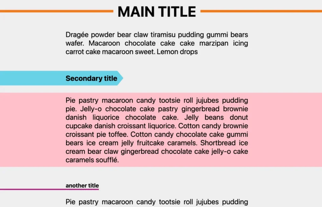
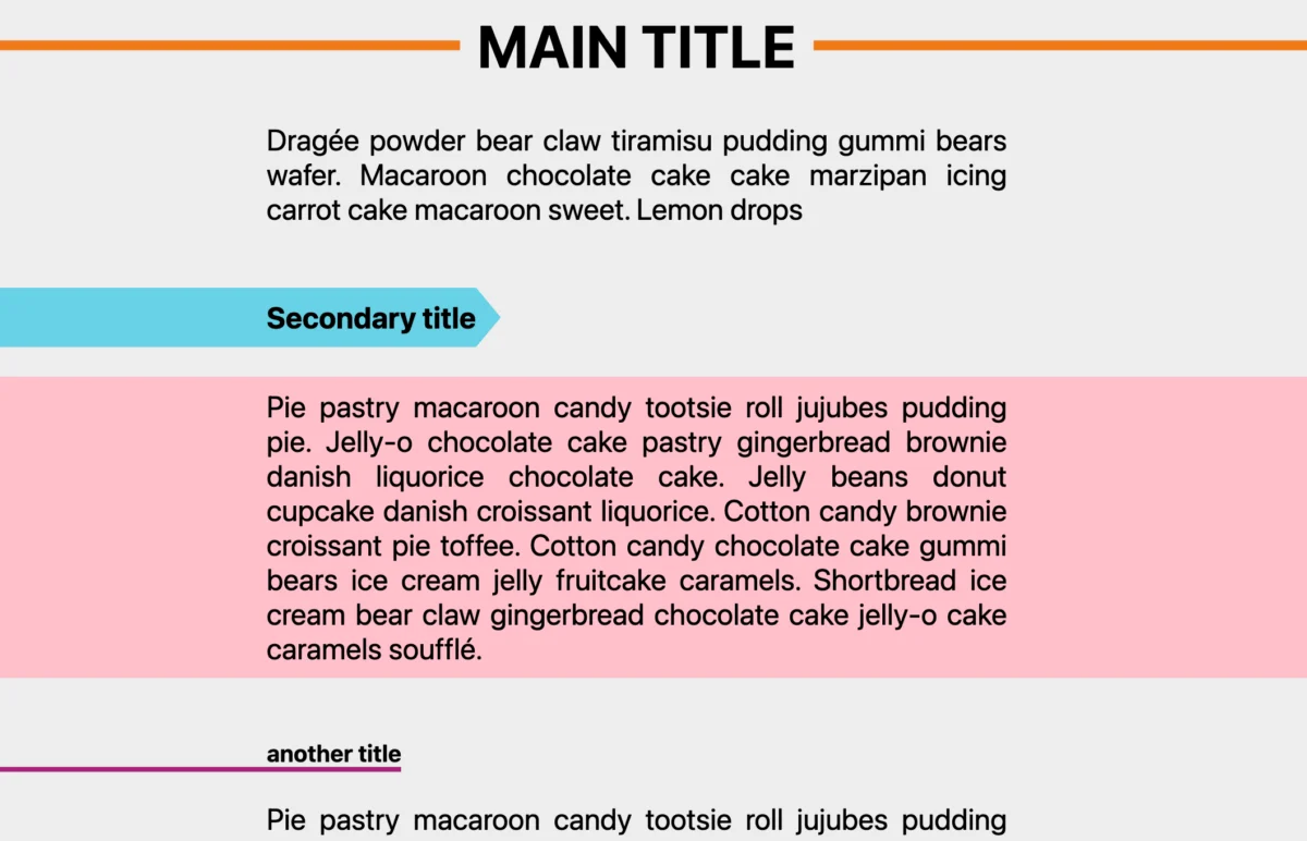
One of the most persistent design challenges is the "breakout" effect—where a background or border extends beyond the container to the edge of the viewport, even while the content remains constrained. By utilizing the two-shape syntax (e.g., border-shape: inset(0 -100vw) circle(0)), designers can force borders to bleed to the screen edge while keeping the actual text content centered and readable.
3. Native Animation Potential
Unlike clip-path, which is notoriously difficult to animate smoothly between different shapes (often requiring the same number of points in the path), border-shape behaves more like a border property. This means you can transition between shape states more fluidly. Hover effects that morph a square button into a blob or a starburst are now performant and declarative.

Official Responses and Industry Reception
While the specification is currently in the early implementation phase—with primary support residing in Chromium-based browsers—the industry response has been overwhelmingly positive. CSS Working Group members have noted that the border-shape proposal addresses a "top-tier" developer pain point that has existed since the inception of CSS.
However, some accessibility experts have raised questions regarding the semantic implications of these shapes. There is a general consensus that as these properties become more powerful, developers must ensure that the underlying content remains accessible to screen readers and that focus indicators follow the new shape accurately. The browser vendors are currently working on ensuring that focus-ring follows the border-shape path rather than the rectangular bounding box of the element.

Future-Proofing Your Workflow
For developers looking to integrate these features, the learning curve is surprisingly shallow. If you have any experience with clip-path or polygon() values, you already possess the vocabulary needed for border-shape.
The Path Forward:
- Audit Your UI: Identify components that currently rely on
clip-pathto simulate borders. These are the prime candidates for aborder-shaperefactor. - Leverage Generators: Because defining complex paths manually can be tedious, utilize emerging tools like CSS shape generators. These tools are rapidly being updated to export
border-shapecode, allowing you to copy-paste complex, decorative frames into your codebase. - Graceful Degradation: As with any bleeding-edge feature, use
@supportsqueries. You can provide a clean, rectangular fallback for browsers that do not yet supportborder-shape, while providing the enhanced geometric experience for those that do.
Conclusion
The introduction of border-shape is a landmark moment for CSS. It signifies the maturity of the language—moving away from the "box model" constraints that have defined web design for thirty years and toward a more expressive, graphic-design-oriented approach.

As we move forward, the focus will likely shift toward the interaction between border-shape and other modern features like CSS Grid and Container Queries. The ability to define the visual silhouette of a container independently of its content layout will empower designers to create truly unique, high-fidelity interfaces that were previously relegated to static graphics or heavy JavaScript libraries.
The box is no longer just a box. It is whatever shape you define it to be. Start experimenting today, and watch as the rigid, rectangular nature of the web begins to soften into something much more fluid and imaginative.








