
The Art of Motion: Mastering Scroll-Driven Animations for Modern Web Design
In the evolving landscape of front-end development, the line between static documents and interactive experiences is blurring. Designers are increasingly looking for ways to create immersive, tactile, and reactive interfaces that respond to the user’s physical engagement with the browser. One of the most sophisticated techniques to emerge in recent years is the "opposing column" scroll effect—a design pattern where vertical content streams move in contrary directions, creating a parallax-like sensation that feels both premium and intuitive.
While this visual flair was once the exclusive domain of heavy JavaScript libraries—often at the cost of performance and accessibility—modern CSS has fundamentally shifted the paradigm. By leveraging the power of scroll-driven animations, developers can now achieve high-fidelity motion effects with minimal markup and optimal browser rendering.
The Core Concept: Redefining Web Interactivity
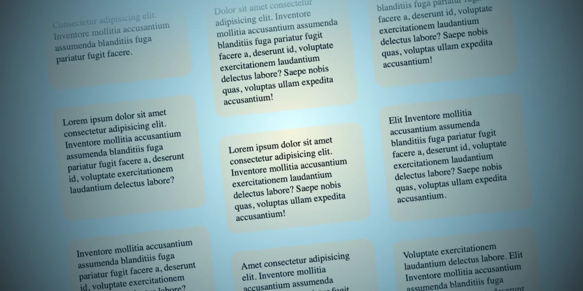
At its heart, the opposing column effect involves creating multiple vertical containers that transition items across a defined viewport area. By having columns move in opposite directions—some traveling upward while others descend—designers can create a sense of depth and complexity.
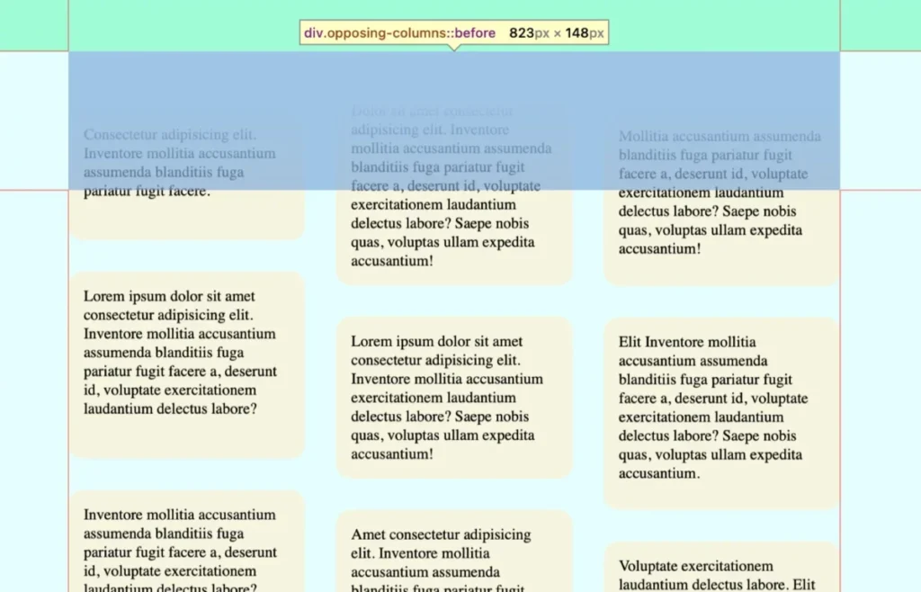
This technique, while visually ambitious, is surprisingly lightweight. The implementation relies on a clean, semantic HTML structure and a modular CSS approach. The core premise is to treat the parent container as a "stage," using pseudo-elements to create a masking effect that gives the illusion of items seamlessly appearing and disappearing into thin air.
The Architectural Blueprint
To begin, we define the structure of our stage:
- The Parent (
.opposing-columns): Acts as the primary flex container, holding the individual columns. - The Children (
.opposing-column): These act as the tracks for the movement. - The Items (
.opposing-item): The actual content—whether logos, images, or text—that will glide across the user’s view.
Chronology of the Implementation
Building this effect requires a sequential approach, moving from structural layout to the application of the browser’s scroll-driven animation engine.
Phase 1: The Structural Foundation
We start by defining our CSS variables. By utilizing a root variable for the background color (--opposing-bg) and the mask size (--opposing-mask), we ensure that the design remains maintainable and globally consistent.
The parent container uses display: flex and margin-inline: auto to ensure it is centered and responsive. Crucially, we apply position: relative to the container, which is a prerequisite for absolute positioning the masking pseudo-elements that will define the boundaries of our animation.
Phase 2: Implementing the Masking Illusion
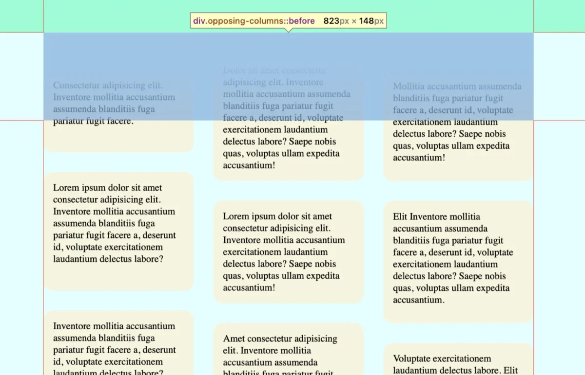
The "magic" of the fade-out effect lies in the clever use of ::before and ::after pseudo-elements. By placing these elements at the top and bottom of the container with a higher z-index, we effectively create a "clipping plane."
Instead of manipulating the opacity of individual items—which would be computationally expensive—we apply a linear-gradient to the masks that matches the document’s background color. As the items scroll toward the top of the container, they pass underneath the mask, creating a clean, professional fade. The gradient transitions from a solid color to transparent, ensuring a smooth visual transition.
Phase 3: The Animation Logic
With the layout and masking established, we move to the centerpiece: the animation-timeline. In the past, animations were time-bound, triggering automatically upon page load. The modern view() function, however, tethers the animation to the scroll position of the element within the scrollport.
By defining animation-range: entry 0% cover 100%, we instruct the browser to map the start and end of our column movement precisely to the moment the column enters and exits the viewport. This ensures that the animation is perfectly synchronized with the user’s physical scroll action, providing a seamless, jitter-free experience.
Supporting Data: Performance and Browser Compatibility
For developers, the move from JavaScript-based scroll listeners to CSS-driven animation is not just about aesthetics; it is about performance.
- Main Thread Efficiency: Unlike JavaScript, which requires constant event listener polling that can block the main thread, CSS scroll-driven animations are optimized for the browser’s compositor thread. This results in smooth, 60fps performance, even on lower-powered devices.
- Reduced Motion Compliance: A critical consideration for modern web accessibility is the
prefers-reduced-motionmedia query. Implementing this is non-negotiable. By settinganimation: unsetwithin this media query, developers ensure that users who suffer from motion sensitivity are not negatively impacted by the design. - Browser Support: As of mid-2026, Chromium-based browsers (Chrome, Edge, Opera) and Safari offer strong support for these features. While Firefox integration is currently in progress, developers can safely utilize
@supports (animation-timeline: view())to provide a high-performance experience for compatible browsers while defaulting to a graceful fallback for others.
Official Perspectives: The Shift Toward Native CSS
The web standards community, led by groups like the CSS Working Group, has championed scroll-driven animations as a pivotal step forward. The philosophy is clear: the more native the browser capabilities become, the less reliance there is on third-party frameworks.

Designers have praised this shift, noting that it allows for a more "declarative" way of building interfaces. Instead of calculating scroll offsets and coordinates in JavaScript, developers can now describe the behavior of the interface in CSS, effectively telling the browser what to do rather than how to do it. This declarative approach drastically reduces the potential for bugs and memory leaks.
Implications for Future Design Trends
The implementation of opposing column scrolling is more than a stylistic choice; it represents a broader trend toward "Scrollytelling."
1. Enhanced User Retention
By making the act of scrolling an interactive journey, users are more likely to engage with content longer. The visual feedback provided by moving columns creates a "sticky" interface, encouraging users to scroll through the entirety of a page.
2. A New Standard for Digital Branding
For brands and agencies, this technique offers a way to distinguish their online presence. It moves beyond the flat, static "hero" sections of the early 2020s and into a space that feels more like an interactive application.
3. The End of "Jank"
One of the most significant implications is the eradication of scroll-jank. Because these animations are offloaded to the compositor, they maintain fluidity even when the page contains high-resolution assets. This is particularly important for e-commerce platforms and portfolio sites where visual quality is synonymous with brand reputation.
Conclusion: Looking Ahead
The technical demonstration of opposing columns serves as a gateway to a broader ecosystem of scroll-driven possibilities. As we look toward the future, the integration of scroll-timeline and view-timeline will likely become a standard tool in every front-end developer’s utility belt.
Whether it is for subtle parallax effects, interactive progress bars, or complex geometric animations, the ability to link UI state to scroll position is a transformative development. We encourage developers to experiment, iterate, and share their findings. After all, the best interfaces are those that don’t just display information, but invite the user to participate in the experience. As browser support broadens, the only real limitation will be the designer’s imagination.








