The Ghost in the Machine: Why Your Modal’s "Angry Mustard" Console Warning Is More Than Just Noise
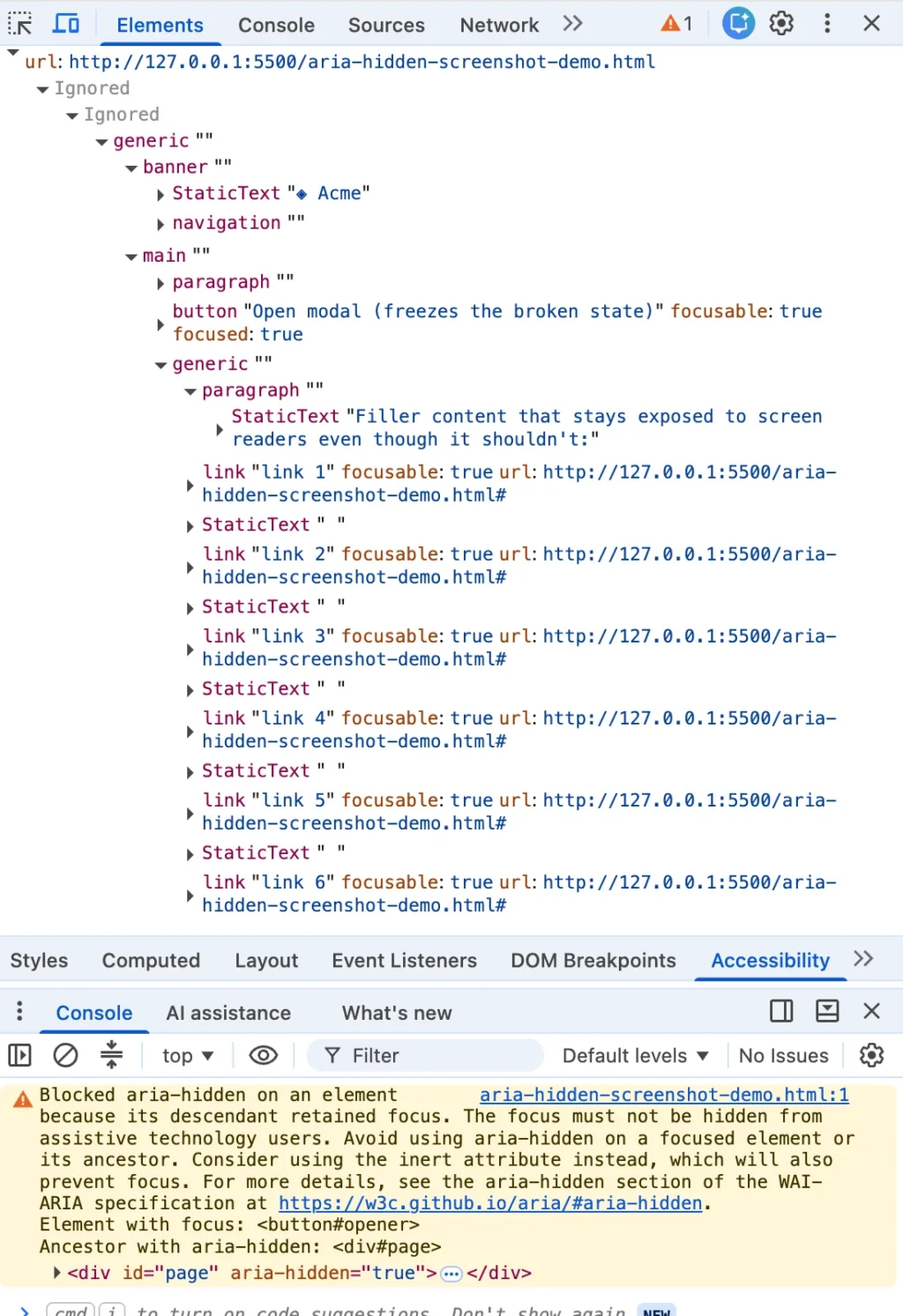
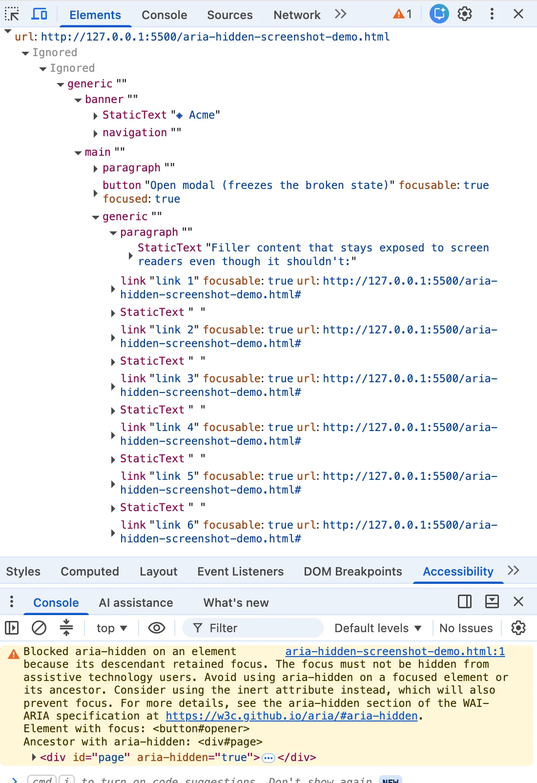
You close a dialog box, and suddenly, your browser console erupts in a distinctive, angry shade of mustard-yellow. You highlight the warning, paste it into a search engine, and find yourself staring at a screen filled with thousands of other developers—from Angular enthusiasts to Bootstrap veterans and phpMyAdmin maintainers—all asking the same question: “How do I make this go away?”
The top search results often provide the same suite of "fixes": a blur() one-liner, a setTimeout wrapper for your closing animation, or the quick-and-dirty removal of an aria-hidden attribute. These snippets are widely shared, frequently upvoted, and—crucially—architecturally flawed.
Here is the truth that the most popular answers bury: the warning is correct. There is a real person on the other side of that screen—someone using a screen reader whose focus is about to fall into a structural void in your page. If you have shipped one of these "quick fixes," you are in enormous company, and you were likely failed by your search results rather than your own carelessness.
The Core Conflict: Focus vs. Visibility
The warning is not Chrome nagging you about a style-guide nicety. It is the browser telling on your architecture. When a developer hides a modal, they often want the rest of the page to vanish from the "accessibility tree" to ensure screen readers don’t get lost in the background. They do this by setting aria-hidden="true" on the document wrapper.
However, a fundamental paradox exists in web standards: aria-hidden removes content from the accessibility tree, but it does not remove that content from the keyboard focus order. Two different systems are at play, and if they are not synchronized, you create what is known as "ghost focus."
When a user triggers a modal, the focus moves into the dialog. When they close it, if the background wrapper is hidden before the focus is safely returned to a logical element (like the button that opened the modal), the browser sees a paradox: a focused element living inside a region that is supposedly invisible. Chrome, seeing this, overrules your code and keeps the region exposed so the user isn’t left in a state of "silence."
A Chronology of the Warning
While the technical conflict has existed for years, the "loud" warning is a relatively recent phenomenon. Chromium’s accessibility team has been quietly patching this behavior since at least 2020. In early 2020, ARIA WG issue #1185 recorded Chrome accessibility engineer Aaron Leventhal proposing that browsers should expose focusable aria-hidden nodes so that users could "at least hear where they are tabbing to, instead of complete silence."
The "noisy" era began in mid-2024. The open-time warning—which scolds developers about an element that "just received focus"—began appearing across major trackers around Chrome 127. By late 2024, with the release of Chrome 131, a second wave of warnings emerged, specifically targeting the "retained focus" that occurs when a modal closes. This was observed across high-profile projects, including Bootstrap, Angular, and MUI, as the browser started holding developers accountable for the accessibility tree they were generating.
The Four Traps: How You Get Here
To solve the warning, you must identify which "trap" your application has fallen into. The symptoms are often identical, but the architectural roots differ:
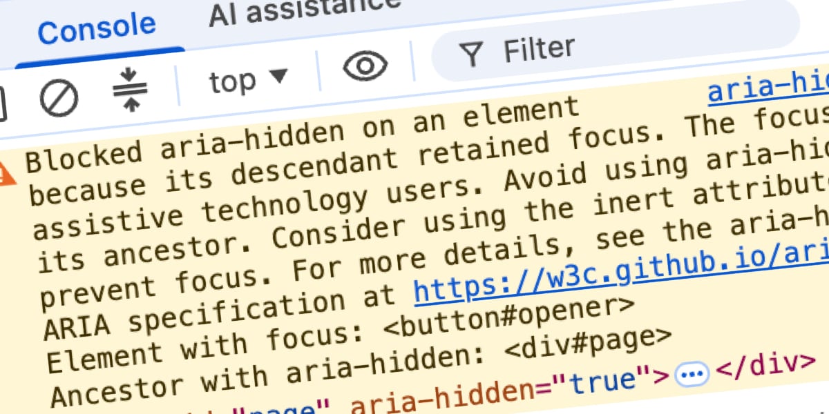
- The Close-Time Race: This is the most common scenario. You click "close," the modal begins a CSS fade-out, but the library marks the background hidden before the focus has been returned to the trigger. For the duration of the transition, you have a "ghost" modal.
- The Open-Time Inversion: The reverse of the race. The modal opens, and the library hides the background while the trigger button—which the user just clicked—still technically holds focus.
- The Composition Turf War: This occurs when nested components (like a
selectdropdown inside adialog) both attempt to manage the "modal" state of the page. Under React 19, this can escalate from a console warning to a "focus freeze," where the entire page becomes un-tabbable. - The Abandoned User: Sometimes, nothing in your code changes, but the user does. If a user hits
Alt+Tabor switches browser tabs while an overlay is open, the focus bookkeeping can fail, stranding anaria-hiddenstate that has no active focus to reconcile against.
The Anatomy of a Failed Fix
The "Internet’s favorite" one-liner—document.activeElement.blur()—is a classic example of optimizing for the console rather than the user. By blurring the element, you do remove the warning. However, you also dump the user’s focus onto the <body> element.
For a screen reader user, this is a disaster. When they press Tab after closing a modal, they don’t return to where they were; they are sent back to the top of the page, forcing them to re-navigate the header, navigation, and sidebar just to reach their previous location. This is a clear violation of WCAG 2.4.3 (Focus Order). You haven’t fixed the bug; you’ve just silenced the alarm while the house is still on fire.
The Teardown Contract: A Better Way
If you cannot migrate to the native <dialog> element—which handles this entire focus dance automatically via the browser’s "top layer"—you must adopt a strict teardown contract. The rule is simple: Focus must leave the closing region before that region becomes hidden.
To implement this correctly, follow these four steps:
- Un-inert the background: If you are using the
inertattribute to block the background, you must remove it before attempting to focus the trigger. If the background remains inert, the browser will ignore your.focus()call entirely. - Move focus home: Return the focus to the trigger button synchronously. This ensures that the moment the modal starts its transition, the user is already "home."
- Inert the dying shell: Do not use
aria-hiddenon the modal itself. Instead, set the modal toinert. This removes it from the accessibility tree, prevents focus navigation, and stops pointer events, all while allowing your CSS fade-out animation to finish gracefully. - Unmount on transition end: Only after the animation completes should you remove the element from the DOM. Be sure to handle
transitionendcarefully—if the transition is interrupted or skipped, you must trigger the cleanup immediately to avoid leaving an "inert" shell stuck in your DOM.
Implications for the Future of Web Accessibility
The browser is not being malicious by issuing these warnings. It is attempting to uphold a basic contract: an interface should not be a "black box" that swallows the user’s ability to navigate.
The recent increase in console warnings has forced a much-needed reckoning among maintainers of popular UI libraries. Projects like Bootstrap 6 have already begun moving toward the native <dialog> element, which effectively deprecates this entire class of bugs.
For developers, the lesson is clear: your console is a diagnostic tool, not a nuisance to be silenced. When you see that mustard-yellow warning, don’t look for a way to hide it. Look for the user you are about to strand. By treating accessibility as an architectural requirement rather than a post-launch "fix," we can ensure that the web remains a navigable, inclusive space for everyone—not just those using a mouse.
The warning isn’t just noise on top of your architecture; it is your architecture, speaking out loud about what it does the moment you stop watching.