Rethinking the Toggle: The UX Debate Over Dark Mode Implementation
In the modern web development landscape, the dark mode toggle has become a staple of site architecture. Found tucked away in headers or footers, these widgets are designed to grant users agency over their visual environment. However, a recent, provocative discussion ignited by web standards expert Lea Verou has challenged the industry’s status quo. Verou argues that the ubiquitous "tri-state" toggle—offering Light, Dark, and System options—is an unnecessary layer of complexity that clutters user interfaces without providing meaningful value.
The Core Argument: Complexity vs. Intent
The prevailing design pattern for theme selection usually involves a three-option menu: Light, Dark, and System. This approach, while seemingly comprehensive, assumes that users are constantly managing their color preferences across every site they visit.
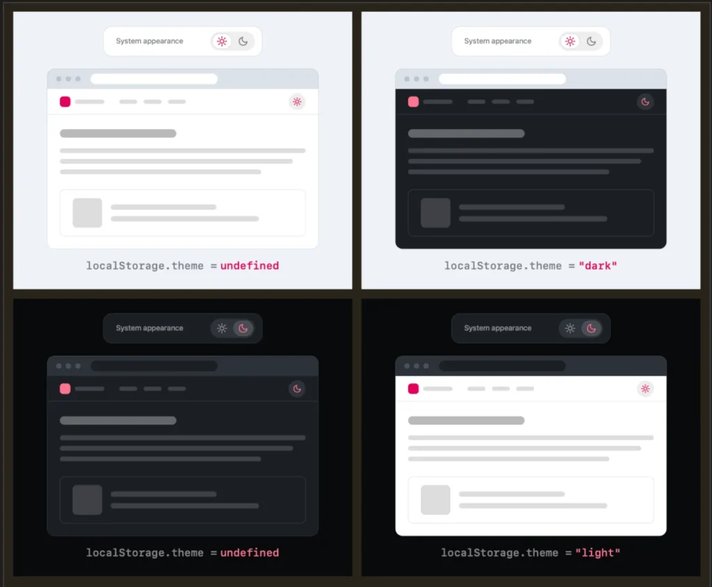
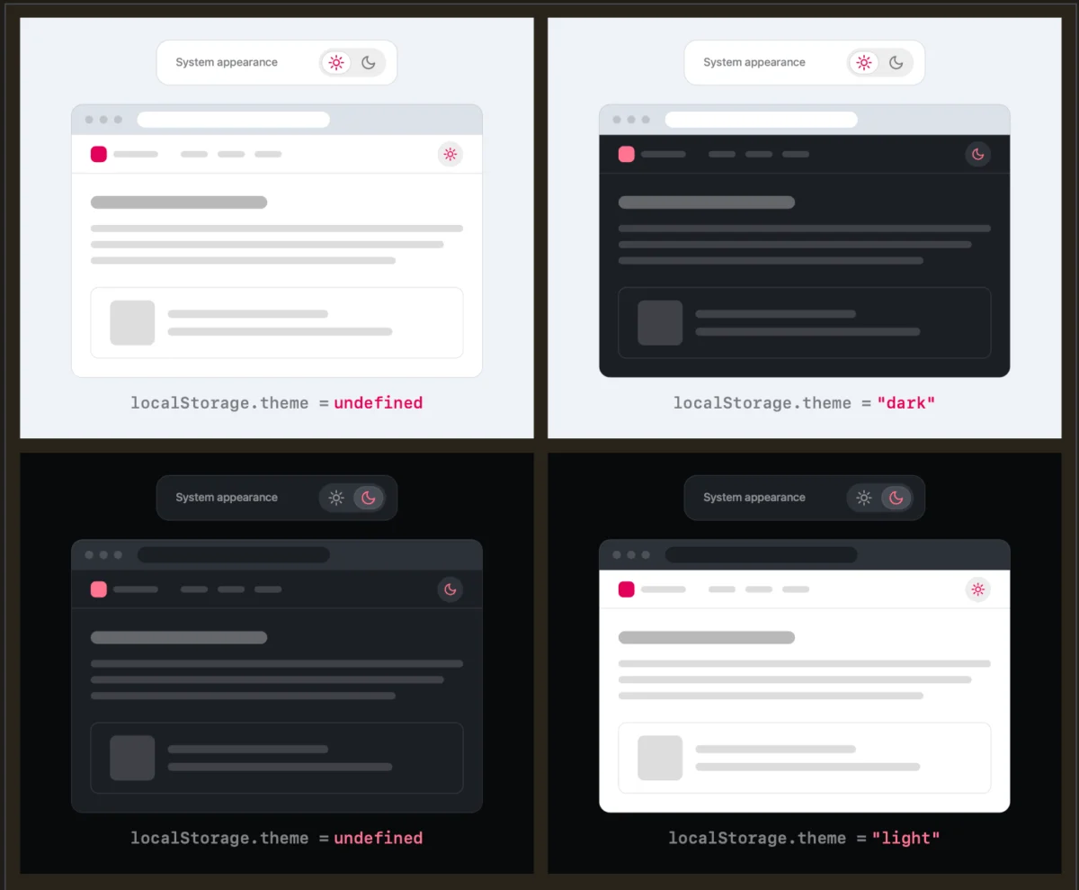
Verou’s central thesis is that a simple, two-state control is sufficient to handle all necessary user requirements. By defaulting to the system’s color scheme preference, websites can respect the user’s OS settings without requiring explicit input. If a user wishes to override this, a single, binary toggle—switching between the current active state and the alternative—is all that is required.
The rationale is rooted in cognitive load: UI components, especially those in global navigation bars, should be sparse. When a user lands on a site, the "System" preference is the baseline. If they find the site too bright or too dark, they click the toggle to invert it. This single action inherently creates an override in localStorage, persisting the preference for future sessions. The need for a dedicated "System" button becomes redundant because the browser is already handling that logic automatically.
Chronology of the Debate
The conversation, which gained significant traction on platforms like BlueSky and through Verou’s own technical blog, unfolded in several distinct stages:
- The Initial Critique: Verou published her initial findings, demonstrating that three-state toggles often suffer from "option paralysis." She provided visual examples showing how the three-state model unnecessarily complicates the user flow.
- The Community Backlash and Support: As the article circulated, developers began sharing their own implementations. Some argued that removing the "System" option would confuse users who might want to revert to the OS default after having set an override.
- The Clarification Phase: Recognizing the pushback, Verou published a follow-up article. She clarified that her guidance specifically targets "persistent toggles"—those displayed in headers or primary navigation—rather than deep-menu settings pages.
- The Synthesis: The discourse shifted toward the broader philosophy of web content, with experts debating whether websites should even be responsible for theme toggling in the first place, or if that control should reside entirely within the browser’s own UI.
Supporting Data and UX Psychology
The psychology of choice suggests that "less is more." Hick’s Law—which states that the time it takes for a person to make a decision increases with the number and complexity of choices—is directly applicable here. By presenting a three-state toggle, designers are forcing the user to evaluate three distinct possibilities. By reducing this to a binary switch that only appears when a manual override is needed, the designer reduces the cognitive friction of the navigation bar.
Furthermore, empirical observations from web traffic logs suggest that theme switching is a low-frequency intent. Most users, once they set their system preference, rarely toggle a website’s theme unless the default contrast is unreadable. Therefore, building a sophisticated, multi-option UI for a feature that is used infrequently is, according to the principles of lean design, an inefficient use of screen real estate.
Official Responses and Industry Perspectives
The industry response has been varied. Many senior front-end engineers have praised the "two-state" approach as a cleaner, more accessible alternative. Chris Coleman, a notable voice in the discussion, pointed out a fundamental misalignment in the industry: "All I ever wanted was for my OS to be dark, not every website I look at."
This sentiment highlights a deeper issue: the browser vendors’ aggressive enforcement of prefers-color-scheme. Because browsers automatically force sites to adapt to OS settings, developers have been forced to build "overrides" that are often clunky. If the browser provided a native, universal toggle for dark mode, the burden on individual websites to build these complex, tri-state components would vanish.
However, there are niche scenarios where the three-state control remains valid, as outlined by Verou herself:
- Settings Panels: In a dedicated accessibility or profile dashboard, exposing all three states allows for granular control and clarity.
- State Reset: If a user has manually set a theme, they may appreciate a button that explicitly says "Reset to System," preventing the "stuck" feeling that occurs when an override is active but forgotten.
Implications for Future Web Design
The implications of this debate extend far beyond simple CSS toggles. It forces a reconsideration of how we treat user preferences on the web.
1. Minimalist Navigation
The primary takeaway is that designers should audit their persistent navigation elements. If a theme toggle is taking up space, is it essential? If the answer is yes, can it be reduced to a single, intuitive button that simply swaps states? The shift away from "menu-style" theme selection toward "action-style" toggles is likely to become a best practice for clean, modern interfaces.
2. The Role of Browser Vendors
The debate also places pressure on browser developers (Google, Apple, Mozilla) to provide better native support for theme management. If the browser could handle the color-scheme override at the proxy or application level, the need for custom JS-based theme switching might disappear entirely, further simplifying the web ecosystem.
3. Accessibility and Inclusion
While simplicity is the goal, designers must ensure that the "override" state is clear. If a user toggles to Dark mode, they should not feel trapped. Providing a clear path to return to the system default is essential. The challenge for developers is to build this path without relying on a permanent, three-option widget. One elegant solution is to show a "Reset to System" button only after a manual override has been applied, effectively making the UI dynamic.
Conclusion: The Path Forward
The discussion initiated by Lea Verou serves as a vital reminder that even the most "standardized" components of web design deserve periodic scrutiny. The tri-state toggle, once considered a gold standard for accessibility and control, is now being revealed as a relic of a time when we over-engineered user interactions.
By prioritizing the user’s system settings and using persistent, binary overrides, developers can create cleaner, more focused interfaces. As the web continues to mature, the goal should not be to provide every conceivable option to the user, but to build systems that act intelligently on their behalf. In the context of dark mode, the best UI is often the one that disappears until it is truly needed.
Whether developers choose to follow the two-state model or remove the toggle entirely in favor of native system integration, the conversation has successfully shifted the focus toward a more streamlined and thoughtful user experience. The era of the bloated, tri-state navigation menu may well be drawing to a close, replaced by a more elegant, "system-first" philosophy.