
The Modern Standard for Web Modals: A Deep Dive into the HTML <dialog> Element
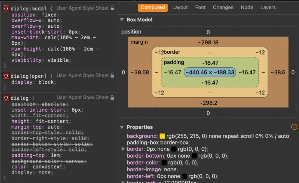
It has been nearly a decade since the native HTML <dialog> element was introduced to the web platform, yet it remains one of the most frequently misunderstood and underutilized tools in a front-end developer’s arsenal. While many developers still reach for third-party JavaScript libraries to manage overlays, the native implementation has matured into a robust, accessible, and performant standard. This article serves as a comprehensive technical guide to mastering the <dialog> element—a vital piece of web architecture that every modern developer should embrace.
Main Facts: The Anatomy of a Modal
At its core, the <dialog> element provides a standard way to create interactive overlays, such as modals, inspectors, and temporary prompts. Unlike custom div-based solutions, the native <dialog> handles complex accessibility concerns—such as focus trapping and screen reader announcements—out of the box.
The element operates in two primary modes:

- Non-modal (Pop-up): Triggered via the
show()method, this behaves like a standard element. It lacks a backdrop and does not restrict interaction with the rest of the page. - Modal: Triggered via the
showModal()method, this creates a "top layer" experience. It automatically renders a::backdropbehind the element, centers it within the viewport, enablesEsckey support for closing, and renders the background contentinert.
Chronology: From Experimental Spec to Browser Dominance
The journey of the <dialog> element is a testament to the slow but steady progress of web standards. Initially proposed to solve the "div-soup" problem of custom modal implementations, it spent years in the "experimental" phase.
- 2014-2016: Early adoption in Blink-based browsers (Chrome/Opera) began, though Firefox and Safari lagged behind, requiring heavy polyfills for cross-browser consistency.
- 2022: A milestone year for the web, as all major browser engines (Chromium, WebKit, and Gecko) reached full support for
<dialog>. This effectively rendered legacy jQuery-based modal plugins obsolete. - 2024-2026: The ecosystem has moved toward refinement. We have seen the introduction of the
:modalpseudo-class, improvements to CSS animation capabilities via@starting-style, and the rise of declarative invoker commands.
Supporting Data: Accessibility and Performance
The primary argument for moving away from custom modal libraries is performance and accessibility. Custom modals often require complex JavaScript to calculate focus transitions and manage aria-hidden attributes on the background.
When a <dialog> is opened via showModal(), the browser automatically handles:

- Inertness: The
inertattribute is implicitly applied to the rest of the document, preventing mouse and keyboard interaction with background elements. - Focus Trapping: The browser ensures that the tab order remains within the dialog, preventing users from accidentally navigating to background content.
- Top-Layer Rendering: The dialog is promoted to a special browser layer that sits above all other UI elements, eliminating the need for
z-indexwars.
Official Perspectives and Industry Standards
The W3C and WHATWG have emphasized that the <dialog> API is intended to be a foundational primitive. While frameworks like React and Vue have their own abstraction layers, the consensus among core maintainers is that these frameworks should ultimately defer to the native HTMLDialogElement whenever possible.
However, a point of confusion often arises between the <dialog> element and the newer, more experimental Popover API. The consensus, as articulated by web performance experts, is simple:
- Use
<dialog>for tasks that require "modal" behavior (interrupting the user workflow, requiring a decision, or trapping focus). - Use Popover API for transient UI (tooltips, non-blocking menus, or secondary navigation).
Implications: Styling, Animating, and Future-Proofing
One of the most significant implications of using native dialogs is the shift in how we handle CSS.

Mastering the Backdrop and Positioning
The ::backdrop pseudo-element is the key to creating immersive overlays. By applying backdrop-filter: blur(10px) or a custom semi-transparent background color, developers can maintain visual context for the user. Furthermore, the use of scrollbar-gutter: stable is essential when modals appear; it prevents the layout shift caused by the scrollbar disappearing from the background document.
Advanced Animation
The historical complaint that <dialog> elements "snap" into existence without transition is now solved. By utilizing the @starting-style rule in conjunction with transition properties, developers can now animate a modal’s entrance and exit smoothly.
@starting-style
  dialog[open]
    opacity: 0;
    transform: translateY(20px);


dialog
  transition: opacity 0.5s, transform 0.5s;
  opacity: 1;
  transform: translateY(0);
The Rise of Invoker Commands
The future of the <dialog> element is declarative. The emerging "Invoker Commands" standard aims to eliminate the need for event listener boilerplate entirely. With attributes like command="show-modal" and commandfor="my-dialog", developers will soon be able to trigger modals directly via HTML. This represents a significant move toward "HTML-first" development, reducing the reliance on JavaScript for standard UI interactions.

Best Practices for Implementation
To ensure a robust implementation, developers should adhere to these three core principles:
- Labeling: Always provide an accessible name. If using a close button with an icon (e.g., an "X"), ensure there is a visually hidden span containing the text "Close modal" to support screen reader users.
- Focus Management: While the browser handles initial focus on the first focusable element, developers should use
autofocuson specific form inputs within the dialog to guide user intent immediately upon opening. - Scroll Control: Rather than relying on
overflow: hiddenon the body, which can be brittle, use the modernoverscroll-behavior: containon the dialog element to prevent "scroll chaining," where the background page moves while the user is interacting with the modal.
Conclusion
The <dialog> element is more than just a convenience; it is a mature, high-performance standard that aligns with the modern web’s focus on accessibility and native capability. By shifting away from custom scripts and toward the declarative power of the native <dialog> and the emerging suite of CSS layout features, developers can create faster, more resilient, and more inclusive user experiences. As the web platform continues to evolve with features like Invoker Commands, the barrier to entry for building complex, interactive interfaces will only continue to lower, leaving us with cleaner codebases and more time to focus on product value rather than plumbing.








