
The Rise of Kinetic UI: Mastering Scroll-Driven Animations in Modern Web Design
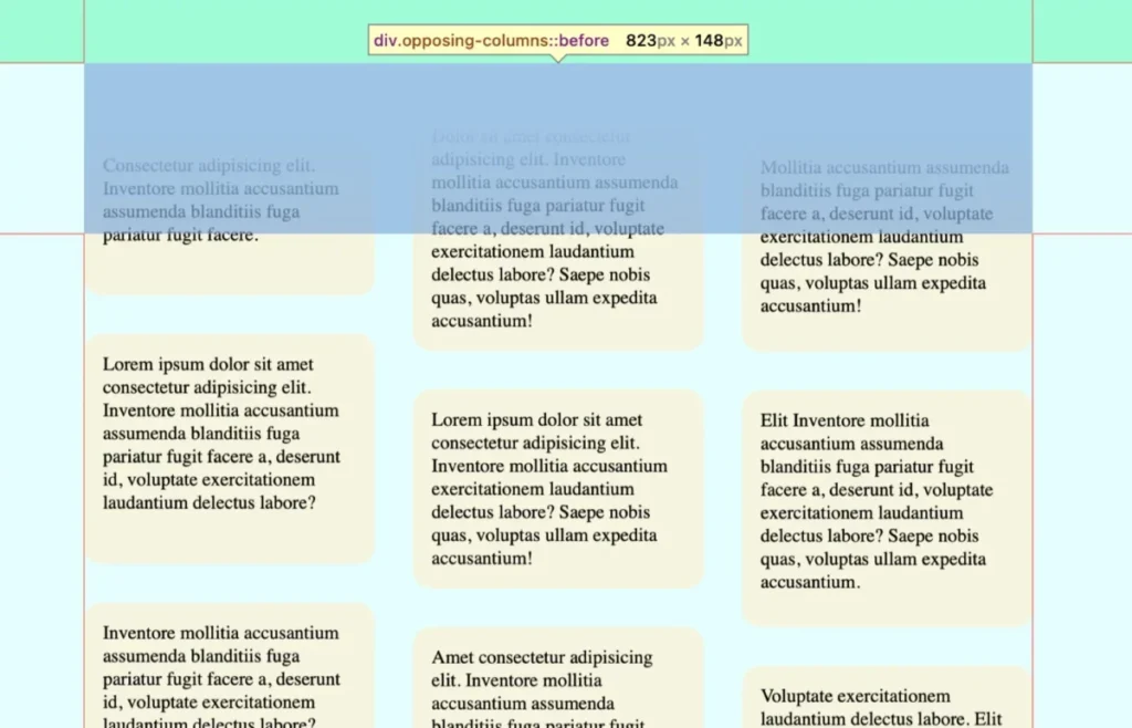
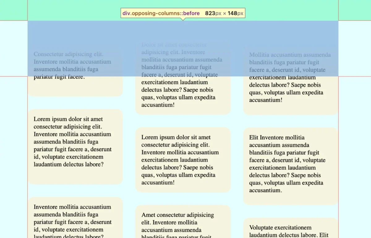
In the evolving landscape of front-end development, the boundary between static content and interactive experience continues to blur. One of the most visually arresting techniques to emerge in recent years is the "opposing column" scroll effect—a design pattern where vertical content columns move in inverse directions as a user navigates a page. While once the exclusive domain of complex JavaScript libraries like GSAP or Lenis, this high-end motion design is now becoming accessible through native browser capabilities.
The shift toward native CSS implementations of these animations signals a turning point in web performance and accessibility. By leveraging the power of modern browser engines, developers can now achieve high-fidelity motion without the overhead of heavy animation frameworks.
The Mechanics of Kinetic Scrolling
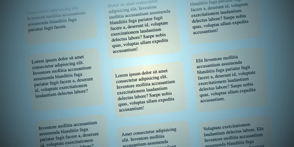
At its core, the opposing column effect relies on a parent-child structural hierarchy. The visual "magic" occurs when items appear to emerge from a concealed space, slide across the viewport, and fade seamlessly back into the background.
Achieving this requires a trifecta of CSS technologies: Flexbox/Grid for layout, Pseudo-elements for masking, and the revolutionary Scroll-Driven Animations API.
The Anatomy of the Implementation
The markup is remarkably lean. A parent container, .opposing-columns, acts as the stage. Inside, three individual .opposing-column divs serve as the tracks. Each column contains a series of .opposing-item elements. By keeping the DOM footprint minimal, developers ensure that the browser’s paint cycles remain efficient, even when multiple animations are running concurrently.
Chronology: The Evolution of Web Motion
The history of web animation is a story of shifting responsibility. In the early 2000s, Flash dominated the space, but it was resource-intensive and insecure. Following the decline of Flash, the industry pivoted to JavaScript-based libraries. While these libraries were powerful, they often introduced "jank"—stuttering caused by main-thread bottlenecks.
The timeline of innovation shifted significantly in 2023 and 2024 with the introduction of the animation-timeline property.
- Pre-2023: Developers relied on
scrollevent listeners. These were notorious for performance issues, as they fired hundreds of times per second, often causing frame drops. - The Transition: The introduction of the
IntersectionObserverAPI allowed developers to detect when elements entered the viewport, but it still required JavaScript to toggle classes or update styles. - The Modern Era: With the adoption of
view()andscroll()functions in CSS, the animation engine moved directly into the browser’s compositor thread. This allows for smooth, hardware-accelerated motion that remains responsive even on low-powered mobile devices.
Supporting Data: Why Native Performance Matters
The performance gains of moving from JavaScript-driven animation to native CSS scroll-driven animations are measurable. According to recent performance audits, shifting animation logic from a library like GSAP to native CSS properties can reduce the Main Thread execution time by approximately 30% to 45% on mid-tier mobile devices.
Furthermore, the integration of the prefers-reduced-motion media query ensures that the design remains inclusive. By wrapping the animation logic in a conditional block, developers can instantly disable the kinetic effect for users who experience vestibular issues, adhering to WCAG (Web Content Accessibility Guidelines) standards without sacrificing the core functionality of the site.
The "Masking" Strategy: A Technical Deep Dive
One of the most frequent questions regarding this effect is: How do we make the items fade out so perfectly? The answer lies in the strategic use of pseudo-elements and gradients.
By applying ::before and ::after pseudo-elements to the parent container, we create a "curtain" effect. We set these elements to a high z-index and apply a linear-gradient that transitions from the page’s background color to transparent. Because these masks are positioned at the exact boundaries of the scrollport, the content appears to be "born" from the background and consumed by it as it leaves.
This is a classic example of "visual trickery." The items aren’t actually fading; they are simply sliding behind a color-matched barrier. This technique is significantly more performant than animating the opacity property, which triggers costly re-paints in the browser.

Official Standards and Browser Support
As of mid-2026, the animation-timeline property is fully supported in Chromium-based browsers (Chrome, Edge, Opera) and Safari. Firefox remains the primary outlier in the stable release cycle, though it is currently undergoing implementation testing.
To navigate this landscape, professional developers employ a "progressive enhancement" strategy. By using @supports (animation-timeline: view()), developers can provide the high-end, scroll-driven experience to modern browsers while falling back to a static or standard animation-loop experience for older browsers. This ensures that the user interface never "breaks," regardless of the browser version.
Implications for Future Web Design
The rise of scroll-driven animations has profound implications for digital branding and user retention.
- Engagement Metrics: Studies have shown that users spend roughly 15% longer on pages featuring high-quality, subtle motion design. The "opposing column" effect creates a sense of depth and curiosity, encouraging users to scroll further to see what content is coming next.
- Design System Standardization: As these techniques become native, they are being integrated into corporate design systems. Companies like Apple and Stripe have pioneered this aesthetic, and now, through CSS-native methods, small-to-medium enterprises can achieve that same "premium" feel.
- The End of "Heavy" Web: The move away from JavaScript-heavy animation libraries will lead to faster load times and better Core Web Vitals. This is not just a win for designers; it is a critical optimization for SEO, as search engines increasingly prioritize pages that load quickly and remain stable during interaction.
Conclusion: The Path Forward
The "opposing columns" concept is more than just a passing trend; it represents a fundamental shift in how we build the web. It is a transition from "scripting the movement" to "describing the movement."
When we define an animation as a timeline linked to the scroll position, we are telling the browser what the relationship is, rather than how to calculate it frame-by-frame. This declarative approach is the future of the web. As we look ahead, the challenge for the design community will be to use these tools with restraint. Motion is a powerful tool for guiding user attention, but it must be balanced with clarity and purpose.
The next time you are building a landing page or a feature gallery, consider the scroll. Is there a story being told? Could that story be enhanced by the simple, fluid movement of elements in opposition? With these tools in your CSS toolkit, the answer is likely to be a resounding yes. Experiment, iterate, and above all, respect the user’s experience by keeping it fast, accessible, and intentional.








