
The State of the Web: A Deep Dive into What’s !important #15
The web development ecosystem is currently undergoing one of its most transformative periods in recent memory. As browser vendors and the CSS Working Group push the boundaries of what is possible within the browser, developers are finding themselves equipped with a new toolkit that replaces legacy hacks with robust, native solutions. The latest edition of What’s !important #15 highlights this evolution, showcasing a series of technical breakthroughs that promise to reshape how we build, style, and interact with the digital landscape.
From the introduction of boundary-aware styling to the nuanced debates surrounding grid accessibility, this report breaks down the critical shifts occurring in web UI development.
Main Facts: The Evolution of Web UI
The current landscape of web design is shifting away from "working around" browser limitations and toward "leveraging" the platform’s native capabilities. The standout developments include:
- Boundary-Aware CSS: The emergence of
view()allows for dynamic, context-aware styling, enabling elements to react to their container boundaries rather than just the viewport. - The Grid Lanes Debate: While native "masonry-style" layouts are gaining traction, accessibility experts are raising alarms regarding the navigation flow for assistive technologies.
- Temporal Web Design: New APIs like the Temporal API are enabling time-based interface transitions, allowing websites to mirror real-world environmental changes, such as light and color shifts.
- Standardizing the Future: The CSS Working Group is actively auditing past "mistakes" in the language, leading to experimental projects like FixCSS that propose cleaner naming conventions for future-proofing the web.
Chronology of Recent Innovations
The pace of change in web development has been relentless over the last few weeks. To understand how we arrived at the current status quo, we must look at the timeline of these releases:
- Early June 2026: Preethi Sam introduces the paradigm of boundary-aware styling via
view(), marking a shift in how developers handle responsive components. - Mid-June 2026: Google I/O 2026 serves as the stage for Bramus and Una Kravets to unveil 35 new web platform features, signaling a major push for standardized UI components.
- Late June 2026: David Bushell publishes a definitive guide on solving the "full-bleed" layout problem, utilizing container query units to eliminate overflow issues.
- Early July 2026: A wave of accessibility discourse follows the implementation of "grid lanes," with Manuel Matuzović questioning the viability of the current syntax for screen readers.
- Ongoing: The collaborative efforts of the CSS Working Group to address historical language debt, such as the debate over
border-radiusvs.corner-radius.
Supporting Data: Why Modern CSS Matters
The transition from legacy CSS to modern methodologies is not merely aesthetic—it is a performance and maintenance necessity.
Solving the "Full-Bleed" Dilemma
For years, the "full-bleed" layout (where an element spans the entire width of the viewport while nested inside a restricted container) was a constant source of frustration, often requiring negative margins or viewport-width units that caused horizontal scrollbars. By implementing Container Query Units, developers can now anchor an element’s size relative to its parent container. This reduces the need for "hacky" CSS, resulting in cleaner, more performant stylesheets.
Customizable Select Menus
Jake Archibald’s recent work on the <select> element addresses a long-standing pain point in web design. Historically, the <select> element was notoriously difficult to style, forcing developers to build custom, non-native dropdowns that often broke keyboard accessibility. The new, customizable <select> architecture allows developers to retain native behavior while gaining granular control over styling and sizing, effectively solving the "Goldilocks" problem of dropdown height.
Official Responses and Accessibility Concerns
The introduction of new layout models, such as Grid Lanes (formerly known as Masonry), has sparked a vital conversation about the "Cost of Convenience."
The Grid Lanes Accessibility Gap
While Grid Lanes provide a Pinterest-like layout that is visually compelling, accessibility researcher Manuel Matuzović has highlighted that these layouts often destroy the logical document order. If an item appears in a column visually but is not positioned correctly in the DOM, screen reader users may experience a disjointed narrative.
The Proposed Solution:
Matuzović has championed the use of the reading-flow property as a potential remedy. This CSS property would allow developers to define how focus and reading should move through a layout, independent of the visual grid. While the proposal is still in the testing phase, it represents a critical intersection between powerful layout tools and inclusive design.
Implications for the Future of Web Development
The implications of these developments are twofold: developers are becoming more productive, but the barrier to entry for "accessible" development is rising.
The "FixCSS" Movement
The existence of FixCSS—a project aimed at correcting historical CSS naming errors—reflects a maturing industry. The CSS Working Group’s openness to auditing their own mistakes is a sign of a healthy, long-term project. Moving toward more semantic property names like corner-radius instead of the legacy border-radius might seem trivial, but it suggests a future where CSS is more intuitive for the next generation of engineers.
Dynamic, Time-Based UI
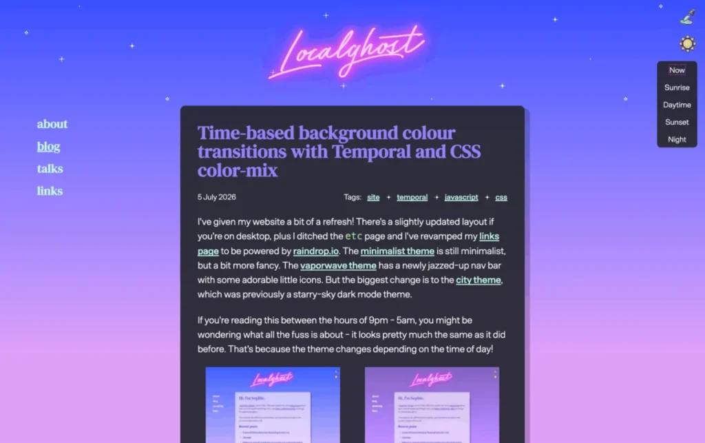
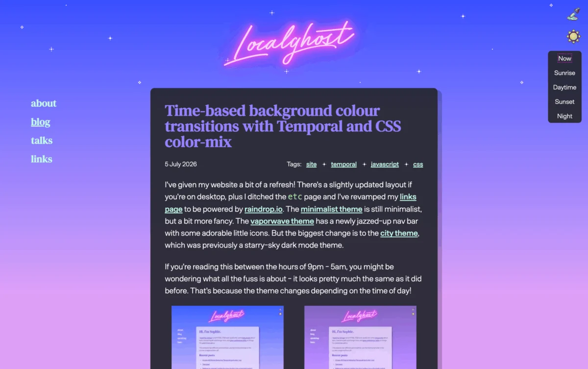
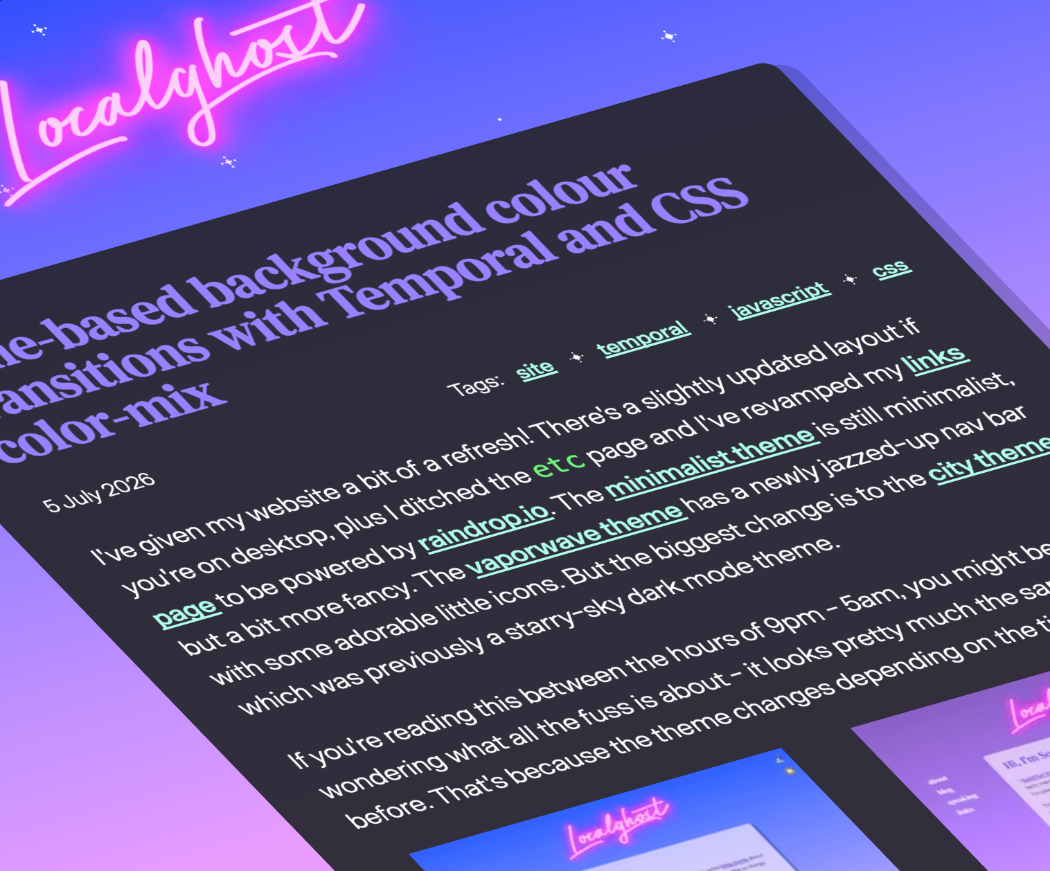
Sophie Koonin’s work on time-based background transitions using color-mix() and the Temporal API showcases a shift toward "Human-Centric Design." By having a website adapt to the time of day, developers are mimicking the environmental awareness of native operating systems. This reduces eye strain and provides a more immersive user experience, but it also demands that developers think about their color palettes as dynamic variables rather than static values.
The 35 Features Paradigm
The recent presentation by Bramus and Una Kravets highlighted a staggering 35 new features for the web platform. This volume of updates suggests that the "Web" is no longer just a document viewer; it is a full-fledged application engine. The implication for developers is clear: the era of the "Generalist" is returning, but they must now master a significantly deeper stack of native APIs.
Conclusion
The developments featured in What’s !important #15 paint a picture of a web that is becoming simultaneously more complex and more capable. We are moving toward a future where layout, accessibility, and environmental context are handled by the browser itself, rather than by thousands of lines of custom JavaScript.
However, as these tools become more powerful, the responsibility of the developer grows. Whether it is ensuring that a new grid layout remains navigable or utilizing view() to create performant, boundary-aware components, the mandate remains the same: innovation must never come at the expense of accessibility.
As we look toward the next two weeks of development, the industry seems poised to continue this rapid pace of refinement. The transition from "fixing" the web to "architecting" it has truly begun.
For further reading on these topics, visit the respective documentation pages for the Temporal API, the W3C CSS Working Group’s audit of legacy mistakes, and the ongoing discussions regarding the reading-flow property.








