The Modern Web Standard: A Comprehensive Deep Dive into the HTML <dialog> Element
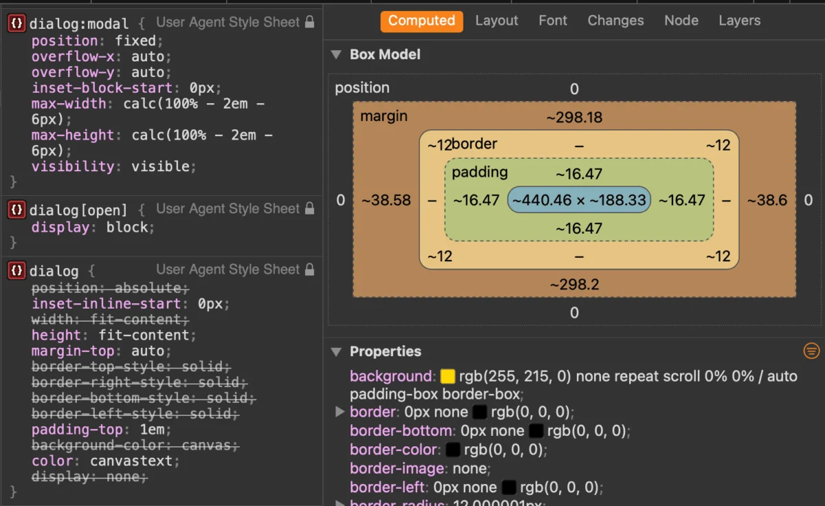
It has been nearly a decade since the <dialog> element was introduced to the web platform, yet it remains one of the most misunderstood and underutilized components in modern front-end development. While developers have historically relied on third-party libraries or complex, custom-coded overlays to handle modals, the native HTML <dialog> element offers a robust, accessible, and performant alternative.
As we move toward a more declarative web, understanding the nuances of this element—from its inertness states to the complexities of ::backdrop styling—is essential for any developer looking to build resilient user interfaces. This article serves as a definitive guide to the architecture, implementation, and future trajectory of the <dialog> element.
The Core Architecture: Understanding the Native Modal
At its most basic level, the <dialog> element is a semantic container for interactive content. Unlike generic <div> elements, the browser treats <dialog> with specific behaviors that enhance accessibility and user experience.
Marking Up the Dialog
The markup is remarkably simple. You define your trigger button and your dialog container:
<button id="open-btn">Open Dialog</button>
<dialog id="main-dialog">
  <h2>Settings</h2>
  <p>Update your preferences here.</p>
  <button id="close-btn">Close</button>
</dialog>
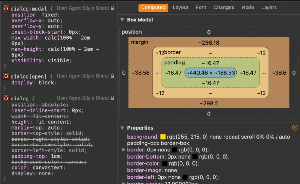
By default, the dialog is hidden (display: none). To show it, we use the JavaScript API. While one could manually toggle the open attribute, developers are strongly encouraged to use the showModal() method.

show() vs. showModal(): A Critical Distinction
There is a fundamental difference between dialog.show() and dialog.showModal(). The former treats the element as a non-modal popup—essentially a floating box with no special focus management. The latter, however, invokes a "modal" state:
- The Backdrop: A semi-transparent overlay is automatically created, darkening the rest of the page.
- Inertness: The rest of the document becomes
inert. Users cannot click, tab to, or select text outside the dialog. - Focus Trapping: The browser automatically handles focus within the dialog, preventing the user from "tabbing out" into the background content.
- Keyboard Support: The
Esckey is automatically wired to close the dialog, a standard user expectation.
Chronology and Evolution of the API
The journey of the <dialog> element reflects the broader shift in web standards from "do it yourself" (DIY) to "native platform capabilities."
In the early days of the web, creating a modal required a complex dance of CSS absolute positioning, JavaScript event listeners for key presses, and manual aria-hidden management to keep screen readers from reading background content. The introduction of <dialog> was a landmark moment in the WHATWG HTML specification, aiming to standardize these patterns.
Over the years, the specification has evolved to include features like:
- The
::backdroppseudo-element: Providing a standard hook to style the overlay. - The
method="dialog"form attribute: Allowing for declarative closing without a single line of JavaScript. - Modern CSS Hooks: The adoption of
:modaland@starting-stylefor smooth entrance and exit animations.
Implications for Modern Web Accessibility
Accessibility is the primary argument for using native elements over custom implementations. When you build a modal from scratch, you are responsible for managing the "Focus Trap," ensuring screen readers ignore the background, and handling the Esc key.

The Problem with "X" Icons
A common mistake in custom modal design is using a simple icon for the close button. If you use an SVG or an "X" character without proper labeling, screen readers may announce the button as "Button" or "X," leaving users confused.
The professional standard is to use a visually hidden text label:
<button>
  <span class="visually-hidden">Close settings modal</span>
  <svg aria-hidden="true">...</svg>
</button>
By utilizing the native <dialog> element, the browser provides the necessary role="dialog" or role="alertdialog" automatically, ensuring that screen readers handle the modal context correctly without additional ARIA bloat.
Advanced Styling and The Power of ::backdrop
One of the most requested features for modals is the ability to customize the backdrop. With the ::backdrop pseudo-element, we can move beyond the browser’s default grey tint.
Implementing Blur and Transparency
Modern browsers allow us to apply filters directly to the backdrop. By adding a backdrop-filter: blur(5px), we can create a sophisticated, glass-morphism effect that keeps the user grounded in the context of the page:
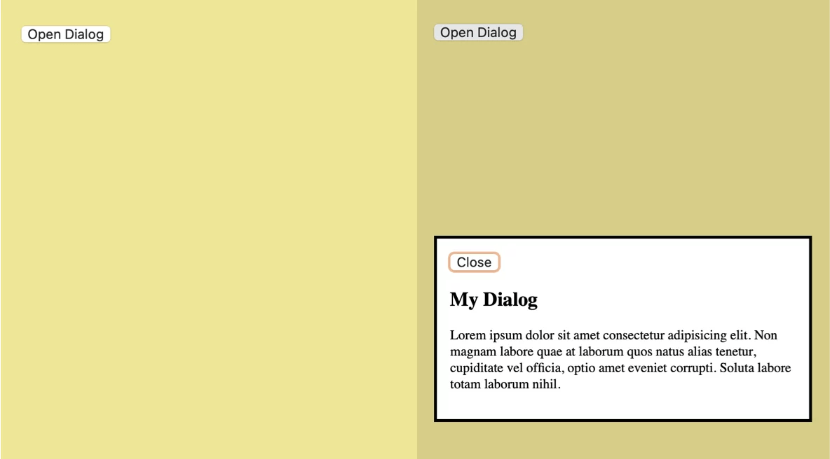
dialog::backdrop
  background: rgba(0, 0, 0, 0.4);
  backdrop-filter: blur(8px);
The Scrollbar Challenge
A common issue arises when a modal opens: the page background scrollbar disappears, causing the entire layout to "shift" to the right. To solve this, we use the scrollbar-gutter property:
dialog[open]
  scrollbar-gutter: stable;
The Future: Invoker Commands
As we look to the future, the W3C is currently experimenting with "Invoker Commands." This proposal aims to make opening and closing dialogs entirely declarative—meaning no JavaScript at all.
By using the command and commandfor attributes, we will soon be able to write:
<button command="show-modal" commandfor="my-dialog">Open</button>
<dialog id="my-dialog">...</dialog>
This represents the final step in the evolution of the element: moving from a JavaScript-dependent component to a fully native, HTML-only interactive element.
Dialog vs. Popover: When to Use Which?
A common point of confusion exists between the <dialog> element and the newer Popover API. While both can appear to behave similarly, their use cases are distinct:

- Use
<dialog>for Modals: When you need to interrupt the user, focus their attention on a single task, and block interaction with the rest of the page. - Use
<popover>for Tooltips and Menus: When you need a transient piece of UI that doesn’t necessarily block the user or require focus trapping.
As Zell Liew famously noted, the accessibility difference is profound. A popover does not automatically make the rest of the page inert, nor does it inherently trap focus. Attempting to force a popover to behave like a modal requires re-implementing all the logic that the <dialog> element provides out of the box.
Summary of Best Practices
To ensure your implementation is production-ready, adhere to these professional standards:
- Always use
showModal()for true modal behavior. - Handle the initial focus: Do not rely on the browser’s default focus. Use
autofocuson the most important element inside the dialog (like a form field or the primary action button). - Use
::backdropcarefully: Ensure high contrast and accessibility if you choose to use custom colors or complex patterns. - Prefer native semantics: Avoid adding manual
aria-modalattributes, as the browser handles these natively when the element is opened as a modal. - Animation: Use the
@starting-stylerule for smooth transitions, avoiding the "snap" effect that often plagues native elements.
The <dialog> element represents the pinnacle of modern web standard evolution. By embracing these native capabilities, developers can reduce their dependency on heavy third-party libraries, improve performance, and provide a significantly more accessible experience for all users. As browser support continues to solidify, there is no reason to rely on legacy "modal-in-a-div" patterns. The future of the web is declarative, accessible, and native.